View
Search

Name Password


<<PREV · [1][4] [5] [6] [7] [8] [9] [10] [11] [12] · NEXT>>


[1110] Artist: Crescent | Title: Concept - Virgil Schulze | Time: unknown
Pic #1110

Uploaded
Crescent @ Thursday, August 16th 2012, 3:58 AM
avatar
Threw this together, looking for opinions on the design o 3o

After picking up the couple of Erik's characters, I had wanted to add another male to my roster (in addition to the new Divine Crown Wolf). This is that dude.

Virgil also gives me a male (that's sane <_<; Hi there, Shinn) in the Soma et all high school age group.

He's someone confident and capable. Compared to Kai, who's brash and cocky, Virgil's much more calculating and debonair. (He's an interesting foil to Kai and then also Nana in several regards). He's meant to have a refined and in control look, very comfortable with everything. (At least outwardly) kind and proper, but with a bit of a bite to him.
Sketch Meister @ Friday, August 17th 2012, 1:06 AM
avatar
OH GOD ANOTHER REDHEAD.

Dagrus: *TWITCH*

>_>;; Maybe he'll be a benign redhead.. like.. you know.. Robyn?
Crescent @ Friday, August 17th 2012, 1:25 AM
avatar
Nope, sorry XD

...He can act fairly benign, which is more than can be said for Celia, Aku, Frey, etc >_> But Virgil definitely has a gusto for life.
JDeschain19 @ Friday, August 17th 2012, 6:54 PM
avatar
The Redheads will rise...The time is drawing close.

xD
Akurei Nagisa @ Saturday, August 18th 2012, 1:55 AM
avatar
I really like his look and overall shape, as well as his eyes, but that hair is, as I said, a liiiiittle close to Celia's. XD;; I like the length, though, just needs to be slightly different. Maybe a little more feathered? Dunno. o 3o

Also, don't worry, Dagrus! It's extremely unlikely you'll have as many problems with him as Blu--oh bugger that's a lance through my sternum

Kuuhaku: Spoilers are impolite. *-//////////-*
Crescent @ Saturday, August 18th 2012, 2:04 AM
avatar
Hrm, could go with a bit more of a feathery look for his hair or something o 3o It's a different length and doesn't cover his eye or anything, but I can see how it still kinda has a Celia-y "shape" to it.
YoshinoSuki @ Saturday, August 18th 2012, 4:50 PM
avatar
1.) I like how most of them are also green-eyed. XD

2.) I like the concept sketch. ^_^

3.) I dunno, there's something amusing as hell about the idea of a "Man-Celia" ....... and I can't stop thinking about it now. Thanks, guys.

Aph: *salute* That's our job! ^^
Crescent @ Saturday, August 18th 2012, 5:03 PM
avatar
>_> Virgil's teal-eyed! XD
YoshinoSuki @ Sunday, August 19th 2012, 9:52 PM
avatar
I blame my screen. They look green, but on Graham's, I can see the tint of blue that makes them teal.

So it's the fault of a White Rabbit.


[1101] Artist: Crescent | Title: Ready to Rock? | Time: unknown
Pic #1101

Uploaded
Crescent @ Sunday, August 12th 2012, 1:51 AM
avatar
People other than full PCs (and MILFs >_>) can get some cheesecake too!

Another hiccup or two with the proportions, but hey, the hands came out well! o 3o;;

Anyway, I'll take this opportunity to provide some details!

Name: Kikyo
Origin: Named Kikyo by her parents actually only because Japanese names are popular in Mirai, her heritage is primarily Southeast Asian.
Alias: K' (pronounced "Kay-Dash")
Hobby: Bass Guitar (plays in a band I've yet to name)
Favorite Bassist: The Red Hot Chili Peppers' Flea
Piercings: Seven (See if you can you count them all! Only one not pictured is on her left ear)

Digimon Partner: Jane
Cosmomon Highlights: Black (Replaces Red areas on Lex's colors)
Specialization: Heavy Armor
Sketch Meister @ Sunday, August 12th 2012, 2:20 AM
avatar
X__X Oh god nipple piercings. Jesus no.

Sorry just.. dun mind piercings till they enter the tits and the basement. Then the metal makes me ill. X___X

It's a good drawing and nice job on the guitar just... gah. X___X
Crescent @ Sunday, August 12th 2012, 2:31 AM
avatar
...I didn't realize they were a sore subject XD
Akurei Nagisa @ Sunday, August 12th 2012, 2:54 AM
avatar
I'm going to earn myself Cam's undying enmity and say that I think Kikyo actually looks really cute/hot here. And the guitar is really well rendered. I like this a lot.

I'm not a fan of huge nipple rings, or chains, or shit that looks like it hurts (also clit piercings make me oogh for the same reason dick piercings do) but little tasteful studs like K' here has are cute. :3

Also the ripped fishnets look really good. Nice touch.

(Edited on August 12, 2012, 2:55 am)
YoshinoSuki @ Tuesday, August 14th 2012, 2:11 AM
avatar
I see what you did there, Justin. >_>

As for the pic, I like it. The holey fishnets look nice and I agree that her hands came out really well!

My personal thing about piercings, I guess, is more that I don't mind them on characters... but personally, I wouldn't want them. >_> lol However, they do look good. Like... anatomically. o 3o


[1099] Artist: Crescent | Title: The Fairlions | Time: 56s
Pic #1099

Uploaded
Crescent @ Saturday, August 11th 2012, 1:04 AM
avatar
Yo dawgs, here's Iris's crew.

The most prominent three members of the Fairlions gang after its leader, Iris - and also tamers on the side! They were never drawn before or really developed much. I've taken the base framework that Erik had established and further characterized them.

On the left is Hana. She's not so much shy as she is simply quiet and unassuming, as she can also be rather frank and sarcastic. ALWAYS WATCH OUT FOR THE SMALL, QUIET ONES. Because her kendo swing is lightning fast (even faster than Iris).

In the middle is Ashley. She was never mentioned as NOT having dark skin in her few prior appearances, so yeah! >_> She's effectively Iris's rival - strong, flirty, and just as well-endowed <_<

And on the right is Kikyo. She's the most easygoing of the group - but also has the biggest wild streak. Her persona's very rock 'n roll, and she has a bunch of piercings.

EDIT: This totally isn't a repost after a bit of photoshop magic when Cam pointed out I made their necks too long. Nope. (Hana's still a bit long, but fixing that would require more effort ^^; )
Sketch Meister @ Saturday, August 11th 2012, 1:10 AM
avatar
Nice job diversifyin. Also, yeah. Neck still needs a little work.
Crescent @ Saturday, August 11th 2012, 1:13 AM
avatar
Yeah x_x There are a few parts of anatomy that - especially on paper - look fine, and then once everything gets colored and shaded some I'll notice look off. Though this time I hadn't noticed until you pointed it out. I'll have to be more mindful, since I think you've mentioned necks to me once before.
Akurei Nagisa @ Saturday, August 11th 2012, 4:26 AM
avatar
Oh shit we're almost to 1100! o 3o

Also this is awesome! :D It really helps to have a visual of the three rather than just...descriptions.

Especially considering where most of the descriptions came from >_>;;;; BUT WE DON'T TALK ABOUT THAT. x_x

I like Hana's design especially. She's just right for her role and aesthetic. Props. :O
Crescent @ Saturday, August 11th 2012, 5:42 AM
avatar
Yeah, I like how Hana came out o 3o She was the one with the most to work with, believe it or not. Though I also like the angle I managed to take with Kikyo.

Ashley... I made progress ^^; But still feels like there's a little something that can be improved upon. Maybe it's just her hair (and not sure how the eye shadow came out). Maybe I should also make her skin a bit darker? She's definitely not as light-skinned as Jasmine, though I also wasn't going as dark as, say Chuukon.


[1089] Artist: Crescent | Title: Roots of the King | Time: unknown
Pic #1089

Uploaded
Crescent @ Wednesday, August 8th 2012, 2:13 AM
avatar
Fixed? Fixed.
Akurei Nagisa @ Friday, August 10th 2012, 12:32 AM
avatar
HELL yes. This is a much better color schema. Intimidating but still regal. Props.


[1077] Artist: Crescent | Title: Armor of the Demon King: Zaehlmon | Time: unknown
Pic #1077

Uploaded
Crescent @ Sunday, August 5th 2012, 3:34 PM
avatar
Here's the prototype for Zhyrmon's perfect, Zaehlmon.

I wanted to make sure the colorscheme worked and kinda designed the armor as I went, so that's liable to change a bit. Think I may make the shoulder armor a bit bigger and design the chest plate tighter around his chest, yadda yadda.

I'm kinda unsure what to do with the helmet whether or not to keep the faceplate or what. I kinda wanted that to be gold too, but it felt like too much with the rest of the helm.

Anywho; while Zhyrmon is restrained demonic power, and Xefalmon is that power boiling to the surface, Zaehlmon focuses that power. In a way his armor acts as a new restraint, keeping it in check (Zaehlmon's skin lacks the Imprisoned-style scales of Xefalmon). His innate demonic power is channeled into the lenses located beneath his chest, forearm, and leg armor (all of which split open) as a means of attack.
Sketch Meister @ Sunday, August 5th 2012, 3:39 PM
avatar
Oooo. I REALLY like this, though it almost seems more like a Golden Armor evo than just a basic version up to Perfect. I like where you're going with this line.
Crescent @ Sunday, August 5th 2012, 3:46 PM
avatar
Yeah, that's the other part of the reason I'll likely retool the armor design a bit.

Maybe I also need to add another color to the armor? Use more of the charcoal grey; and maybe also add some runic script to portions of the armor to further differentiate it from golden armor evos (the script would also fit with the nature of the armor).
Akurei Nagisa @ Sunday, August 5th 2012, 4:23 PM
avatar
Ooooohhh. It's a definite shift from Xefalmon, and I love the armor's design, but I agree, the gold is...foreign, almost. I'd say go back to the cold, hard iron/steel of Zhyrmon, or something more...dark silver? I'd lean towards iron, though.

Also, runic script is definitely a good idea here.


[1075] Artist: Crescent | Title: Crown x Tekken | Time: unknown
Pic #1075

Uploaded
Crescent @ Friday, August 3rd 2012, 12:38 AM
avatar
I scraped this together, as I'm prolly gonna be too lazy to properly finish it or redraw it > 3>

Head's a bit big, didn't do a Tekken Crown logo, Celia's not really a Crown anymore, yadda yadda ^^;
JDeschain19 @ Friday, August 3rd 2012, 1:35 AM
avatar
I still like it. Asuka!Celia ftw. TEKKEN DIGIMENTALS.
YoshinoSuki @ Friday, August 3rd 2012, 4:07 AM
avatar
I like it. Nice job. X3
Mooncrafter @ Sunday, August 5th 2012, 6:02 PM
avatar
It's definitely an interesting take on Celia... I can totally see her wearing this on missions and stuff.


[1074] Artist: Crescent | Title: Swords Dragon | Time: unknown
Pic #1074

Uploaded
Crescent @ Thursday, August 2nd 2012, 6:02 AM
avatar
Alright, so in effort so that my art doesn't become like Tite Kubo's, I had wanted to draw a few chars of different facial structures (and body shapes).

Millia immediately came to mind... but ended up being an issue with starting with the hardest XD

Cam designed her with a very unique face. It has a bit of a 'long' look to it, a straight and flat nose, and sharp but still very feminine eyes. ; 3; And for the life of me, I couldn't get her to not look like a tranny at first. Then by the time I got her face looking acceptable, her body became pretty much an afterthought XD So that's not my best work in terms of getting her body type spot on.

o 3o But I guess this also marks Millia's clothed debut on the Sketcher!

Kai: >_> I personally think there's nothing wrong with a lack of them. At all.

<_< Quiet, you.
YoshinoSuki @ Thursday, August 2nd 2012, 6:19 AM
avatar
I can see what you meant about Tranny. ^^; BUT. I think you fixed it/did well. 8D

Aph: Now if you had given her an Adam's Apple, THEN she-

Robyn: APH. >_<;
Sketch Meister @ Thursday, August 2nd 2012, 6:17 PM
avatar
DEM THIGHS
Akurei Nagisa @ Thursday, August 2nd 2012, 7:58 PM
avatar
That damn nose, man. ; 3; You made a really good effort, though, and for what it's worth she doesn't look manly in the final product, I think, but...yeah, you did kind of start with the hardest.

I like the fashion sense you gave her, though. :D And her thighs are indeed tasty.
Crescent @ Thursday, August 2nd 2012, 8:41 PM
avatar
That's all Cam there, Graham o 3o Just went with what he had written up for Millia's casual clothing on her profile.

And yeah, I do think it's the nose that's the biggest trouble spot ; 3;
Mooncrafter @ Sunday, August 5th 2012, 6:01 PM
avatar
I love her design so much ~<3


[1066] Artist: Crescent | Title: Xefalmon Concept | Time: unknown
Pic #1066

Uploaded
Crescent @ Friday, July 27th 2012, 9:19 PM
avatar
While trying to more properly envision him, here's a sloppy concept I doodled up for Xefalmon, Zhyrmon's Adult.

Zhyrmon's very much so "restrained" to the point where his restraints double as armor. Xefalmon, not so much - He's on the absolute limit where any remaining restraints are just to keep him there. I kinda want to keep a piece or two of the heavier restraints, one thought was the cracked and almost busted chest guard from Zhyrmon.

I don't think he's quite looking differentiated enough from Zhyrmon here, but that's really only detail. Xefalmon's demonic power is on the edge of boiling out (as with his fleshy forearm vents), and that's something that should be better illustrated throughout his body - the little scale ticks I added to his skin are placeholders for skin in the vein of The Imprisoned's design, more fitting of the "demonic power boiling out" feeling.
YoshinoSuki @ Friday, July 27th 2012, 9:25 PM
avatar
I like it! And I can see The Imprisioned influence. o 3o

Awesome though. ^.^
Crescent @ Friday, July 27th 2012, 10:19 PM
avatar
The design works, so I guess I should get around to drawing him properly scaled Imprisioned-style and all o 3o ...When I'm not feeling lazy >_>
Akurei Nagisa @ Saturday, July 28th 2012, 3:54 AM
avatar
I actually really like this. He looks so much more scary and psychopathic than Zhyrmon, and the feeling of a restrained berserker got across really well.


[1063] Artist: Crescent | Title: Brand Recognition | Time: 6m 12s
Pic #1063

ShiPainter
(Public)
Crescent @ Wednesday, July 25th 2012, 11:14 PM
avatar
Not even Hikari's "friend" can escape the market share of Crown Sensuals! >_>

(Original by Akurei Nagisa)
Akurei Nagisa @ Wednesday, July 25th 2012, 11:17 PM
avatar
DDD8 THEY'RE EVERYWHERE! Damn you, de Croix!
YoshinoSuki @ Wednesday, July 25th 2012, 11:19 PM
avatar
I saw it on the bar, I had to click to see where else it was. Oh God. XD
Sketch Meister @ Sunday, August 5th 2012, 6:28 PM
avatar
I almost feel there isn't ENOUGH brand recognition.


[1061] Artist: Crescent | Title: Kai's D-Phone | Time: 58m 33s
Pic #1061

PaintBBS
[View Animation]
(Public)
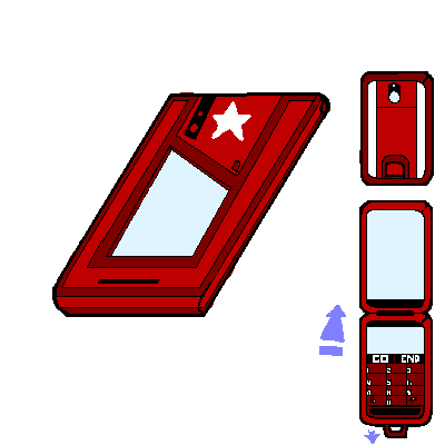
Crescent @ Tuesday, July 24th 2012, 10:56 PM
avatar
D:

(Original by Haru)
Akurei Nagisa @ Tuesday, July 24th 2012, 11:30 PM
avatar
WHAT BOUT KAI'S STAR D:
Sketch Meister @ Tuesday, July 24th 2012, 11:40 PM
avatar
>_> Mariah thought this was Kolenkhov's Digivice. >_> Kai... Kai.... is that a Russian name?

Crescent @ Tuesday, July 24th 2012, 11:44 PM
avatar
...Why does this look Soviet? XD It's not a yellow star and there's no sickle or anything >_>

The Reds were Kai's DDT Digivice colors, so I stuck with those here o 3o And the star's just because of his tattoo <_<
Akurei Nagisa @ Tuesday, July 24th 2012, 11:47 PM
avatar
Also Kolenkhov would have an Oracle, come on now. XD


[1059] Artist: Crescent | Title: Nana's (Not So) Bad End | Time: unknown
Pic #1059

Uploaded
Crescent @ Tuesday, July 24th 2012, 3:40 PM
avatar
>_> With Jason and Graham working on stuff, I felt the need to jump in. Been awhile since I've tried something a bit harder in terms of proportions/perspective, anyway o 3o

So here's Nana, making the best of certain circumstances!

...I've also realized how Nana's yet to be drawn on the Sketcher without stockings XD

I think it came out pretty well in general, though I didn't quite get the perspective perfectly.
Sketch Meister @ Tuesday, July 24th 2012, 3:51 PM
avatar
Nana without stockings? 

...no...no I really can't see that.

Also, you remembered the Crown Vibe. Lordy why?

YoshinoSuki @ Tuesday, July 24th 2012, 4:28 PM
avatar
Ooo. Very nice. o 3o

Though, admittedly, that Crown Vibe looks rather big for my personal tastes. Doesn't detract from it. Very well done. X3

Also, everyone pester Graham repeatedly to buy another Tablet. ; 3;
Crescent @ Tuesday, July 24th 2012, 4:51 PM
avatar
Part of it is perspective fail XD It's not supposed to be huge >_> Though I guess not tiny either <_<;
Akurei Nagisa @ Tuesday, July 24th 2012, 10:10 PM
avatar
Nana likes it in the butt, I see. o 3o And has special furniture! That is probably also Crown Sensuals technology. >___>

Also yeah, Nana seems like a stockings kind of girl.

I like the blindfold combined with the ahegao face. o 3o And the shading is nice. Props.


[1044] Artist: Crescent | Title: Camille's Grimoire Phone | Time: 50m 47s
Pic #1044

PaintBBS
[View Animation]
(Public)
Crescent @ Tuesday, July 17th 2012, 11:18 PM
avatar
Colorscheme for Camille's phone o 3o

(Original by Haru)
Sketch Meister @ Wednesday, July 18th 2012, 12:00 AM
avatar
Flashy. Surprised the girl lacks a personal emblem though.
Crescent @ Wednesday, July 18th 2012, 12:21 AM
avatar
I was thinking about card houses or something, but yeah, mouse ^^; Hence why I said "colorscheme" XP
Akurei Nagisa @ Wednesday, July 18th 2012, 12:53 AM
avatar
Maybe the Ace of Spades? o 3o
JDeschain19 @ Wednesday, July 18th 2012, 5:25 PM


[1041] Artist: Crescent | Title: Junko's D-Phone | Time: 1h 6m
Pic #1041

PaintBBS
[View Animation]
(Public)
Crescent @ Tuesday, July 17th 2012, 9:24 PM
avatar
Here's Junko's rather plain D-Phone o 3o Wasn't gonna bother trying to draw her Serenity and Wrath charms with a mouse >_>

(Original by Haru)
Sketch Meister @ Tuesday, July 17th 2012, 10:40 PM
avatar
Plain but cute. Reminds me of the D-Arc of that one kid in Tamers...


[1028] Artist: Crescent | Title: Magimon/King Magimon Concept | Time: unknown
Pic #1028

Uploaded
Crescent @ Saturday, July 14th 2012, 5:05 PM
avatar
Sketched this up quickly while we skyped this morning o 3o Was just trying to get the general look down for Adelaide's partner. I may change the gold to silver or something instead... or maybe change the armor bits on the Adult from black to another color.

And yes, Magimon is supposed to have a bit of a Kaepora Gaebora stare XD
YoshinoSuki @ Saturday, July 14th 2012, 6:01 PM
avatar
amg I can almost hear his theme song. *cough*

Don't Spam A, Kids.
GoldClaw @ Saturday, July 14th 2012, 6:35 PM
avatar
Very awesome designs. I much like. The designs for Magimon and King Magimon are interesting. Though no I can't unsee the child form as Kaepora Gaebora. I think the themesong fits well with Magimon. o3o;; Maybe...
Sketch Meister @ Sunday, July 15th 2012, 2:48 AM
avatar
...am starting to think the Avian species held a tight grip on Witchelny, not much unlike the whites in North Africa... >.>
Akurei Nagisa @ Sunday, July 15th 2012, 12:15 PM
avatar
IT'S A GODDAMN BIRD CONSPIRACY D:<

Seriously, though, your Digimon design is improving too, Justin! o 3o I like! It's a good general look, and I like how King Magimon also follows the seeming Avian tendency for a humanoid Adult form.


[1013] Artist: Crescent | Title: Olivia / Cloudmon | Time: unknown
Pic #1013

Uploaded
Crescent @ Tuesday, July 10th 2012, 1:52 AM
avatar
>_> There's a zillion other things I'm supposed to be drawing atm, but~

Here's some concept art for a girl by the name of Olivia and her partner, Cloudmon. Olivia's a student at Cyan University who's an Assistant Coach at St. Nunally's for its swim, volleyball, and track teams.

She's simultaneously very lucky and unlucky - Lucky that she was able to form a contract following the Second Crash and got a D-Phone to manifest. And unlucky since that with no DJ, nobody know's she's a tamer, that while she did get a phone, its manual was completely glitched out, and that Cloudmon's a bit of an... airhead. Leaving Olivia completely lost.
Akurei Nagisa @ Tuesday, July 10th 2012, 2:07 AM
avatar
...oh God dat Cloudmon. XD

...also I fucking love her expression. It's beautiful. XD
Sketch Meister @ Tuesday, July 10th 2012, 2:30 AM
avatar
...I love her.

XD The clueless nature just screams from this picture. And my lord Cloudmon is effing adorable.


[1005] Artist: Crescent | Title: Crown X Street Fighter | Time: unknown
Pic #1005

Uploaded
Crescent @ Saturday, July 7th 2012, 3:14 AM
avatar
...I'm totally late, as we've moved on from fighting games to Witchelny ; 3;

But here's a quick #1 in a two part Crown Cross series > 3> I blame Cam (Tekken-Mishima Dagrus) and Jason ("everyone draws Celia!"). Crown X Tekken will be coming next with Celia <_<

But first, here's Han Juri Nana. Fashion-wise, Juri's a good match, since most of Nana's non-Crown clothing shares similar colors, and she'll even wear some similar sorts of outfits.

I took a cue on shadowing her hair from Cam's cheesecake, and I think that turned out well o 3o But I ended up drawing her a bit too thin, Cam's depiction is a lot more accurate to Nana's frame. And I think I whiffed on the pose a bit, her arm ended up looking pointed back a bit pointlessly.

YoshinoSuki @ Saturday, July 7th 2012, 3:16 AM
avatar
XDD I love it. It makes me giggle. But very well done, man!
Sketch Meister @ Saturday, July 7th 2012, 3:29 AM
avatar
XD Oh wow. Talk about sexy back. >.> Doesn't help Juri is my favorite character to use in SF IV.

And yeah, that arm is way too far back. Better if you had it out of more forward, or rather, away from the viewer. Beyond that, nice work on the back shot.
Akurei Nagisa @ Saturday, July 7th 2012, 4:29 AM
avatar
Dat back indeed. o 3o While the arm is off, the curves are expertly done.

...stupid sexy Nana, proving your points about brand recognition....; 3;


[998] Artist: Crescent | Title: Zhyrmon? | Time: unknown
Pic #998

Uploaded
Crescent @ Monday, July 2nd 2012, 9:01 PM
avatar
~_~ Opinions, please

A concept for Zee's base Zhyrmon, as he's never been drawn >_>

I think his head may need... something more?

Zee shares a common inspiration as Battymon, to those uninformed, though they both draw from different aspects of said inspiration.

Cam would prolly be the only one to comment in this regard, as I wonder if he came out a bit too close to Kiva x_X Even though I varied up the shoulders, they do still use a lot of the base design (maybe I should change some of the lines there, add some curves/points to them). Though perhaps it's also because of the limited portion I drew. The rest of his arms are completely different, as they're entirely wrapped in chains.
Sketch Meister @ Monday, July 2nd 2012, 9:23 PM
avatar
So this is what you were looking into..

Yeah, the shoulders are a bit much but I think I can successfully work with this. If no one takes 999 I'll use that to try my hand at him.

I think the problem here is not that you took from the same source as I did for Battymon => Vampimon, but that you didn't draw from much else. The simplicity is what is drawing out the obvious Kiva-ness.
Crescent @ Monday, July 2nd 2012, 9:26 PM
avatar
Yeah. I wasn't really concerned about being similar to Diva, as they both take separate parts of the Kiva aesthetic. It's just being a bit too Kiva because, yeah, his demonic aspects are too plain as is x_X


[997] Artist: Crescent | Title: Do You Have That In Red? | Time: 25m 1s
Pic #997

PaintBBS
[View Animation]
(Public)
Crescent @ Monday, July 2nd 2012, 6:24 PM
avatar
I need to go get myself a tablet one of these days so I don't have to do public edits via mouse o 3o But I think the point of the pic is still made~

(Original by Sketch Meister)
JDeschain19 @ Monday, July 2nd 2012, 6:52 PM
avatar
...Knuckles
Sketch Meister @ Monday, July 2nd 2012, 6:53 PM
avatar
D8 OH GOD KUUHAKU NOOOOO!!!!

Blues: *GRABS CHUUKON* >_>;; Kuu-chan, why don't you just toss that into the nearest waste disposal chute and we can all go out for ice cream.

Kurokawa: >.> What's going on over here now?

Blues: *THROWS EVERYTHING AT KUROKAWA SAVE FOR THE KITCHEN SI- NO, NO HE THROWS THAT TOO* AWAY WITH YOU!!!
Akurei Nagisa @ Wednesday, July 4th 2012, 8:38 AM
avatar
Chuukon: >:D But Blues-kun! I am trying to be educational, here! X3 *is very much not*

Kuuhaku: ...That is what Captain Spinneret said as well...Are these devices dangerous somehow? o 3o;

XDD Good work, Justin. Good work.


[990] Artist: Crescent | Title: Wild Star | Time: unknown
Pic #990

Uploaded
Crescent @ Saturday, June 30th 2012, 10:39 PM
avatar
Here's concept art for DU Kai~

...I think this was the shortest blurb I've ever written o 3o;;
YoshinoSuki @ Saturday, June 30th 2012, 10:40 PM
avatar
9 more and you have to do Pic 1000.

Go go.

Also, I like it. XD ^^
Sketch Meister @ Saturday, June 30th 2012, 10:42 PM
avatar
>_> He is apparently too sexy for a shirt.

But seriously, I like him. Your expressions have really gotten stronger.

...he looks like he has JYB as a VA. X__X
YoshinoSuki @ Saturday, June 30th 2012, 10:57 PM
avatar
>_> Cam, that is because he favors PR Adam. lol
Akurei Nagisa @ Sunday, July 1st 2012, 7:57 AM
avatar
....I like this. 8D Very....shonen protagonist, actually. XD I'm trying to figure out who it is he reminds me of, but I like the hair and the smirk.


[989] Artist: Crescent | Title: Getting Wet | Time: unknown
Pic #989

Uploaded
Crescent @ Saturday, June 30th 2012, 5:59 AM
avatar
Terrible pun is terrible >_>

But here's the final slice of Crown Cheesecake!

My first time drawing Godiva. And also my first time drawing someone wet.

Was gonna try drawing a bit more of her and a bit of detail into the background, but wanted to try and get this up tonight o 3o
Sketch Meister @ Saturday, June 30th 2012, 6:06 AM
avatar
Dude..Justin.

I mean, yeah I'll get to the funny pervy comments but holy the fuck shit. Dude this is REALLY good. I mean it. This is a real show of your progress and I am shocked you could come up with this so quickly and so fine tuned.The curve of the breast is natural, the anatomy for the arms is all where it should be, the eyes fit the head shape perfectly, the hair flow, the water effects-

I salute you, sir.

*ahem* Now then.

Griffin: *___* I SAY GODDAMN.

Ezio: >.> Class. Fuck the MIBs. We have class.
Crescent @ Saturday, June 30th 2012, 6:13 AM
avatar
Thanks ^^

I still do typically find some reference pics for most poses... But that's something I've been doing fairly consistently, so it definitely doesn't mean I've always been able to replicate the anatomy well XD
Akurei Nagisa @ Saturday, June 30th 2012, 6:13 AM
avatar
>_> Why you gotta hate, Ezio. Why you gotta drink all the haterade.

I have to agree with Cam, though, this is very nice! o 3o Your practice is really showing--I mean, compare this and delicious Jade below to, say, CAAAACTUS.

Also, her face is very expressive. Severe, even, which I think is a hat Godiva should wear more, she's a goddamn librarian.
JDeschain19 @ Saturday, June 30th 2012, 1:52 PM
avatar
Verrrry nicely done, Justin. :> I like it.
YoshinoSuki @ Saturday, June 30th 2012, 10:42 PM
avatar
I agree with Cam.. But also, *_* HI THAR.

The lipstick just adds that touch... * 3*
Crescent @ Saturday, June 30th 2012, 10:52 PM
avatar
I don't think Godiva's Godiva without the lipstick XD


[983] Artist: Crescent | Title: Lyria | Time: unknown
Pic #983

Uploaded
Crescent @ Wednesday, June 27th 2012, 9:00 PM
avatar
I'm supposed to have a Crown Cheesecake on the way, but first some new people o 3o

Here's some concept art for Flare's new char, Lyria Hall.

>_>; I had technically already done a rough concept to show Flare and this was supposed to be more full art, but something wasn't quite clicking ^^;;

Her top is sleeveless/vest-style. The black interlay would be lace (which will also line her skirt). The pink at the bottom probably continues on and off in place of buttons, and they'll be some sort of other pink design either along the shirt's sides (possibly with lace down the middle) or over the hips.
Sketch Meister @ Wednesday, June 27th 2012, 9:12 PM
avatar
Anatomy is getting better, and I like the design. Delightfully girly and the heart theme fits the nature of the pic.

Stragomon: WAHAHAHHAHAHAHH!! MORE MEAT!!

..ignore him.
YoshinoSuki @ Saturday, June 30th 2012, 10:56 PM
avatar
I just wanna say that I think this is actually kind of adorable. ^ o^
Akurei Nagisa @ Sunday, July 1st 2012, 2:46 PM
avatar
Awww! She's cute! 8D Just the right level of innocence to DESTROY UTT--*hit in the head with a pan* *drops*

Akurei: T_T;;; Ignore him, too.


[981] Artist: Crescent | Title: The Choices We Make | Time: unknown
Pic #981

Uploaded
Crescent @ Wednesday, June 20th 2012, 7:10 PM
avatar
I was just gonna throw this up on Subspace or something, but I'm not sure of what pichost I could use where it may not be deleted because of the nudity XD

I figured the Jade cheesecake pic offered the perfect opportunity for this o 3o

On the left is the same pic I put up yesterday, on the right is a quick edit that removes her hair dye, tattoo, piercings, and eyeliner (as well as the collar). It's effectively a glimpse of Jade all of ~2 years before present time in-game.
Sketch Meister @ Wednesday, June 20th 2012, 8:08 PM
avatar
O_o Amazing what a layer diff does. She looks like a completely different girl.
YoshinoSuki @ Wednesday, June 20th 2012, 8:44 PM
avatar
Have to agree with Cam. She really does look like a completely different girl. o 3o Nice.
Akurei Nagisa @ Wednesday, June 20th 2012, 9:12 PM
avatar
That contrast, my God. o 3o; ...Now I kind of feel bad for getting her into her te--*bleeds out of ears* *drops*

Hansel: ^_^ Completely voluntary, enjoyable situation! Enjoyable.
Crescent @ Wednesday, June 20th 2012, 9:18 PM
avatar
XDD If it's any consolation, she's much more better equipped for her current 100% voluntary, totally loved situation in her current state of being o 3o

>_>; Though, of course, there's the possibility that (with everything else remaining moot), had she remained a Typical Asian Honors Student™, Jade would just be another THESEUS member ^^;;;

But yes. Pic Title. Super Relevant o 3o


[979] Artist: Crescent | Title: A Moment Alone | Time: unknown
Pic #979

Uploaded
Crescent @ Tuesday, June 19th 2012, 11:59 PM
avatar
And here's Jade, my other contribution to the Ladies of Daedalus series o 3o

Jade is not a member of THESEUS. Instead, she is totally voluntarily part of ICARUS, where she works directly under the kind Dr. Hansel or Gretel Blübeck. >_> Did I mention she works for them completely under her own free will?

Although the anatomy's not perfect, I really like how this came out 8D It's a different side of Jade than normal. I really like how she looks with her hair down~ Plus, I finally got a chance to draw her entire tattoo :3
YoshinoSuki @ Wednesday, June 20th 2012, 12:02 AM
avatar
Ooooo. o 3o I like the tattoo!

I have to say, I think your anatomy's gotten much better since I first saw your drawings how long ago? ^o^

I also like her hair. I know that sounds random. XD
Akurei Nagisa @ Wednesday, June 20th 2012, 1:07 AM
avatar
Ooooh, this is very nice. 8D I think you've really improved, too! Jade looks a lot different with her hair down, and I like her tattoo.

... She keeps reminding me of Chell from Portal more and more. XD; It doesn't help that the Twins are her employers.
Sketch Meister @ Wednesday, June 20th 2012, 1:10 AM
avatar
Head is a bit big, but like Jess said I definitely see the great leap you've made in anatomy. 8D Awesome job and I love her tat.


[978] Artist: Crescent | Title: Ready for Battle? | Time: unknown
Pic #978

Uploaded
Crescent @ Tuesday, June 19th 2012, 7:34 PM
avatar
Figured I should try to do some of my part of our Ladies of Daedalus series o 3o

Here's Adelaide Le Blanche, Sourei's Vice Captain.

Although missing her altered top here, you can clearly see the *ahem* modification (i.e. buttwindow o 3o ) to the lower half of her combat uniform needed to accommodate usage of her Enhancement.

I was kinda torn between going with a skirt or uniform pants, as both had their pluses and minuses in form and function between her DE and her buttwindow. So instead of a full skirt, I went with something more battle appropriate, taking cues from both Frey's buttwindow proposal and Captain Hibiki's uniform (also going with tights similar to Hibiki).

In terms of colors, I decided that Adelaide would probably choose to match Sourei. And for the background, I went with "Solwulff Red" XD
Akurei Nagisa @ Tuesday, June 19th 2012, 8:12 PM
avatar
Oh my that's an even more risque buttwindow than I thought. o 3o And what a butt to fill it with! If there is one thing that this series has demonstrated, it is that Daedalus ladies got back, as the saying goes.

Droidemon: =*_* Good things come in small packages, too!=

Malcolm: T___T; SAM!

Droidemon: =D8 ROBOT ABUSE~ ; 3;=
Sketch Meister @ Tuesday, June 19th 2012, 8:20 PM
avatar
I say GODDAMN. *_*

...There must be a lot of brothers in Daedalus, lemme tell ya... Wonder if there's a Booty Appreciation Society in the Shai-Hulud..

Dagrus: T_T;; The Crowns have the Friends of Mammaries and the Dat Ass Brigade. I wouldn't be shocked.

..... sorry Graham maybe the Shai-Hulud WILL be getting that newsletter.
Akurei Nagisa @ Tuesday, June 19th 2012, 8:29 PM
avatar
The first issue of Winged Gear, coming soon to a Sketcher/Sub-Space Museum near you. XD
JDeschain19 @ Tuesday, June 19th 2012, 11:00 PM
avatar
Frey: Hmm...Even Adelaide has some wonderful assets...
Freya: Why are you even here?! X_X

Very nice, man. xD
YoshinoSuki @ Tuesday, June 19th 2012, 11:02 PM
avatar
That is a fantastic Buttwindow if I do say so myself. *thumbs up*

Aph: *taking notes*

>_>; I refuse to dignify that Scientist Outfit with a question.
Crescent @ Tuesday, June 19th 2012, 11:24 PM
avatar
I'm sure Aph's notes are worth sharing XD

Adelaide: * 3* Why thank you, Frey~~<3 <3 <3


[950] Artist: Crescent | Title: Combat Variable! Omicronmon Type Sigma | Time: unknown
Pic #950

Uploaded
Crescent @ Saturday, June 9th 2012, 8:10 PM
avatar
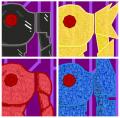
Alrighty, here's a quick mock up of Omicronmon Type Sigma's different states o 3o

The basis of Omicronmon's abilities lay in his "Data Flow" - a code structure that runs through his body and increases certain characteristics.

At top left is his base/inactive form. Top right is the offensive Pattern Yellow, bottom left is the speedy Pattern Red, and bottom right is the defensive Pattern Blue.

I'll end up doing a full body shot (prolly of Pattern Yellow again) at an angle to finalize his design and better show the depth of his head/chest.
YoshinoSuki @ Saturday, June 9th 2012, 8:13 PM
avatar
o 3o Ooooo! Shiny! Nice colors. 8D
Sketch Meister @ Saturday, June 9th 2012, 9:36 PM
avatar
O_o Damn dude, I am loving this!

So when do we get the motorcycle form?
Crescent @ Saturday, June 9th 2012, 10:16 PM
avatar
Maybe I'll do that next. Omicronmon's "core unit" (his chest + eye) is the same for all three evo paths, so that would still give me a chance to show its depth and improve upon its design without doing Type Sigma again right away o 3o


<<PREV · [1][4] [5] [6] [7] [8] [9] [10] [11] [12] · NEXT>>