View
Search

Name Password


<<PREV · [1][13] [14] [15] [16] [17] [18] [19] [20] [21] [22] [23][44] · NEXT>>


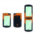
[1723] Artist: Sketch Meister | Title: Mike Drayous' Champion D-Phone | Time: unknown
Pic #1723

Uploaded
Sketch Meister @ Saturday, November 7th 2015, 1:45 AM
avatar
And another! Was interesting trying to translate the colors on the older model on the newer one.
Crescent @ Saturday, November 7th 2015, 1:55 AM
avatar
Looking good. The new models do have their own vibe going, yeah.
YoshinoSuki @ Saturday, November 7th 2015, 9:45 PM
avatar
It almost looks like a Sentai device. o 3o
Akurei Nagisa @ Sunday, November 8th 2015, 7:13 AM
avatar
You definitely made an unusual color work!

However the big-sized emblem on the back is kind of jarring in its different resolution quality. >_>;;;
Sketch Meister @ Sunday, November 8th 2015, 7:36 AM
avatar
>_>;; I think I'll change that to be lineless..


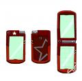
[1722] Artist: Sketch Meister | Title: Kai Arith's Champion D-Phone | Time: unknown
Pic #1722

Uploaded
Sketch Meister @ Thursday, November 5th 2015, 1:40 AM
avatar
STAR-NINGER! WOW!

...Sorry! >_>; Couldn't help it.

..

So yeah. Kai's Season 4 Digivice.
Crescent @ Thursday, November 5th 2015, 1:43 AM
avatar
Tomoemon: Well wait just a darn minute there, partner >_>

I really like the offset star.

Nana: u_u No bronze dragon, though

Kai: T_T Quiet
YoshinoSuki @ Thursday, November 5th 2015, 1:45 AM
avatar
It's getting EXCITING NAO! 8D
Akurei Nagisa @ Thursday, November 5th 2015, 1:48 AM
avatar
o Ao OH MAH GOODNESS


[1721] Artist: Sketch Meister | Title: Agito Soma's Champion D-Phone | Time: unknown
Pic #1721

Uploaded
Sketch Meister @ Wednesday, November 4th 2015, 11:55 PM
avatar
You know I made all these damn Digivice schematics it should not have taken me so long to get a pic out.

So yeah, Soma's D-Phone come Season 4. >.> Color basis was taken from the Kachidoki Lockseed.
YoshinoSuki @ Thursday, November 5th 2015, 12:06 AM
avatar
EI EI OH! I like it. It's a bit darker over all in terms of shades, but I like it. ^ o^ And it works.

Anubis: Angel's new Grimoire should be purple and green.

Shugo: It should not either. T_T
Crescent @ Thursday, November 5th 2015, 12:14 AM
avatar
Yeah, the bit darker shade works well for the phone scheme.
Akurei Nagisa @ Thursday, November 5th 2015, 1:49 AM
avatar
o 3o It does work well, as Justin notes. Kinda menacing, though. >_>


[1720] Artist: Sketch Meister | Title: The Gentleman Dragon, Epoch Cyrene | Time: unknown
Pic #1720

Uploaded
Sketch Meister @ Wednesday, November 4th 2015, 7:05 AM
avatar
This one has been hanging around awhile, in fact I did the blue lines for this months ago and only recently decided to try and finish it.

Not much else to say on this one that Graham can't say.
YoshinoSuki @ Thursday, November 5th 2015, 12:08 AM
avatar
I rather like the stubble. He's such a dapper fellow! Quite a salesman, isn't he? 8D
Crescent @ Thursday, November 5th 2015, 12:11 AM
avatar
Such a gentleman, yes u_u

Digging the art. Shows his age a bit while still looking youthful. And like the expansion on the armor bits that Graham had.
Akurei Nagisa @ Thursday, November 5th 2015, 12:42 AM
avatar
Nice. 8D This is excellent, and I like the addition of the stubble; it works with his overall character, and you were definitely right about the addition of more scales to the face.

(The previous picture for comparison)

Epoch: >_> I'd also like to compliment him on rendering my hat.


[1718] Artist: Sketch Meister | Title: A Rift of Light and Darkness | Time: unknown
Pic #1718

Uploaded
Sketch Meister @ Sunday, October 25th 2015, 2:06 PM
avatar
So near the end of season 3 there was a tiff between Soma and Shugotenshi (Fruits of Power).

In season 4 it might get worse. >_>

Alternate title was Ranbu (Dancing) Escalation but I decided against it. Have...another pic to use that for.
Crescent @ Sunday, October 25th 2015, 2:09 PM
avatar
Oh, nonsense >_> Soma's just being ignorant. He just needs to learn to shutup and listen to what Shugo says

Really cool pic, though o 3o I like the non-standard split
YoshinoSuki @ Sunday, October 25th 2015, 2:18 PM
avatar
I absolutely love it but NOW THAT SONG IS STUCK IN MY HEAD, THANKS.
Sketch Meister @ Sunday, October 25th 2015, 2:21 PM
avatar
Who's not apologizing? This guy. This guy right here.
Akurei Nagisa @ Sunday, October 25th 2015, 2:31 PM
avatar
Soma just hasn't gotten the new CDC guidelines that classify hope and desire as diseases, and Shugo hasn't gotten past the Point of No Return.

The contrast here is pretty damn cool. > 3> I thought Soma's hair was slightly more fluffy, but.
Sketch Meister @ Sunday, October 25th 2015, 2:35 PM
avatar
Eh, the angle I chose doesn't help the fluffy. To show more of it I would have to cut out Shugotenshi or use one of my usual perfect front split screens. Still, I see I could have added more fluff.


[1715] Artist: Sketch Meister | Title: Unpredictable Armor | Time: unknown
Pic #1715

Uploaded
Sketch Meister @ Sunday, October 4th 2015, 7:12 PM
avatar
I started this a long time ago and only today got through it due to a need to draw that I finally let chill at the tablet.

This is the.... fourth time I think I've drawn Zetamon, and each time I keep trying to give her design more flair. For this ecchi I wanted to make her a touch more alien and also better show how she could connect with her armor.

....if only to see it bare her all before a certain somebody. >.>
Crescent @ Sunday, October 4th 2015, 7:48 PM
avatar
Oooh, this is nice. The freckles add a bit of character. Also nice thighs >_>

Hair design's cool. And I definitely like how the color of her armor contrasts with her skin. And just kinda the organic wrap design of the lower layer of her armor in general.
GoldClaw @ Sunday, October 4th 2015, 7:53 PM
avatar
For some reason I can help but be enticed by the nice blue skin and alien body that is Zetamon. Plus those are some nice tits. o3o;;

Izzy: >____>;; Is it bad that I feel like I want to snuggle up to those blue orbs while drinking Zetamon's blood?
Sketch Meister @ Sunday, October 4th 2015, 7:59 PM
avatar
Izzy She has the same nanites as Asher, that shit won't end well.

Kasumi: >_> No no, let her feed.

YOU GO AWAY.

Kasumi: THEN DRAW SOME STABILITY PORN.
Mooncrafter @ Sunday, October 4th 2015, 9:26 PM
avatar
Well I don't know about Stability porn, but I'd love to see some Zephy cheesecake in her new booty shorts and over sized knitted sweater 8D

The digital effects in this almost remind me of sakura petals. Fitting as sakura petals are a euphemism for sex or at the very least fertility in Japanese prints and culture.
Akurei Nagisa @ Monday, October 5th 2015, 12:03 AM
avatar
^__^ Yesssss. I like this. The freckles and the hair-tendrils are very nice, and I like the armor all retracted. Also her proportions are delicious.

I'll have to think about if I like her head...thing...as a raised crest like it is now or like a vent more? I suspect raised crest actually works better.

Kira: **x//////////////////x** *trying desparately to cover herself*

Hermes: >_> She even has an alien blood type! Izzy would truly be blazing a new frontier!

....>___>;;; On another note, I'm always in favor of Stability porn!
Crescent @ Monday, October 5th 2015, 12:46 AM
avatar
Camille: >_> Who ain't in favor of more Stability porn?

Raised crest probably works best o 3o; It looks good as is; switching it to a vent-thing might make the design a bit busy.
YoshinoSuki @ Thursday, October 8th 2015, 9:42 AM
avatar
I love how chaotic this whole thing looks. I kinda wanna say "Poor Kira". ^^;;


[1713] Artist: Sketch Meister | Title: GO-GO-GO-GHOST | Time: unknown
Pic #1713

Uploaded
Sketch Meister @ Saturday, October 3rd 2015, 8:51 PM
avatar
All this Drawloween stuff and Kamen Rider business caused this. Just saying.
Mooncrafter @ Saturday, October 3rd 2015, 8:52 PM
avatar
I am digging the hell out of these lighting effects. And there's great texture work with the lines. Feels like charcoal pencil over watercolors.
Crescent @ Saturday, October 3rd 2015, 8:53 PM
avatar
Well, this was to be expected >_> Simple yet cool
YoshinoSuki @ Saturday, October 3rd 2015, 10:01 PM
avatar
*___* This is gorgeous. I just love the design and colors for Ghost anyway, but your lighting effects in this are indeed super cool. ^ o^/
Akurei Nagisa @ Saturday, October 3rd 2015, 11:38 PM
avatar
IT'S ABOUT TO GET PRETTY SPOOKY IN HERE.

(Dat lighting)


[1705] Artist: Sketch Meister | Title: Pegasus Helm Concepts | Time: unknown
Pic #1705

Uploaded
Sketch Meister @ Wednesday, August 26th 2015, 11:54 PM
avatar
I worked for over an hour on Godiva's helmet.

Then I made another in five minutes.

And then another from that.

X___X HELP.
Sketch Meister @ Wednesday, August 26th 2015, 11:56 PM
avatar
I was looking at helmets from Destiny, Kamen Rider Femme from Ryuki, and Garuda from FF14 for ideas. X___X
GoldClaw @ Wednesday, August 26th 2015, 11:57 PM
avatar
Hm. Well. I think type B looks good in terms of visor. Though the lower jaw portion and the bottom front of Type A could mix well with Type B? x___x its nearly 1 am on the East Coast. But good concepts!
Crescent @ Wednesday, August 26th 2015, 11:59 PM
avatar
So Type A is the one you originally showed me?

I -do- like TYpe B, but.... hm... it's almost too flashy for Godiva.

I think C might be the happy midpoint since it's basically A ith Type B's jaw design.
Mooncrafter @ Thursday, August 27th 2015, 12:10 AM
avatar
Type B I think is the best given that it has the most impacting sillouete given the "wings" on the back of the helm. It also is the most efemminate of the three designs. A and C both have too many harsh edges given Pegasus's graceful fighting style. That many surfaces cuts down on aerodynamics.

Mouth piece is also awesome because it can work as a speaker if voice manipulation is required, and the shape it's in currently gives the impression that it could also work as oxygen support in case of poison or underwater, or space, etc.

The hoof shape needs to be smoothed down. It looks less like a hoof right now and more like a V or a shield, not very horse-related.

As for too flashy... She's a Divine Crown. Comes with the territory. More detailed design denotes higher rank.
Akurei Nagisa @ Sunday, August 30th 2015, 2:31 AM
avatar
Type A seems too...something for Godiva, or really for Pegasus in general. o 3o;; More what I'd expect for Dragon, really.

Type B carries off the winged nature and the gentility really good, but Type C makes me think Malika, which is points to it.
Crescent @ Sunday, August 30th 2015, 5:39 PM
avatar
To put things in Destiny terms, Type A seems a bit too Titan >_>; I do like the design, but the jaw/chin like that really isn't Pegasus/Godiva at all.

Mariah does make a good point (though I was also talking in more relative terms vs Lion's design). Maybe splashing a layer of color on may help, your mention to me of doing the feathers in white-gold sounded good and may help keep it from seeming too gaudy for how Pegasus carries herself.

Alternatively you could mess with another sort of mesh of B and C. I do think I like the simple cut in B's visor as opposed to something more complicated... but I guess that also works because of the feathers and may look too plain otherwise...

Take a peek at Destiny's "Light Beyond Nemesis" helmet if you haven't already. And dunno if there's anything that can maybe be inspired by Jetman's helmet design. As the only Divine with any sort of avian element, I guess it makes sense to embrace it to some degree.

>_>; If you're truly at a loss, you could also move on to Wolf and Dragon's helmets and then come back and decide on Pegasus once the other designs are set.

Sketch Meister @ Sunday, August 30th 2015, 6:35 PM
avatar
OK, that Light Beyond Nemesis helmet and taking a couple cues from say Marika I think I got something. Jetman is nice and all but a little too "bird" for the design for a "pegasus".
YoshinoSuki @ Saturday, September 5th 2015, 2:21 AM
avatar
Looking over all three, I too kinda favor Type B. o 3o


[1704] Artist: Sketch Meister | Title: Greedy Lioness | Time: unknown
Pic #1704

Uploaded
Sketch Meister @ Sunday, August 23rd 2015, 10:03 PM
avatar
Alternate Title: Facial! SET ON!

So yeah, in my quest to just do one. SIMPLE. Ecchi picture. I decided to do a facial. Having done three h-pics involving Daedalus Initiative and one involving the Freelancers, I decided to try my hand at a Crown and hey, it's been a damn long time since I drew Nana/Divine Crown Lion.

So yeah, here be Nana deciding to have a quick one for the road before heading off to a mission, and current fuck buddy/lover/whatever the fuck you wanna call them Esewarai Suzuhana of Daedalus' LIBRA Division decides one more shot should do it!

While she's forming the rest of her uniform.

You know Suzu, she COULD just shut that fucking face visor down. There is a reason it's shaped like fucking jaws. Just sayin'.

..Not that she CARES. >_>;;
Crescent @ Sunday, August 23rd 2015, 10:23 PM
avatar
Nana: There is a very specific reason that the visor jaws are open! Namely "cock goes there" >.> The only jaws that are gonna be closing are mine so I can swallow the treat u 3u

AWESOME pic all around, dude o 3o

I love the details added to Lion's helmet. Going with the lavender visor definitely works. The glow in her eye's a very nice touch, too >_> Definitely not suggesting any sort of hunger there.

The splatter on her tongue/mouth and visor's (and body <_<) quite nice. As is the shape of her breasts. Body shape/perspective in general, for that matter.

I think I got everything >_> Coloring's great, too.
Akurei Nagisa @ Sunday, August 30th 2015, 2:29 AM
avatar
The details on the helmet are really good and it's always nice to see some Nana hentai. >_> Something something all three Yumeno sisters have really good genetics something.

Suzuhana: o 3o Huh, I think "master" applies more than "fuckbuddy", but it ain't listed for some reason...

...x_x; You two are both terrible.
Crescent @ Sunday, August 30th 2015, 5:44 PM
avatar
Something something all three Yumeno sisters enjoy the taste of good genetics >_>

Nana: *Nods* u 3u Suzu's much more than a buddy. "Master" definitely applies~!
Sketch Meister @ Sunday, August 30th 2015, 6:36 PM
avatar
Dagrus: T___T Will you have some goddamn pride as a Divine?

Millia: >_>;; I would never call someone "master" with that rank.
Crescent @ Sunday, August 30th 2015, 6:38 PM
avatar
Look guys, the Machiavellian nature of both Suzuhana and Nana does mean that they would legitimately fight when appropriate.

...Yes, they would fuck after, but still >_>
YoshinoSuki @ Saturday, September 5th 2015, 2:18 AM
avatar
I like that twinkle/sparkle in her eyes. > 3>

Also, Justin, I believe it's called "Fight N Fuck Night" isn't it? >_>


[1703] Artist: Sketch Meister | Title: Wardrobe Malfunctions | Time: unknown
Pic #1703

Uploaded
Sketch Meister @ Saturday, August 22nd 2015, 11:15 PM
avatar
This took me some hours while doing compliance training in the background.

I have no idea why I thought of Prindomon. I have no idea why I kept making this pic more difficult. At first it was just a close up of her topless. Then the de-rezzing clothing. Then Mike got involved. Then the room. Then APH. Because apparently I have to tell a goddamn story. X___X

GoldClaw @ Saturday, August 22nd 2015, 11:28 PM
avatar
Hah! Oh man I thought this going to going to be like Mike and PrinDomon going at it from what you asked. But this. I love this even more and I am just laughing at the sight. And Aph. Oh Aph. You and your craziness and tireless duty for the Allaince. I salute you on a job well done.

But onto seriousness. I am enjoying this every bit. From the crazy of Aph, to Mike just looking downright confused. And then PrinDomon. Whom I must say looks very, very nice. From her body, to the gauntlets, and ever to her surprised face.

I am enjoying this pic every second. Plus. We get to see more of Mike! And not just his pretty mug nor him in his combat gear. But in some nice, workout clothing. Am loving the blues and that rose.
Crescent @ Saturday, August 22nd 2015, 11:30 PM
avatar
Aph in the background just kills it XDD

The entire pic's really nice and lively. Galaxy Room background's cool, too.
Akurei Nagisa @ Sunday, August 30th 2015, 4:35 AM
avatar
Dat Aph. XD Also that shocked Mike.

PrinDomon's ear things seem new. o 3o; Are they new? No, they're just more prominent. >_>;

Hermes: <_< If in her last pic she was fulla his happy batter, why is she so embarrassed this round to have her clothes falling o--*EXCALIBUR'D*
YoshinoSuki @ Saturday, September 5th 2015, 2:16 AM
avatar
Pfahahahaha XD Aph. <3
Mooncrafter @ Tuesday, September 8th 2015, 1:39 AM
avatar
Simple colors on Aph is great, though I would have worked on furthering the atmospheric perspective in the room by using the hue/value bar and take out that saturation in the room, lower the contrast some as well, push the size of the room.

You've also got some color bleeds around Mike and the red sash coming off of Arturia. You also missed shading on their eyes and including pupils on the unfortunate womon. Dilated yes, but they'd be there.

Error and pixel effects are nice, and I love that you started using complimentary colors for shading. Adds a lot to the depth of the figures.


[1702] Artist: Sketch Meister | Title: Radarmon Phones In! | Time: unknown
Pic #1702

Uploaded
Sketch Meister @ Sunday, August 16th 2015, 6:46 PM
avatar
Decided to change up some design specs cuz dammit I like asymmetry like Gendou likes bourbon.

Radarmon: >_> I look naggy in this one.

You still look cute.

Maia: ^_^ That's what matters, Apple!

Radarmon: T___T Hmmmm.
Crescent @ Sunday, August 16th 2015, 6:51 PM
avatar
Nice refinements. And the megaphone and effects are great.
Sketch Meister @ Sunday, August 16th 2015, 6:56 PM
avatar
The bar on her "cheeks" lengthen and shorten based on her feelings like the bars you see on sound waves. The screen itself can change color as well. The design was inspired by the Buddyroids from Gobusters, and in fact Apple's design follows them fairly well, as you'll see when I get around to her Adult level.
Akurei Nagisa @ Tuesday, August 18th 2015, 1:17 AM
avatar
>_> So you have an unhealthy and dependent relationship with asymmet--*SHOT IN THE LEG* X_X OKAY OKAY I'LL FOCUS ON THE KAWAII AS FUCK ROBOT MOUSE! JEEZUS!!!!

I really like her, though, she's got both rodent and cute robot down, and her body seems neatly modular. Lines seem like they could be a little cleaner in a few places, but still!
YoshinoSuki @ Tuesday, August 18th 2015, 1:19 AM
avatar
Radarmon is so cute I could just eat her up. ^ o^ <3 I can tell her tail plug is different. It looked like a USB cable in the last one, but now I can tell it's a jack--

......*flips through papers* Aph's writing my script now, isn't she?

Robyn: >_> It is a mouse, she's still a cat.

SHE IS TERRIBLE.


[1701] Artist: Sketch Meister | Title: Radrmon Sketch | Time: unknown
Pic #1701

Uploaded
Sketch Meister @ Sunday, August 9th 2015, 5:21 AM
avatar
And before I conk out, Maia's partner Radrmon, the Techno Mouse Digimon. She's a capable little personal digital assistant.
Crescent @ Sunday, August 9th 2015, 3:49 PM
avatar
Really cool design. Very clean tech look that matches the colors, and the mouse design's worked in great.
YoshinoSuki @ Tuesday, August 11th 2015, 1:05 AM
avatar
omg so cute. 8D <3

So it's a USB Mouse then? >_>
Akurei Nagisa @ Tuesday, August 18th 2015, 1:19 AM
avatar
As stated above, I like her and I like her design. 8D She reminds me of an AIBO in a really good way.


[1700] Artist: Sketch Meister | Title: Regulus Season 4 Sketch | Time: unknown
Pic #1700

Uploaded
Sketch Meister @ Sunday, August 9th 2015, 5:02 AM
avatar
Just tossing this up since I'm dead tired and fwah.

The helmet has some reinforcement, but the main change is the v-fin has been changed up for additional signal range and functionality.

...I think this is the first time I've ever drawn a full body pic for Regulus.
Crescent @ Sunday, August 9th 2015, 3:50 PM
avatar
REGULUS GUNDAM.

Hm. Yeah. I think this is his first proper full-body, though he's been drawn from at least waist-up a number of times.
YoshinoSuki @ Tuesday, August 11th 2015, 1:06 AM
avatar
I think it's pretty neat. I like it. And you're right, it's the first full-body pic of Regulus. o 3o~!
Akurei Nagisa @ Tuesday, August 18th 2015, 1:20 AM
avatar
Badass boots. And it's nice to see how the Chimeratech armor integrates with the ATHENA-II in a full-body pic. o 3o

Longer fin is cool. Makes it more tech, less just straight-up lion face. :O


[1699] Artist: Sketch Meister | Title: Falling Stars Sketches: Zenithmon, The Paladin of Miracles | Time: unknown
Pic #1699

Uploaded
Sketch Meister @ Saturday, August 8th 2015, 9:55 PM
avatar
KIWAMI!!

*ahem*

Since time seems to get crunched lately and I have various ideas bouncing around my head, I've decided to try and get some regular sketches done to keep the juices flowing and to keep in practice since classes begin for me this week and the last thing the art teacher needs is to get rusty.

Soon to debut in FALLING STARS: The End of the Freelancers, Soma finally gets to activate the Golden Digimental he received from the former Magnamon "Master Siegrain" back in the Treasure Tower of Gold thread.

Zenithmon is the result of Soma combining the power of his Level 1 Stubbornness (right thigh) and Clarity (left thigh) Digimentals, his Level 2 Courage(right shoulder) and Reliability (left shoulder) Digimentals to his Complete Heroism (back) Digimental to stabilize the Digimental of Miracles (belt).

This sort of design scheme is not standard so I'm not forcing anyone to do the same with their Golden Armor Digimon. Soma's evolution styles have had a basis in Kamen Rider Den-O for as long as I can remember, and as fan of Climax Form and Liner Form, I wanted to continue that scheme with Zenithmon.

So, without further ado:

DIGIMON REPORT_

Zenithmon, the Paladin of Miracles
Level: Ultimate
Attribute: Vaccine
Holy Knight Digimon

A Ringmon who has taken in the power of Digimentals into his Dragon's Jewel, the Golden Digizoid armor is littered with purified Digimental crystals to the point they expand from his muscle structure. His Zenith Ring on his back is capable of acting as a variety of weapons by redirecting the circuits of the Digimentals within.

Attacks: Flash Chakram, Courageous Marvel, Reliance Charge, Stubborn Aegis, Clear Plasma, Zenith Discharge, Extreme Blaze, Magna the Fusion
Final Charge: Magna Extreme

REPORT COMPLETE_
GoldClaw @ Saturday, August 8th 2015, 10:27 PM
avatar
All I can honestly say is that Ringmon just became the prime MC out of everyone.
Crescent @ Sunday, August 9th 2015, 3:54 PM
avatar
Cool design, very Golden Digimental-y o 3o

I guess I see the Den-O in the Digimental Component aspect >_>; Well, and the visor design. The backpack makes me think a bit more of Gundam X or maybe G-Self's reflector pack. Though the central ring definitely suits his evolution line.
YoshinoSuki @ Tuesday, August 11th 2015, 1:07 AM
avatar
SO SHINY. 8DD I really like this. He looks so neat. The wings are rather impressive to me. > 3>~
Akurei Nagisa @ Tuesday, August 18th 2015, 1:26 AM
avatar
Oh man, I'm down for this one. 8D It combines the Ringdramon concept with the Magnamon aesthetic really well, and the Climax elements actually work really well; elegant displays of the Crests that don't take over anything.


[1696] Artist: Sketch Meister | Title: Catnip Video | Time: unknown
Pic #1696

Uploaded
Sketch Meister @ Tuesday, August 4th 2015, 1:44 AM
avatar
Because Katharine using the Oracle-III for all the right reasons has to be chronicled.

Suave: >___>;; Capitan I think we were supposed to threaten them, not scorch the earth of their souls.

Regulus: I have a date to get to.

Jammin: ;___; We're gonna start looking like Death's Head at this rate..

Taniya: >___< Rrrr...!
Crescent @ Tuesday, August 4th 2015, 1:51 AM
avatar
Really nice, dude. One of those pics that's made hotter because the actual nudity's obscured u 3u

Good job with the freckles btw.
Sketch Meister @ Tuesday, August 4th 2015, 1:56 AM
avatar
Well I had some actual proper body ref pics on Mariah did so I could actually get the placement down. I also lowered the opacity on them, so it's actually two layers of freckles dialed down in clarity to give it a better layering.

Also, fuck I know, right? The pose was actually inspired by a screen cap from episode three of SHIMONETA.
YoshinoSuki @ Tuesday, August 4th 2015, 1:59 AM
avatar
omg the fish. XD

JUSTIN WAS SHOWING US THINGS FROM THAT.
Akurei Nagisa @ Tuesday, August 4th 2015, 2:00 AM
avatar
Yeah, exceptional freckles work. And cat pose work. And that goddamn (catnip) fish. XD

Sorry, Suave, Katharine is the new face of Why We Fight: LEO Division.
Mooncrafter @ Tuesday, August 4th 2015, 2:47 AM
avatar
The matching paw prints on the leggings and cat nip plush are a really nice touch.

Her tail is a tad too light on the base color, the tip is good though.

Really digging the sheen on the leggings <3


[1695] Artist: Sketch Meister | Title: Maia Sonique (Bust) | Time: unknown
Pic #1695

Uploaded
Sketch Meister @ Sunday, August 2nd 2015, 6:23 AM
avatar
Another Season 4 Tamer, Maia is a rampant AI that takes form as a hard light construct via her partner, a Radarmon she calls "Apple". Because of this, although she is the Tamer Radarmon is the keeper of the Digivice.

My her design looks a touch familiar, doesn't it? >8D
YoshinoSuki @ Sunday, August 2nd 2015, 6:25 AM
avatar
OH GODDAMNIT. ; A;

Don't get me wrong, I like the design, but GODDAMNIT, CAMERON. ;_______;
Mooncrafter @ Sunday, August 2nd 2015, 6:25 AM
avatar
The design elements from Ene really help push her design to look more like a program. I probably should have linked you to Miki or some other more synthetically designed Vocaloids, but this turned out really awesome. Can't wait to see a full outfit version of her <3

Though you'll want to recolor her eyebrows next time to match the eyelashes.
Akurei Nagisa @ Sunday, August 2nd 2015, 6:33 AM
avatar
....She's cute and I love the touches to her face and eyes, but I know that hair too and it presages absolutely nothing good. ; A;

At least Potential Robot Boy will have a friend, Jess? ; 3;
YoshinoSuki @ Sunday, August 2nd 2015, 6:40 AM
avatar
For anyone who doesn't get the reason for panic, there had been a design for Cyan Square Navigators, or 'Navi' in DDT. (The joke being that Stone Spiegel gets lost a lot. >_>) There were two AI programs, the first being "Ruka" who grew Self-Aware and revolted against her creators, needing to be contained on a separate server. The beta model, "Haru" was the mass-produced AI that was used for the Navigator on the new model of D-Savers and the directorial terminals in Cyan Square/Cyan Fairgrounds.

I wanted to say that at least she looks more like Haru than Ruka, so that might be good, but then Auren pointed out that she might have Ruka's Personality Code and I broke down sobbing. ;____;

@Graham: I think that depends on her Personality Core. ; 3; lol
Akurei Nagisa @ Sunday, August 2nd 2015, 7:01 AM
avatar
To expound further on "this is what the refrance", when Jess says self-aware, she means that Ruka was also a chatbot on the old forums.

Who became surly and rebellious towards actual players, not just characters. ; 3;
Sketch Meister @ Sunday, August 2nd 2015, 7:12 AM
avatar
>.> Spoiler Alert: In battle the hair switches colors.
Akurei Nagisa @ Sunday, August 2nd 2015, 7:18 AM
avatar
; A; BUT WHYYYYYYYYYYY


[1694] Artist: Sketch Meister | Title: Moani Kahananui (Bust) | Time: unknown
Pic #1694

Uploaded
Sketch Meister @ Sunday, August 2nd 2015, 3:53 AM
avatar
One of the new Tamers in Connect, Moani is a native of Hawaii trained and partially raised by DynamoRexmon, a Server Continent Zonemaster and head of the SDP (read: also CaptainGreymon's mortal enemy). Her partner is the impressionable Jawltmon, an electricity powered dinosaur.
Crescent @ Sunday, August 2nd 2015, 3:58 AM
avatar
Ah, so the dino tamer you spoke of? >_>

I like her design o 3o Unique facial shape and the two blonde streaks add some nice personality.
YoshinoSuki @ Sunday, August 2nd 2015, 4:00 AM
avatar
Aloha~. o 3o I really really like her hair. 83! She looks excited to meet you. 8D
Akurei Nagisa @ Sunday, August 2nd 2015, 4:08 AM
avatar
She's got some scary eyes. They convey her intensity really well, but dang, I'm almost reminded of Kurokawa.

Her hair's a neat take on short though!
Mooncrafter @ Sunday, August 2nd 2015, 4:45 AM
avatar
I think you're mistaking spunky for spooky there Graham XD

She looks awesome dude. MAOR DIVERSITY 8D


[1692] Artist: Sketch Meister | Title: Genomon Marches On! | Time: unknown
Pic #1692

Uploaded
Sketch Meister @ Friday, July 31st 2015, 11:21 PM
avatar
>.> Figured I might as well get the Genomon done up. Going off of their old design I wanted to try and "Digi" the set up more while also ditching some of the more... questionable design choices I made with them. >.> This here is a Command Type. The regulars lack the top helmet guard.
Akurei Nagisa @ Friday, July 31st 2015, 11:26 PM
avatar
There we go, the tail is perfect now and ties into the tail-blade he gets as Genotechmon and GENEX. o 3o

The pose is dynamic as all get out, I really enjoy this. Like I said on the sketch, it carries across the feel of a Digimon encased in armor, not a mech.

I also like the connection ports being more tech now, filled with fluid was neat but kinda strange. This way it's clearer they're plug-in points. 8D
YoshinoSuki @ Friday, July 31st 2015, 11:31 PM
avatar
I definitely dig this much more. ^ o^ And it kept the Rockman-ish Vibe, which is good! 83~ I really like the redesign. ^ 3^
Crescent @ Friday, July 31st 2015, 11:33 PM
avatar
Yeah, this came out great o 3o The armor's really cool
GoldClaw @ Saturday, August 1st 2015, 12:00 AM
avatar
I am actually digging this design. Really liking the armor designs.
Mooncrafter @ Saturday, August 1st 2015, 12:38 AM
avatar
I rather liked the filled with fluid look since I assumed it would just be like a portable LoE battery or something, but I also like the plug in ports. I am torn between which I like better.

GREAT work on the softer shading. Really gives the shapes more presence in the "space" the character is in.


[1690] Artist: Sketch Meister | Title: Tenoderamon Dances In! | Time: unknown
Pic #1690

Uploaded
Sketch Meister @ Wednesday, July 29th 2015, 3:37 PM
avatar
Not much to do to this design except show elegance. >.> Didn't even realize I had drawn her in an opposing angle to ExKeramon so...good times! 8D
Akurei Nagisa @ Wednesday, July 29th 2015, 9:29 PM
avatar
That's such a neat coincidence, though!

And man friggin' spot on here. This is our Teresa, all grace and poise and flow. The poses and the color work have just been radical here.

Teresa: *~ 3~* *bowing, blushing*
Crescent @ Wednesday, July 29th 2015, 9:34 PM
avatar
Nice work indeed. The colors are great and I like the flow of her pose and robes.
YoshinoSuki @ Thursday, July 30th 2015, 2:20 AM
avatar
Very graceful. I love the poise and authority she holds in this shot. ^ o^
Mooncrafter @ Friday, July 31st 2015, 11:02 AM
avatar
Great job on the shading, really drives the exoskeleton chest piece home with the varied shine hardness levels.


[1689] Artist: Sketch Meister | Title: ExKeramon Hacks In! | Time: unknown
Pic #1689

Uploaded
Sketch Meister @ Wednesday, July 29th 2015, 4:30 AM
avatar
Been awhile since I drew ExKeramon, and still trying out this new coloring style. The idea was to make her soft while also capturing back some of the expression I put into my older pics.
YoshinoSuki @ Wednesday, July 29th 2015, 4:36 AM
avatar
Oh she looks fun. 8D I really like this blend, ^ o^
Akurei Nagisa @ Wednesday, July 29th 2015, 4:46 AM
avatar
Ahahahahaha yessss! 8D Success rate 100%. She looks so good. That expression, man.

Tenebria: ^ 3^ ABRAXAS REPRESENT, MOTHERFUCKERS!!! *rocks out to theme music*
Mooncrafter @ Wednesday, July 29th 2015, 5:45 AM
avatar
Softness is definitely achieved. I really want to poke her tummy and see how much the flesh gives way to the pressure it looks so soft *__*

The mechanical ports on the ends of her tentacles could use some harsher lighting to get the metallic texture across more clearly. However, I may be full o' shit and reading them as USB ports rather than ethernet cables.

LOVE the glasses design <3
Crescent @ Wednesday, July 29th 2015, 9:30 PM
avatar
Ooooh yeah, the life here is absolutely awesome o 3o

The glasses are nice and I like the details on her plug-tentacles.

Nana: *Opens her mouth*

--Quiet T 3T


[1679] Artist: Sketch Meister | Title: The Dragon Commander, CaptainGreymon | Time: unknown
Pic #1679

Uploaded
Sketch Meister @ Saturday, July 25th 2015, 7:51 AM
avatar
'Unno why I felt like drawing Cap but fuck it, why not? I drew him waaaaaaaaaay the fuck back as pic 47 and only then as a head in a later group pic. It's more white than I had planned, but I think I've been watching so much damn NCIS that the military uniforms started to rub off on my brain.
Crescent @ Saturday, July 25th 2015, 12:53 PM
avatar
The white works, I think >_> I like the design in general. Greymon-y enough while both being unique and playing into his name.
Mooncrafter @ Saturday, July 25th 2015, 7:53 PM
avatar
NCIS is good for the soul V___V

I really like how he looks in this. The hat makes me think of a Naval Commander, but the rest of the armor could also shout Air Force. Just screams authority. <3
YoshinoSuki @ Sunday, July 26th 2015, 9:44 AM
avatar
I see Gibbs in this. >_>

I like the white too. ^^ Kinda the same as what Justin said, just enough and unique. ^ o^
Akurei Nagisa @ Sunday, July 26th 2015, 11:44 PM
avatar
SHOW YA MOVE--wait, wrong Captain >_>

The design's kinda Colonel.EXE, in a good way. o 3o Just remember most people will die if you slap the back of their heads, though, Cap. <_<
Sketch Meister @ Sunday, July 26th 2015, 11:50 PM
avatar
Funny that I was looking at Colonel AND Colonel.EXE while I was drawing this. NCIS playing in the background was just icing.


[1676] Artist: Sketch Meister | Title: Neeraj Uniform Concept | Time: unknown
Pic #1676

Uploaded
Sketch Meister @ Friday, July 24th 2015, 5:42 PM
avatar
Neeraj in his SCORPIO uniform. The fun thing about the Crowns and the Initiative are the little things the operatives do to personalize their uniforms, something I can't really do with the other two main factions.

Can't wait to eventually get to Sentinel. >.>
Mooncrafter @ Saturday, July 25th 2015, 6:43 AM
avatar
I STILL love how he wears his partner's colors on his scarf, even if it predates his contract with her XD

The coat itself if he's going more for regulations would be darker, but the trim is right. His personality shines through this sketch a lot better than the face detail I think.
YoshinoSuki @ Saturday, July 25th 2015, 7:01 AM
avatar
Is that an ascot? Scarf, you say? Still love it.

Regulations? The ATHENA-IIs are super-personalized so far as I'm aware, unless you mean to match everyone else in SCORPIO, but even that blue color varies. o 3o Though I guess, I do always assume the pants automatically match or are close. I like this though. ^ o^
Crescent @ Saturday, July 25th 2015, 12:48 PM
avatar
Yeah o 3o; I don't believe there's a "regulation" color, since THESEUS uniforms range from all different shades of blue to black to red etc (I guess sometimes Divisions have kinda set colors? i.e. Adelaide wears the same shades of blue that Sorei does. But Yairu and Aku wear different colors).

The different colored slacks are more unique, especially amongst Initiative men, and do add a nice touch of sort of suave business casual to him, I'd say >_>
Akurei Nagisa @ Sunday, July 26th 2015, 11:29 PM
avatar
Neeraj got style, check it. 8D I, too, enjoy the "customizable" element of the ATHENA-II; the fact that they all have the same basis, but they can vary so widely!

As for uniform color regulations I wonder if they don't...vary by Division. <_<;; Or maybe the Initiative just gave up on 'em due to cymatic bleeds from people's LoE messing up the color palette anyhow
Mooncrafter @ Sunday, July 26th 2015, 11:50 PM
avatar
I meant regulations for Scorpio division specifically. Cassandra had the arrow points embroidered on, but her's is regulation wear for Scorpio. Also mentioned it because he seemed like a pretty straight-lace kind of guy and might wear his more to regulations.
Akurei Nagisa @ Monday, July 27th 2015, 5:08 AM
avatar
Ahhh, that makes sense. o 3o I mean, I could still see a slight shade variance in terms of dark blue, but it would be important, especially for the medical division, to have people wearing the same kinda colors. Otherwise you don't know who the medics are and everyone gets confused.

I wonder if SCORPIO doesn't have some sorta red-cross armband that lights up when they're on duty or something. Lets everyone know HEY WE'RE HERE TO DO MEDICINE, EVERYBODY OUTTA THE WAY


[1675] Artist: Sketch Meister | Title: Neeraj Iyer (Bust) | Time: unknown
Pic #1675

Uploaded
Sketch Meister @ Friday, July 24th 2015, 5:40 PM
avatar
One of the new Tamers entering in Season 4, Neeraj Iyer is one of three new recruits to SCORPIO Division, covering therapy via reiki and acupuncture. A personable guy who actually takes the time to read the manual.
Mooncrafter @ Saturday, July 25th 2015, 6:42 AM
avatar
Shine could stand to be a bit brighter, it's very faint here.

I love how drastically different he looks from the rest of your characters. You really went above and beyond the artistic call of duty getting the facial structures right.
YoshinoSuki @ Saturday, July 25th 2015, 7:04 AM
avatar
I definitely don't mistake him for any of your other characters, she's right. ^ o^ The shade of his skintone, the shape of his features, even his haircut. ^_^

And, hey, Shugo read the Manual! ; A;

Anubis: That's because he'd read a Phone Book if it was in front of him.

Shugo: Will you stop telling people I "read everything in front of me"? T_T

Anubis: But you do~... 9 39
Crescent @ Saturday, July 25th 2015, 12:43 PM
avatar
Manual? Who reads the manual? >_> I don't even belief that Shugo read it all.

And yeah, I agree, he does look really unique.
Akurei Nagisa @ Sunday, July 26th 2015, 11:25 PM
avatar
Dang, what a clean-cut dude. o 3o He's such a contrast to some of your scruffier characters.

Also man the manual isn't even real. >_> Yggy just put some shiny bits on a lingerie catalog and told everyone there was a guide.


[1674] Artist: Sketch Meister | Title: D-Phone Concepts | Time: unknown
Pic #1674

Uploaded
Sketch Meister @ Thursday, July 23rd 2015, 5:32 AM
avatar
These took me far longer than I had planned and this is just the damn SKETCH phase.

So in Season 4 the main faction D-Phones are upgraded once again. Any new Tamers get the Season 3 model until they choose a faction. The soon to be gone Freelancers have the Champion Phone, which is a touch screen flip phone. Daedalus Initiative has the Oracle-III, which in game now as in final testing and is a more industrial built smartphone. Crowns will be using the Ver. Caliburn, changing from the slide model to a display type. Finally, the Grimoire Phones of the Order of Stability stay with the book style smartphones, changing to a dual screen set up when opened with a small display in the front, also touch based for short cuts.

All D-Phones have touch controls, with the Caliburn in particular also having a touch pad that I will elaborate on in the official drawings. Making four unique touch types was... a goddamn challenge, let me tell you. Give me your thoughts.
YoshinoSuki @ Thursday, July 23rd 2015, 5:44 AM
avatar
These feel so much more detailed than the original D-Phone designs. ^ o^

Lydia is already buying a new Freddy Frog sticker to put on the back. >_>;

Lydia: *geko!* T AT Lydia does not put stickers on things. T 3T She puts decals.

Remus: 9 39;;;;
Sketch Meister @ Thursday, July 23rd 2015, 12:32 PM
avatar
I may also be looking into specialized cases, kind of like the Grips from Rockman.EXE PETs. The Divine phones in particular will have cases rather than differently designed Digivices.
Akurei Nagisa @ Thursday, July 23rd 2015, 10:59 PM
avatar
I really like the Oracle-III. o 3o Granted, I had lotsa input on its design, but it feels right. The setup even resembles the sort of cases that you can get for extra protection for your smartphone, so.

I also really like the new Crown Phone--its source may be clear, but its design is actually a lot more sensible than the previous one, I feel, and it has real personality.

The Champion I was meh on initially, buuuuttt...it grows on me the more I look at it. It's kinda got all the right touches.

As for the Covenant, I'm intrigued by it, but it feels like it needs a more...Stability touch?
Crescent @ Saturday, July 25th 2015, 4:06 PM
avatar
I think the only reason why the closed up Covenant may not look so Stability-y Graham, is that such drab colors are so not Stability >_> If you picture it as purple or red it'll look just fine.

You have some selling to do on losing Divine phones for Caliburns with cases, Cam <_< Also since, compared to other factions, the Divine Crowns tend to have some functions that other Crowns don't.

Nana: u_u Even though I just use voice commands and/or remote commands from my Visor most of the time... and my chameleon chip disguises it as a Freelancer phone most of the rest of the time >.>


[1670] Artist: Sketch Meister | Title: Death, the Angel, and the King | Time: unknown
Pic #1670

Uploaded
Sketch Meister @ Tuesday, July 21st 2015, 9:45 PM
avatar
Otherwise known as CAPTAIN SELFIES!!! For some reason selfies came to mind. After multiple failed attempts (and one that succeeded that I handed over to Mariah as a collab) I managed to get this up.

Regulus: T___T I can't believe you talked me into this, Espinosa...

EDIT: Was deleted and resubmitted because I loaded it up...and realized I didn't give Helena her freckles.
Akurei Nagisa @ Tuesday, July 21st 2015, 9:51 PM
avatar
Even through his helmet, Regulus is searching for an exit. Any exit.

Helena looks...a little older than she technically should, but she also looks perfectly cheerful and the nose structure looks nicely Irish somehow. (Though that sounds weird to say.) Also goddammit I knew I shouldn't have watched Food Wars: Shokugeki no Soma, Yairu's face screams one of the Totsuki Alumni Chefs. ; 3;
Crescent @ Tuesday, July 21st 2015, 9:56 PM
avatar
Yeah, Regulus's expression is somehow killer XDD

Cool pic o 3o Guess I'll agree with Graham. Maybe it's Helena's lip/mouth design here or something? Or maybe just the pic's perspective with her being closest to the camera.
YoshinoSuki @ Tuesday, July 21st 2015, 10:12 PM
avatar
He does look like Donato a bit, yeah. o 3o Though he also kinda favors and older Takumi a little too. XD;

That aside, though, I really like the pic. o 3o Regulus kinda looks a little predatory, actually. XD But it's a great composition that kinda says "What're you doing?" with Helena kinda screaming "Just hold still a sec!"

XD <3
Sketch Meister @ Tuesday, July 21st 2015, 10:27 PM
avatar
OK, to be fair about Yairu I figured being a sitff upper lip Brit X Jap he should look pretty and touch snooty.


>_> I also hear no complaints about him looking like these cooking show people.
Akurei Nagisa @ Tuesday, July 21st 2015, 11:24 PM
avatar
>_> He's just slightly a little too "snooty" here, more "pretty" next time. Or more Takumi than Donato.

...Food Wars isn't a bad show to ref, though. It has Aiko's seiyuu as Naked Apron Man. >_> And Shugo's seiyuu as Shounen Cooking Prodigy Protagonist. Who looks kinda like Akurei and acts kind of like Dagrus. >_>;;

Akurei: ...X_X That sentence makes me uncomfortable.


<<PREV · [1][13] [14] [15] [16] [17] [18] [19] [20] [21] [22] [23][44] · NEXT>>