View
Search

Name Password


<<PREV · [1][3] [4] [5] [6] [7] [8] [9] [10] [11] [12] · NEXT>>


[1173] Artist: Crescent | Title: Set On! Lion Visor! | Time: unknown
Pic #1173

Uploaded
Crescent @ Saturday, November 17th 2012, 6:49 PM
avatar
Soooo, while I was digging back through Cam's pics for the glimpse of Malcolm, I came across his Pegasus transformation pic and was inspired to do something similar with Nana.

>_> This one's just even earlier in the transformation process with Nana in a further state of undress XD

I ended up handicapping myself a bit on the transformation itself - it came out a bit too closely to Cam's original effort since my sketch of Nana took up the entire page and I didn't have many options for drawing other pieces ^^; And I didn't want to redo anything because I really like how Nana came out o 3o I think this is the closest I've come to properly conveying Nana's bodytype the way Cam does. If anything, maybe her hips/ass should curve out a little bit more, but maybe I just think that because I drew her at a very subtle pivot since they are drawn pretty wide/thick regardless.


[1172] Artist: Crescent | Title: Does That Seem Right To You? | Time: unknown
Pic #1172

Uploaded
Crescent @ Thursday, November 15th 2012, 9:23 PM
avatar
When I was talking with Graham last week, we realized that Malcolm's never really been drawn. He was only featured ages ago in the background of the Daedalus LIKE A BOSS pic. Well >_> And technically part of him was also featured with Junko's mouth in another pic.

So here's everybody's favorite philosiphical bounty hunter Director of MINOTAUR.

Or at least my interpretation of him pending how well it lines up with what Graham had in mind ^^; Not sure if he should look a tinge more weathered, but then again, he is only 25.
Sketch Meister @ Friday, November 16th 2012, 7:02 AM
avatar
And with this the number of black people in this game increases to SIX.

.... I feel somewhat guilty about that.

But anywho! I like! Man, you've been on a roll lately. >_>;;
Crescent @ Friday, November 16th 2012, 11:49 AM
avatar
Increase? It's not like Malcolm's new or anything XD

Hrm. Malcolm, Chuukon, Griffin, Henry, Glory, Jasmine. Huh. You sound right on the numbering, though. You can add Sophia now, so there's seven >_> And there are a couple NPCs. And I do know that a many of the tamers you have in mind are black or half-black.

But considering the amount of Japanese/part-Japanese characters... XD

And also the fact that there are other ethnicities with even less representation ^^;; Like how many hispanic chars are there? Synne/Sariel's heritage on that behalf and then Miguel coming up. One South American char. Like one-half of a character that's maybe from the Middle East? I just added who I think is our first character from the Indian subcontinent. We're currently lacking any characters from Oceania. We've never even whiffed at a Pacific Islander. And there's only a small handful of Asian characters with roots outside of Japan.

So I don't think there's too much to worry about, especially since we've been actively conscious to mix up character origins more lately >_>
Akurei Nagisa @ Monday, December 3rd 2012, 2:38 AM
avatar
I never got to note that I fucking love this rendition of ol' Mal. So stylish. *_*


[1171] Artist: Crescent | Title: Been Waiting For You | Time: unknown
Pic #1171

Uploaded
Crescent @ Tuesday, November 13th 2012, 4:47 AM
avatar
Alright, a more recent piece of backlog here. Basically a part three to the Sophia cheesecake. And I guess also a subconscious kick to Cam about a design for the other person in the pic XD

Want to try improving with more dynamic angles and perspectives, so here's one. I like how it came out, though her head is a little... not quite right ^^; Think it's slightly too long/large and a tad mishapen?

Also wish I nailed the shading just a little more. I do think it turned out well in general, but without going into detail, because a lot of her body is in a light shadow here, it changed my approach a bit. I still like how her skin came out in the first cheesecake of her lying on her stomach the most - I think it captures the... juiciness of Sophia's figure the best XD
Sketch Meister @ Wednesday, November 14th 2012, 8:32 PM
avatar
...I SAY GODDAMN.

I SAY GODDAMN USING JUST MY ORIGINAL KEYBOARD.

...GODDAMN.


[1170] Artist: Crescent | Title: Autumn Leaves Falling | Time: unknown
Pic #1170

Uploaded
Crescent @ Tuesday, November 6th 2012, 12:32 AM
avatar
And here's some quick S3 Junko art.

She's going to (finally) take a bit more initiative and become more involved >_>; Though such is both good and bad for her.

x 3x Kinda drew her glasses/eyes slightly offcenter, though.
Sketch Meister @ Friday, November 16th 2012, 7:03 AM
avatar
;_; She needs a hug. Badly.


[1169] Artist: Crescent | Title: Magical Showtime! | Time: unknown
Pic #1169

Uploaded
Crescent @ Sunday, November 4th 2012, 10:03 PM
avatar
It's been forevvvveeeeeeerrrrrr since I've drawn some of my main characters. Like, Camille? Over 2 years.

So here's S3 Camille o 3o

^^; Forgot to draw in her fishnets, so here with some slightly alternate stockings.

x_x Jeebus, I could have done better with a few things, yet this is so much better than her old art.
Sketch Meister @ Friday, November 16th 2012, 7:04 AM
avatar
Yeah, the lower body needs a shift. Given the curves it seems more like her back than her front. And watch your shoulders there.
Crescent @ Friday, November 16th 2012, 11:52 AM
avatar
Yeah x_x I think a lot of it is simply just how I drew the lines on the clothing there. Though her right leg should probably be out a little more.


[1168] Artist: Crescent | Title: Virgil's D-Phone | Time: 21m 31s
Pic #1168

PaintBBS
[View Animation]
(Public)
Crescent @ Monday, October 29th 2012, 7:42 PM
avatar
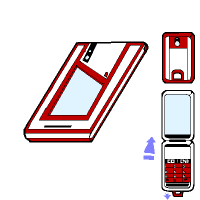
Here is Virgil's D-Phone. Any resemblance it bears to a certain other redheaded character with a thing for Agito booty is ENTIRELY coincidental >_> Seriously XD I had forgotten the color scheme of said character's phone until noticing it while going back to find the D-Phone template.

As you can see, Virgil's phone is a pretty simple design. That's because, like a brush, he sees his D-Phone as a tool - a vehicle for creating art, and not art itself.

(Original by Haru)
Sketch Meister @ Friday, November 16th 2012, 7:07 AM
avatar
LAAAAAAAAAAAME. Someone needs to art him up! >.>
Crescent @ Friday, November 16th 2012, 11:54 AM
avatar
Virgil needs no such thing >_> Virgil arts other people up.


[1167] Artist: Crescent | Title: That Look In Your Eyes | Time: unknown
Pic #1167

Uploaded
Crescent @ Monday, October 29th 2012, 2:38 PM
avatar
This is what happens when Urara lets her hair down >_> You've been warned, glasses-wearing girls of Cyan.

Urara: Shhh, no talking! You're ruining such a romantic moment * 3* We're about to kiss~
JDeschain19 @ Monday, October 29th 2012, 2:40 PM
avatar
Freya: Wh-Wh-WHAT THE HE-?! ::Kissed. Blush.::

xD Nice one, dude.
Sketch Meister @ Friday, November 16th 2012, 7:04 AM
avatar
>_>; My this little tiff is really bringing the sex craze out of people. I thought only DDT had that problem.
Crescent @ Friday, November 16th 2012, 12:07 PM
avatar
...Goddamnit, Cam XD *Moves a certain pic idea that will make you regret that comment somewhere near the top of the backlog list* >_>


[1166] Artist: Crescent | Title: Ready for Battle! Aegis Chamemon | Time: unknown
Pic #1166

Uploaded
Crescent @ Sunday, October 28th 2012, 11:22 PM
avatar
This wasn't even on my radar to draw, yet it's happened o 3o;

This is Urara with Chamemon's adult level (well, actually her Path B prolly). Whereas at the child level, Chamemon can only imbue Urara with her natural abilities (such as camouflage), Aegis Chamemon can enhance Urara's physical abilities.

Aegis Chamemon defaultly sacrifices maximum protection in favor of speed and power. By keeping a portion of her body draped from Urara like the lower half of a coat, Aegis Chamemon improves Urara's speed and agility, as well as makes it a lot easier to conjugate enough of her 'true' body together in order to attack directly.

Urara fights with the as-of-yet unnamed weapons shown over her wrists and the back of her hands - they generate digital Katar blades.


EDIT: Jason mentioned the oddity of "Aegis" while the base configuration sacrifices maximum defense ^^;; So it's possible the name will get changed - Really just wanted something implying Urara still "wears" her. Though needing to stress that may or may not be necessary depending on whether this is Chamemon's Path B or Path A (which I'm not 100% on). Either way: This is one of Chamemon's adult evolutions, which partakes the qualities described above XD
JDeschain19 @ Monday, October 29th 2012, 1:01 PM
avatar
Cool stuff. o 3o She looks neat.
Sketch Meister @ Friday, November 16th 2012, 7:05 AM
avatar
Huh. Thought this would be more Zero Suit-y. Don't get me wrong. I like it. Just a bit surprising with the skin showing.


[1164] Artist: Crescent | Title: Hunter Rushmon concepts | Time: unknown
Pic #1164

Uploaded
Crescent @ Friday, October 26th 2012, 8:07 PM
avatar
X_X; Been trying to get this guy to look right. This is the evolving concept for Adult level of Xavier's partner, Hunter Rushmon.

On the left was done first, and... just the general design cues I took from the inspiration while only mixing in a few odd other things resulted in him looking too similar.

The bottom lef is my most recent attempt, but.... still not looking right.

The green (which may change to another color - might try silver) was mixed in both to differentiate him further from his inspiration, while also hopefully making him look less Crown-like. Which is why there's more of it in the more recent version. Not too sure about his helmet... though probably will redesign his chest again, at least so there's a concentrated area for the circuit lines (the derivative Blitz Rushmon that Xavier becomes using his DE will have more circuit lines, likely similar to the bottom-right here - and that's why I don't want Hunter Rushmon having them over every piece of armor).
Sketch Meister @ Sunday, October 28th 2012, 1:27 AM
avatar
Add teeth to the face plates maybe?
Crescent @ Sunday, October 28th 2012, 3:45 AM
avatar
That's an idea. Even if it is more Quester-y XD Buut since the armor design's veering further and further away from them, shouldn't be an issue.

I think I realized the main issue with the second helmet design is the 'moustache' strip >_> That's a goner.

Though... what tool/type of brush do you use for glowing effects? Doing that with some of the gold should also help add to the high-tech armor vibe (and differentiate them from both Crown and Quester schemes without me needing to add in too many other colors ^^; )
Akurei Nagisa @ Monday, December 3rd 2012, 2:21 AM
avatar
I never managed to note it but I totally love this design, props. :O


[1163] Artist: Crescent | Title: Yay Funding! | Time: unknown
Pic #1163

Uploaded
Crescent @ Friday, October 26th 2012, 6:58 PM
avatar
It was hard to resist not doing a part three for some reason, but there's some other stuff I wanna get to, so I just doodled something really fast >_>;

Upon deeming that the expanded Crown Sensuals product line would receive additional funding following a very successful product demonstration... of course you're gonna celebrate! As pictured here.

Because with Crown Sensuals, everyone wins! The Crowns win! Satisfied consumers win! Even Daedalus wins, because there's no harm in them (even certain finger-steepling directors <_<) enjoying Crown Sensuals because it's not like they're helping the enemy when Fleur has unlimited monies to begin with! And, of course, Meifeng and Xifeng win!
Sketch Meister @ Sunday, October 28th 2012, 1:27 AM
avatar
MONEY WELL SPENT.


[1161] Artist: Crescent | Title: Funding Approved! | Time: unknown
Pic #1161

Uploaded
Crescent @ Monday, October 22nd 2012, 8:25 PM
avatar
Well, I had been debating whether to get to some more of my digimon backlog or do a Part 2 to my last pic, Cam voted, and here we are >_>

So here's Meifeng and Xifeng in the midst of a very successful product demonstration for the improved Crown Sensuals line. <_< I think it can be safely assumed that further expanding Crown Sensuals was greenlit.
Sketch Meister @ Monday, October 22nd 2012, 9:14 PM
avatar
..*keeps the press on of the fund button*

Ezio: >_> Huh. So this is where the money for the new arsenal came from.

Dagrus: ... *looks at the Boost Device line up* ...>_> Should I feel bad about using this stuff?
Crescent @ Monday, October 22nd 2012, 9:21 PM
avatar
>_> No need to feel bad about something that's enjoyed, Dag.

...If you feel guilty, help your own war effort by purchasing some Crown Sensuals products! XD
GoldClaw @ Tuesday, October 23rd 2012, 5:16 PM
avatar
Hm... this... hm... I wonder if anyone in Daedalus actually buys this stuff. >>

Mike: "I wonder if they have any coffee mugs... or any other type of line up?" >.>

<< uh huh... says the man that likes to- *glasses get shot off* right then. shutting up.
Crescent @ Tuesday, October 23rd 2012, 6:35 PM
avatar
I'll have to point you toward that picture of Yoshino Hikari with a certain Director of Daedalus where I added in the Crown logo onto everything XDD

Crown Sensuals is truly the one thing that brings all the factions together! >_>

...And yes, there are Crown Coffee Mugs and the like, they're just not advertised much as research shows that Crown Sensuals sell better <_<;


[1159] Artist: Crescent | Title: Double Your Pleasure | Time: unknown
Pic #1159

Uploaded
Crescent @ Sunday, October 21st 2012, 5:21 AM
avatar
Alright, so I was going back through the Sketcher looking for something, and stumbled upon a set of Cam's old pics (#541-543) and well, I still had two other support Crowns to draw, and we're adding to the Crowns in every other way, so of course they'll be new/updated Crown Sensuals products! >_>

Here are Meifeng and Xifeng, a pair of twins who work in the Crown HQ Ops Center. They are notoriously hard to tell apart, as nobody currently has yet to pick up on any tells between the two, and they have a tendency to change up how they wear their hair does or doesn't match.

Here they are modelling (For whom? I have no clue! <_< So it could become the lucky day for someone(s)! ) some brand new Crown Sensuals lingerie and Crown hairclips, along with always trusty Crown collars, cuffs (one), and armbinder (the other).

>_> Ready to be tested just behind them is a preview of the expanded Crown Sensuals line, almost every item having been improved - such as Crown Vibes with twice the battery life, more secure gags, and more durable steel!

Blame Cam because most of the stuff's of his creation XD
Sketch Meister @ Sunday, October 21st 2012, 6:14 AM
avatar
....Fund it. Fund every last SPEC of it. NOW.


[1157] Artist: Crescent | Title: Lonely Night | Time: unknown
Pic #1157

Uploaded
Crescent @ Saturday, October 20th 2012, 12:52 AM
avatar
Look how lonely the Crowns are! ;_;

Well, thankfully, that'll be changing now that the recruitment effort's seems to have proven a success XD

<_< Sophia here, on the other hand, is waiting for someone else to get themselves together.

Anyway, obviously a sequel pic to the prior. Didn't really show the pivot of her hips too well, which results in the weakest area of anatomy. x_x But I should make a habit of challenging myself more often and not being lazy half the time. Also played around with some approaches to shading to kinda figure out what looks best (I'm not particularly satisfied with how the shading overall came out here ^^; ) .

And as far as Sophia herself goes, been tweaking/experimenting with a few things. Glasses from her on forward will prolly revert more towards how I originally drew them (thinner frame with a more of a pronounced curve)though may keep the lighter green color.
Sketch Meister @ Saturday, October 20th 2012, 8:58 AM
avatar
VERY RELEVANT. YES IT IS.

Face is the only real issue here. The mouth is too low in position. Besides that your understanding of boob physics has improved from your more recent topless pics, and that's always a pain to grasp.


[1156] Artist: Crescent | Title: Per Un Pugno Di Dollari | Time: unknown
Pic #1156

Uploaded
Crescent @ Friday, October 19th 2012, 7:03 PM
avatar
This is in response to both Cam and Graham's comments about Miguel's concept >_>

We'll just say that you don't want to be the guy Miguel's squinting at whenever there's an ominous whistling tune <__<
Sketch Meister @ Friday, October 19th 2012, 7:08 PM
avatar
XD I love it


[1154] Artist: Crescent | Title: Ballad of a Well-Known Gun | Time: unknown
Pic #1154

Uploaded
Crescent @ Thursday, October 18th 2012, 9:37 PM
avatar
I was all like "I want to draw a more expressive pose" and then I didn't >_> But it's all good. Because here's some concept art for the long-fabled Spaghetti Western Conquistador.

This is Miguel Cortez, a Spanish man who had been a Crown operative in America. Sometime soon he'll be debuting as the new Divine Crown Wolf.

<_< And yes, he wears his super elegant mantle as a poncho.

I'm unsure what his personal color will be. I know Pegasus is azure, Lion is lavender, and (I assume) the new Dragon will be crimson. Wolf may remain white (though I don't want him looking too priest-y), I'm also considering green or some shade of tan/brown.

Edit: Oh hrm, forgot that Jason's gunslinger wears black and white. Yeah, definitely not gonna keep white for Miguel o 3o;;
Akurei Nagisa @ Friday, October 19th 2012, 5:57 AM
avatar
I say go with the green.

Also I love how his outfit totally doesn't harken back to the poncho of the Man With No Name. Not something it does.
Sketch Meister @ Friday, October 19th 2012, 7:04 AM
avatar
...Please say his theme song is a kick ass whistle. Pleeeease tell me.


[1153] Artist: Crescent | Title: MAYUMON SUPERIOR | Time: unknown
Pic #1153

Uploaded
Crescent @ Thursday, October 18th 2012, 7:16 PM
avatar
Meant to draw him at more of a dynamic angle than just a straight profile, but oh well XD Been wanting to get something at least representative of him out there forever now, so I'm happy with the result even though it may receive a few tweaks.

Here's the child form (Mayumon) of Welker, Ava's partner. He's the king of cyber-warefare, kthxbye Droidemon >_>
Akurei Nagisa @ Friday, October 19th 2012, 5:02 AM
avatar
Ooooohhh so this is Mayumon. Menacing despite his size, I like. >:D

Droidemon: = sMayumon =~/STUPID DOUCHEBOT/; XP=
Sketch Meister @ Friday, October 19th 2012, 7:04 AM
avatar
GENTLEMEN! PLEASE! CAN'T WE ALL JUST GET ALONG!?


[1152] Artist: Crescent | Title: So, now is the time when I...? | Time: unknown
Pic #1152

Uploaded
Crescent @ Thursday, October 18th 2012, 3:45 PM
avatar
It's Kuuhaku! o 3o

...Being Kuuhaku!

Not my best work ever overall. Had a few issues and didn't really nail dem Agito hips ^^;

x 3x Not entirely sure how Kuuhaku-y it came out, though. But that would be for Graham to answer. Should her expression itself be a bit more blank? Maybe just her mouth more flat? Or should her eyebrows not look as borderline confused?

Also would like opinions on her top's lining ^^; Wasn't sure if the lining should be on the neck or shoulders on top or if there should be on its bottom (had noticed that Cam didn't include any back on the cheesecake).

Is her hair a smidgen too long? I kinda tried combining elements from how both you and Cam had drawn it, since it's supposed to be a little messy here, but certainly not to the degree of the sex hair in your pics >_>

Also, bonus points if you realize the connotation of the background XD
Mooncrafter @ Thursday, October 18th 2012, 4:46 PM
avatar
Cassandra: .....-comes up from behind and gives Kuuhaku her oversized coat to cover up- No it is not.

XD I love her in this XD great confused expression you've got going here.
Akurei Nagisa @ Friday, October 19th 2012, 5:46 AM
avatar
Ha. XD I actually really like this. The outfit came out damn nice, including the undershirt, and actually you got her hair just the right length.

I think her top's lining is good how you did it--it looks natural this way. :3

Her face is definitely Kuuhaku in a moment of confusion or surprise, yeah. Not quite her typical flat look, but the "huh" conveyed adds a nice comedic element to the picture.

EDIT: WAIT RECOGNIZE THAT SHADE OF BLUE. Goddamnit, Virgil. XD

(Edited on October 19, 2012, 5:48 am)
Sketch Meister @ Friday, October 19th 2012, 7:05 AM
avatar
DEM THIGHS.


[1151] Artist: Crescent | Title: Crown Field Tech: Anil Mishra | Time: unknown
Pic #1151

Uploaded
Crescent @ Wednesday, October 17th 2012, 11:49 PM
avatar
Some more Crown NPC concept art here.

Depicted here is Anil, an upstanding young soldier of (India) Indian descent. Threw some of Cam's armor design back into the mix - figure it's part of the generic sort of Crown gear for those who don't get the full package that titled Crowns do.

Also got cut off a bit >_>; Yeah, needa get me a not-oversized sketchbook.
Sketch Meister @ Thursday, October 18th 2012, 7:18 AM
avatar
Hmmmm.. a bit flashy in this one. I would cut back on the gold usage here. I like his facial design though. We need more Indians.
Crescent @ Thursday, October 18th 2012, 1:21 PM
avatar
Hrm yeah, can knock the belts back to steel and see how that looks. And could maybe try switching the shoulders from gold to his personal color or something.

<_<; If I didn't run out of room, I would have drawn his feet, and the steel there would probably also have helped to counterbalance the gold.
Akurei Nagisa @ Friday, October 19th 2012, 5:52 AM
avatar
Oooh, nice. o 3o Definitely giving the Crown Visor uniform a separate direction from Daedalus' Athena.

I'd actually argue keep the gold, it's a good signature color and avoids confusion between Crown and Initiative minions.
Sketch Meister @ Friday, October 19th 2012, 7:06 AM
avatar
Hmmm..touche.. and the Crowns are supposed to look more regal rather than militaristic. Knights Vs Soldiers and all that.


[1150] Artist: Crescent | Title: Join The Crowns! | Time: unknown
Pic #1150

Uploaded
Crescent @ Wednesday, October 17th 2012, 4:05 AM
avatar
Join the Crowns!

...Because this is just an example of their typical personnel! >_>;


But like, seriously, consider the Crowns if you have any character ideas! o 3o;; Apart from Fleur, the Crowns are just Cam and I nowadays ;_;

Anyway, here's Sophia relaxing in a type of pose I've never done before. Think it came out well aside from a minor perspective hiccup or two. The shading isn't quite as seemless as I'd like, I should probably find the right tool/brush to make it fade more naturally in places.
Sketch Meister @ Wednesday, October 17th 2012, 8:11 PM
avatar
*___* Bully old bean, pip pip!

....OK, so apparently I am British when horny. Funny that.


[1149] Artist: Crescent | Title: Crown R&D: Dr. Irena Paluch | Time: unknown
Pic #1149

Uploaded
Crescent @ Tuesday, October 16th 2012, 7:27 PM
avatar
Okay, so, I filled up the sketchbook I had been using and my other one has more paper than I have scanner >_> So I need to mind that ^^;

But anyway, this is just another quick concept. Irena's a Crown scientist who works for Jetten. She's a certifiable genius... mostly in theoretical fields and not so much relative <_<; Her concepts are either brilliant or need to have small little Giant Fundamental Flaws pointed out.

...Though these "flaws" are probably things that Hansel and Gretel would consider "minor details" in terms of human use XD

Anyway, pretty sloppy overall. I just kinda painted on the snaps on the top since I should have figured to draw them (though Irena may get a different top altogether). Her glasses have a small frame drawn here, but probably gonna go with frameless lenses for her.
Sketch Meister @ Tuesday, October 16th 2012, 10:33 PM
avatar
I.. actually really like her design. Simple but straight to the point. Not to mention it makes up a nice tie in to Ezio who uses the long coat design. My only real gripe is the lack of Crown emblem on the breast.
Crescent @ Wednesday, October 17th 2012, 12:28 AM
avatar
Ooooh yeah XD I have no clue how I forgot to slap on a Crown logo x_x

>_> Since the Crowns are all about branding and all


[1148] Artist: Crescent | Title: Crown Support Staff: Sophia Oiseau | Time: unknown
Pic #1148

Uploaded
Crescent @ Sunday, October 14th 2012, 11:17 PM
avatar
Cam had asked me to help create a few Crown techs/sideline guys.

Here's one of them (this one repurposed from a minor tamer of mine on DDT). Sophia is one of three new Crown Ops NPCs who coordinate things from Crown HQ.

Also featured is a redesign for the Crown uniform. It's based largely on the one Cam did ages ago, featuring gold trim instead of steel (since the Crowns are all about the swag > 3> ) and some color on the chest in place of the old pocket design. It's possible they'll be some tweaks to the design depending on if Cam has any further ideas.
Sketch Meister @ Tuesday, October 16th 2012, 10:34 PM
avatar
Well... I say g'damn. I am definitely in the like with this picture. Get her emblem on, though.
Akurei Nagisa @ Friday, October 19th 2012, 5:55 AM
avatar
I like the hair and glasses! And that her uniform comes with a nice breast-highlighting stripe and regulation miniskirt. >_> Look out, Sophia, you might attract the attention of a certain costumed "hero" who likes the Crown ops techs.


[1147] Artist: Crescent | Title: Prototype: GearSpritemon | Time: unknown
Pic #1147

Uploaded
Crescent @ Thursday, October 11th 2012, 12:23 AM
avatar
Super duper quick and rough sketch of Virgil's partner, GearSpritemon.

She's a fairy o 3o With gears! Her evolutions are primarily machine-based.

<_< No other similarities between Virgil and anyone else here. Nope.
Mooncrafter @ Thursday, October 11th 2012, 3:07 PM
avatar
XDDD she's cute, but does she have hands? <_< That might be weird if she doesn't.

I also love the hearts in her eyes XD
Crescent @ Thursday, October 11th 2012, 7:03 PM
avatar
Yeah, she does, I was just too lazy to draw them >_>; I just kinda wanted to doodle a design for her and see how the gear-wings would look.
Sketch Meister @ Friday, October 19th 2012, 7:07 AM
avatar
..Suddenly I am reminded of the Cyber Elves from Megaman Zero...


[1129] Artist: Crescent | Title: Golden Lion Cub, GroLiomon! | Time: unknown
Pic #1129

Uploaded
Crescent @ Monday, August 27th 2012, 3:34 PM
avatar
I've been wanting to draw some of Nana's partner, Laguna, for awhile now @_@

So here's a shot of his child level, GroLiomon, whom I decided to draw alongside Nana after realizing that the resurfaced Nana has thus far only been drawn several times in undress and once in cosplay >_> She's here wearing one of the ~3 different Totally Just An Adventuring Freelancer outfits; most specifically, how she's dressed in the Hi-Spec Kuawagmon mission. I think she came out pretty well, though maybe I pinched her waist in a bit too much for Nana (and didn't make her hips as wide as they should be as a result).

GroLiomon's final design may change a bit, but that's pretty much him o 3o He's basically a walking Buddhist Lion statue XD
Akurei Nagisa @ Monday, August 27th 2012, 4:02 PM
avatar
Oooh o 3o I rather like, it's nice twist on the lion form!

Also I love Nana's fashion sense more and more the more I see of it. XD
Sketch Meister @ Tuesday, August 28th 2012, 11:33 PM
avatar
I like her fashion. >.>

Though I dunno, man. I think you should have had GroLiomon by himself in this one.
Crescent @ Tuesday, August 28th 2012, 11:49 PM
avatar
Part of it is I had kinda failed trying to do GroLiomon in the past x_x So I decided to draw him with Nana here to help facilitate things ^^; It also gives a good idea of his size.

I'm prolly gonna be trying solo shots of his A and B-line evolutions sometime soon.


[1119] Artist: Crescent | Title: Second Skin | Time: unknown
Pic #1119

Uploaded
Crescent @ Friday, August 24th 2012, 9:38 PM
avatar
Refining the concept here o 3o

This is a quickie featuring a better glimpse of Urara's mission/combat attire - which is actually her partner, Chamemon.

While Chamemon usually doubles as Urara's attire, she manifests more directly to fight. Pulling off like shown allows her to look around and speak, but she needs er... more of herself XD in order to do more. Half of the outfit's needed in order to properly manifest her upper body and attack, while all of the outfit is obviously required for her to manifest entirely.

Chamemon's preferred method of binding herself to Urara presents abilities based on her evolution. In her child evolution, Chamemon (being based partly on a chameleon) can provide stealth camouflage, allowing Urara to become nearly invisible for a period of time.
JDeschain19 @ Friday, August 24th 2012, 9:42 PM
avatar
Very neat. I like it. You really are getting a lot better. :>
Sketch Meister @ Friday, August 24th 2012, 11:30 PM
avatar
Huh. Maybe it is just the pose but I am reminded of Shademon from the Xros Wars comic. And yeah, dude, you are definitely improving.
Crescent @ Friday, August 24th 2012, 11:58 PM
avatar
*Looks up Shademon* >.>

The pose, I guess. Chamemon only has the two eyes XD And when she gathers enough of herself to be able to actually attack, she has a more definable form.
Akurei Nagisa @ Saturday, August 25th 2012, 1:15 AM
avatar
You definitely are! The facial details are quite nice here, and I like how you rendered Chamemon's emergence as it begins.
YoshinoSuki @ Saturday, August 25th 2012, 7:09 AM
avatar
She should really invest in pasties. At the very least.

Aph: >_> Why the hell would she do that? More money in the buff! Sheesh!


[1111] Artist: Crescent | Title: Concept: The Three Faces of Ōnishi Urara | Time: unknown
Pic #1111

Uploaded
Crescent @ Friday, August 17th 2012, 1:22 AM
avatar
Another new character! >_> And yet I probably still have less than Cam and Graham!

I felt like bringing my Soul Reflection character, Urara, over.

In DU she's gonna work for the Daedalus Initiative, as an intelligence agent somewhere under Malcolm >_> This hasn't been entirely worked out yet, but I've thus far taken the silence of Graham not being online as an "okay".

Man, this came out sloppier than I even thought o 3o Proportions around her waist are terribad. Anyway, she has long green hair that she normally wears up. And the catsuit on the left is actually her partner.
Sketch Meister @ Friday, August 17th 2012, 1:57 AM
avatar
Yeah. that skirt looks like it would break her. Nice design though, and the beauty mark on her face really adds some spice to her.
JDeschain19 @ Friday, August 17th 2012, 6:55 PM
avatar
Green hair and gold eyes. Nice. :>

Even I kinda wanna doodle her...
Akurei Nagisa @ Saturday, August 18th 2012, 1:50 AM
avatar
Oooh, I like her. :3 She'll make an excellent addition to Mal's MIBs, and that's one more actual PC Tamer to Section 3. I also dig the skirt and hose look, and her aesthetic.

Droidemon: =Hey Aniki, why haven't you been banging her instead if the violinist? * 3* Cause daaaaaaammmmmnnn OH GOD NOT THE OPTICS D8=

...please ignore Mr. Early's robot abuse. >_>;;;
Crescent @ Saturday, August 18th 2012, 3:53 AM
avatar
Yeah, Sam better watch out around Urara too >_>;

And in case I didn't make it clear, I meant her partner's literally the catsuit and not a doppleganger LD XD
Sketch Meister @ Saturday, August 18th 2012, 5:15 AM
avatar
..color me MORE interested. >___>

...>_> Suddenly have to think about Agent Aika...
YoshinoSuki @ Saturday, August 18th 2012, 4:53 PM
avatar
YOU GOT 1111. o 3o

Nice job! o 3o

On the topic of the pic, though, very nice. ^_^ I like it!

And I like the idea of her partner being clothes... I mean... so... if she has to send her partner into battle... is she wearing underwear? Because it doesn't look like she's got a bra on. ^_~
Crescent @ Saturday, August 18th 2012, 5:08 PM
avatar
Yeah, after I put it up I realized it was 1111 o 3o;;

Clothes, underwear included, get in the way between Urara and her partner, yes XD In order to fight, her partner pulls herself partly off her <_< If there's a full separation, she can digitize herself a set of clothing, but obviously that isn't instantaneous >_>;


<<PREV · [1][3] [4] [5] [6] [7] [8] [9] [10] [11] [12] · NEXT>>