View
Search

Name Password


<<PREV · [1][7] [8] [9] [10] [11] [12] [13] [14] [15] [16] [17][44] · NEXT>>


[2116] Artist: Sketch Meister | Title: Bubble Charge | Time: unknown
Pic #2116

Uploaded
Sketch Meister @ Thursday, March 22nd 2018, 9:34 PM
avatar
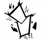
Hm. Or maybe everyone should just have their own? I dunno, I just decided to try a bubble designed one.
GoldClaw @ Thursday, March 22nd 2018, 9:36 PM
avatar
o 3o/ ULTRA BUBBLE CHRAAAAAAAAAAAAAAAAAAAAAAAAAAGE!

*AHEM* This feels very much like Haruka. Super bubbly and the colors just so warm, vibrant, and reminds me of a bubble bath.
JDeschain19 @ Thursday, March 22nd 2018, 10:17 PM
avatar
Maybe just certain chars have their own? Like how some chars customize their Gates.
Akurei Nagisa @ Saturday, March 24th 2018, 11:39 AM
avatar
Ohhhh. Hm. o 3o;;; Damn. I like splitting them up by faction tbh, but this does feel really Haruka up close. Fuck. Now I'm conflicted? Argh.
Crescent @ Thursday, March 29th 2018, 9:40 PM
avatar
ryomadunnolol.png u 3u

I guess it can be one of those things where some people have unique ones? o 3o; This is cool


[2115] Artist: Sketch Meister | Title: Daedalus Initiative Charge Cards | Time: unknown
Pic #2115

Uploaded
Sketch Meister @ Thursday, March 22nd 2018, 9:12 PM
avatar
This one's probs my favorite. I wanted a technological, all systems go look for the Initiative's charge cards.
Benjamin @ Thursday, March 22nd 2018, 9:24 PM
avatar
It does give off an Okudagram vibe, which was one of my favourite designs from Star Trek: TNG onwards.
Akurei Nagisa @ Saturday, March 24th 2018, 11:33 AM
avatar
Oh huh, it does have kind of an LCARS console look.

But yeah, this is my favorite too, this is really good. 8D Kind of provides pointers to how the Porticullis arch might look, maybe...hm...

I wonder how the text for the Final Charge announcements would go with these...
Crescent @ Thursday, March 29th 2018, 10:05 PM
avatar
Yeah, this is prolly the coolest overall design o 3o


[2114] Artist: Sketch Meister | Title: Order of Stability Charge Cards | Time: unknown
Pic #2114

Uploaded
Sketch Meister @ Thursday, March 22nd 2018, 9:12 PM
avatar
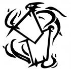
For some reason I see more a spinning motion with this one but I figured with the Order's goals the tendrils reaching out felt appropo.
Akurei Nagisa @ Saturday, March 24th 2018, 11:36 AM
avatar
2Spoopy!!!

Seriously, though, this blends the dark influences of the Order excellently, all of them. It pops, I think.
Crescent @ Thursday, March 29th 2018, 10:03 PM
avatar
Yeah, flashy and stylish o 3o


[2113] Artist: Sketch Meister | Title: Crown Charge Cards | Time: unknown
Pic #2113

Uploaded
Sketch Meister @ Thursday, March 22nd 2018, 9:11 PM
avatar
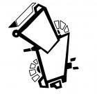
For the Crowns I wanted the image of a knight's sword. As the Digimon would go in the bottom card, it symbolizes the Digimon being the sword of the Tamer.
JDeschain19 @ Thursday, March 22nd 2018, 10:16 PM
avatar
Slick af.
Akurei Nagisa @ Saturday, March 24th 2018, 11:22 AM
avatar
I really like the central pieces here, the Crown piece for the Tamer and the sword that's also almost a flag for the Digimon. The particles surrounding are a bit plain, but the main body is strong enough it makes up for that.
Crescent @ Thursday, March 29th 2018, 9:56 PM
avatar
The Crown is very... Crowns-y >_> In a good way XD It's simple but elegant


[2112] Artist: Sketch Meister | Title: Paragon Charge Cards | Time: unknown
Pic #2112

Uploaded
Sketch Meister @ Thursday, March 22nd 2018, 9:10 PM
avatar
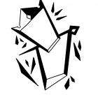
A little experiment, I suppose. An explanation: In my head I see everything on the board animated. Well I've been trying to piece together a Final Charge animation and after several...several tries the recent Paragon banner I did gave me the image of these cards like shown on the banner that shake on the charge announcement like the old pendulum devices in the Digivices. I figured that each faction would have their own and also made an extra for unaffiliated. The cards would appear with the emblem of the Tamer and have after effects like bubbles, engine revving sounds, whatever suits the Tamer.
GoldClaw @ Thursday, March 22nd 2018, 9:20 PM
avatar
o 3o/ This is a complete and fuckyeah! idea. I actually like this and I think this adds more depths to how each character is so unique when it comes to announcements, styles, ect.
Benjamin @ Thursday, March 22nd 2018, 9:52 PM
avatar
This designs really crackles and captures the youthful energy of the faction. The jagged edges and lightning bolts do scream Jace.
JDeschain19 @ Thursday, March 22nd 2018, 10:16 PM
avatar
Oh man, I dig these ideas~
Akurei Nagisa @ Saturday, March 24th 2018, 11:14 AM
avatar
I never got to play around with the old pendulum Digivices, but I keep picturing the cuts in from Persona 5 with these, just featuring Tamer and Digimon in the portraits--especially with the Going All Out banner as reference.

This definitely features Paragon's whole "boundless natural LoE" and youthful-ish feel going on.
Crescent @ Thursday, March 29th 2018, 9:51 PM
avatar
FINAL ATTACK RIDE-- I mean, FINAL CHARGE >_> Cards are always cool


[2111] Artist: Sketch Meister | Title: D-Sketcher Banner: Easy Painting with Hermes | Time: unknown
Pic #2111

Uploaded
Sketch Meister @ Saturday, March 17th 2018, 1:08 PM
avatar
I figured it was high time the sketcher banner got an update, especially since it uses art assets from....crap how long ago did I draw those? D8

But yes. Today's banner (hopefully there will be a few others) is "Easy Painting with Hermes".

Kids... don't be Hermes.

Also, little does he know that the Holy Ring is sending signals to Suki and she's about to start crying and you know what happens to people that make Suki cry.
JDeschain19 @ Saturday, March 17th 2018, 1:10 PM
avatar
Updates are nice o 3o

...Wait, I supposed this means I'm obliged to make one now? >_> Heck, gimme a bit to think of ideas...Me and Graham talk about Haruka sometimes asking Celia to model for her manga because of her unique body type... (and cause Haruka is a LEWD)
Akurei Nagisa @ Saturday, March 17th 2018, 1:12 PM
avatar
I love the contrast here of complete ingenue Yama and Hermes, King of Zero Good Intentions. At all. Just the worst.

Hermes: Excuse you, I am working on a complete masterwork of a doujinshi here, titled "Dumplings For--" ::DODGES THREE MILLION ATTACKS FROM VARIOUS SOURCES:: D8 OH COME ON! LET ME SAY THE TITLE YOU PHILISTINES!!!!

Hmm...I wonder if Yama should have a little more of a snout? Eh, it's a lovely Inuken as is, tho. u 3u/
Akurei Nagisa @ Saturday, March 17th 2018, 1:15 PM
avatar
@Jason: >_> I could see something like "Haruka and the Sketchbook of Mystery/Doom/Etc." featuring various characters...
Crescent @ Saturday, March 17th 2018, 1:40 PM
avatar
Is this why Hermes is in trouble with the ninja? u_u

Bob Ross painted clouds to relax. Hermes paints boobs >_>
Sketch Meister @ Saturday, March 17th 2018, 1:49 PM
avatar
Edited and having Graham resubmit the banner after a fix. I was a little off model from my own drawings.
Akurei Nagisa @ Saturday, March 17th 2018, 1:51 PM
avatar
There we go, updooted. o 3o/
YoshinoSuki @ Saturday, March 17th 2018, 9:52 PM
avatar
Ahahahaha I love it. XDD


[2110] Artist: Sketch Meister | Title: Chibi Guardian Celia | Time: unknown
Pic #2110

Uploaded
Sketch Meister @ Friday, March 16th 2018, 10:49 PM
avatar
So Jason has friends do chibis of his peeps in streams and he asked Mariah and I to make some. I posted mine here since it's DU related. It's..been awhile since I drew Celia, now that I think about it.
JDeschain19 @ Friday, March 16th 2018, 10:52 PM
avatar
Ahhh it looks cute!!

It's tru, clearly you should draw Celia more u_u
Crescent @ Friday, March 16th 2018, 10:56 PM
avatar
Cute indeed o 3o
Akurei Nagisa @ Friday, March 16th 2018, 11:10 PM
avatar
The tiniest version of the Conquering One. XD

Meritursusmon and Chaosdramon: *buying hundreds of plushie versions*

I like how eager in a very quintessentially Celia way she seems. Also, interesting to see the other side of the Mark...
Mooncrafter @ Friday, March 16th 2018, 11:14 PM
avatar
Maor Celia art!
Maor chibis for Jason!!

I love how cute this is and it just really captures her spunky nature.


[2106] Artist: Sketch Meister | Title: Network Demonica | Time: unknown
Pic #2106

Uploaded
Sketch Meister @ Monday, March 12th 2018, 9:29 PM
avatar
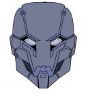
Mike has a new mask but it lacks a design.

Here's one! 8D

Titled the "Network Demonica", the mask is made up of Chrome Digizoid with all the creature comforts an analogman could need. Sheer grate space made of a Digizoid weave for ease of breathing as well as ease of installation of air tanks in case of hostile breathing environment, a voice synthesizer, optic lens with multiple viewing options, plate segmentation allowing only PART of the mask to come up rather than remove the entire thing with an additional field generator built on the sides in case someone tries to plant a bullet in yer face (only good for one round though and it better not be a doozy), and LoE track lines that can spread particles about to make tracking difficult AND they change color with Digimental used. Yes, this DOES count as a Digimental coat. The blank space is open for crests or other affiliated designs.

BUY YOUR OWN FOR 99.99.99!!! 8D
GoldClaw @ Monday, March 12th 2018, 9:36 PM
avatar
o Ao b Totally fuckin rad I love the overall design of it. While it does look plain, I'd imagen with Mike it might at least have the Paragon symbol either between the eyes or on the forehead. I think a pattern motif for it could be either like demonistic style patterns or something that befits his Monikir 'Demon of the Moon' or 'Lunar Demon' depending on his adversaries.

Also. That price point is interesting. >.> Though... remember.. the guy who made it is... dead? u __u Course... I am sure Tetsuo did some fiddling with it when Mike wasn't looking.
JDeschain19 @ Monday, March 12th 2018, 9:45 PM
avatar
Ooo badass helmet. You're on a roll designing stuff for other chars tonight~ > 3>
Crescent @ Monday, March 12th 2018, 9:48 PM
avatar
Yeah, nice design o 3o;
Akurei Nagisa @ Tuesday, March 13th 2018, 2:12 AM
avatar
Oooohhh, nice. Reminds me of MCU Ultron in all the best ways, and is a good look for Mike when he’s going Full Skullface Merc without being...full skullface.
GoldClaw @ Tuesday, March 13th 2018, 12:38 PM
avatar
Now the question is... Which young blood will "borrow" Mike's mask and attempt to find out if it has an X-Ray feature.

>·> I'm sure nothing bad could ever happen if that was the case.


[2105] Artist: Sketch Meister | Title: All New All Different Ruby Saber X and Albion the White Rose Knight | Time: unknown
Pic #2105

Uploaded
Sketch Meister @ Monday, March 12th 2018, 7:31 PM
avatar
Note: I will not in fact be calling them that, fuck Marvel's naming sense.

But yeah, after Shadow Riders Ruby Saber X and Albion update their costumes and they go to a particular fashion designer to get the job done. Going forward their hero suits are meant to show a new unified approach, meant to be more comforting to the citizenry and promote their own developing relationship.

I wanted to push the knight concept more and steer away from the more iron Man aspects the Albion suit was gaining. I also utilized Yukito's emblem on the helmet, as with what will be Albion's rise in popularity he can wave off having the emblem on his necktie and Digivice as him being a fan and buying some merch.

Jason wanted the redesign on the Ruby Saber X suit, and as story wise Riiko is the one who redesigns it he wanted me to take a swing at it. He can explain more.
Crescent @ Monday, March 12th 2018, 9:46 PM
avatar
Looking good o 3o Like Albion's new helmet.

Nana: u 3u~ Not super fond of Saver helping someone with pirated Crown technology though
JDeschain19 @ Monday, March 12th 2018, 10:13 PM
avatar
I guess the only thing really to explain is the reasoning.

So, I know some people didn't get it, cause I guess it wasn't represented well, was that the original Ruby Saber X outfit, along with the name, was intended to be a messy hodgepodge semi-disaster of a design. Erica wanted to look like a magical girl, but also a superhero in spandex, but also have a cute, flowing translucent skirt, but also a cape and she definitely needed a symbol on her chest which she made up on the spot without thinking (When I was in high school, I learned a lot about Greek Mythology and afterward I used greek symbols for fucking everything, so her symbol was kind of an inside joke that only I got . 3. ). She was a little, immature kid who wanted everything she could dream up at once.

By the time Shadow Riders is over, she'll have grown quite a bit since those days. Importantly, she's building a relationship with Riiko that me and Cam have been excited to start since the moment we started contemplating it (Tho the circumstances were originally different). Also, in the wake of all this Rider nonsense, Ruby Saber X's position will take on an entirely new, very vital role in the city as Yukito sort of makes her the face of a movement to restore faith in the city's vigilantes.

With this in mind, it seemed like the -perfect- opportunity to finally give her a big update. And my thinking is this: If we have a character ingame who's established as a passionate fashion designer and it makes sense to use them, why wouldn't you? Following that, I have Celia, who exclusively wears outfits made for her by Riiko, and now Erica who will be looking up to her like a big sister, and be receiving a set of new clothes inspired by Erica herself. I want outfits made by a certain character to look like they were made by that character, which might sound obvious, but it way harder than it seems. It means having to view the character through the eyes of a character played by something else.

What I mean is, Erica does not see herself as a 'knight' or 'knight themed'. Through Riiko's eyes, however, that theme comes to light and thus we have this new design. It's something Erica would have never considered.

It's the same reason I still wanna see Cam design an outfit for Celia by Riiko. Technically, all of Celia's clothes are made by her, but (other than her Guardian jacket, which I made specifically different with a 'Prince' theme) they're all following Celia's design sensibilities. The current one is extremely simple and functional, made from good cloth cause Riiko wouldn't skimp on her fiance. But what interests me is the way Riiko views Celia and how that would come out in her designs for her.

...basically, this is a big long rant on why I asked Cam to do this.

And he did a great job, I love it. I'm not gonna change nearly as much as I thought I would (I mostly only have an idea for her chestplate so it's not formed so neatly to her boobs)
Akurei Nagisa @ Tuesday, March 13th 2018, 2:09 AM
avatar
>_> The Amazing Ruby Saber X and the Superior White Rose Knight, tho.

I have to say, I’m really into Albion here. As much as I didn’t mind the Iron Man elements, this shift back towards knighthood is excellent and helps underscore some...developments. >_> Can’t wait to see you integrate the St. George Driver, Yukito.

I liked Ruby’s style because it was a ridiculous hodgepodge she made work, to be honest, but this is much more of a Crime Fighting For Serious design, and it definitely looks like something Riiko would do to adapt the suit, make it more modern and practical without losing its spirit.


[2102] Artist: Sketch Meister | Title: ALL OUT (Why Does Nobody Want Change?) | Time: unknown
Pic #2102

Uploaded
Sketch Meister @ Monday, March 12th 2018, 2:57 PM
avatar
So yeah, the Persona playlist on iTunes was on for hours, how'd you guess?

In my continuing saga of trying to shove as much Digimon onto the banners, here's the new Paragon banner.
JDeschain19 @ Monday, March 12th 2018, 3:03 PM
avatar
I admittedly expected a larger variety of colors, but I think this works pretty well. Like the last one, I think the heavy green in nice, just because I don't think we currently have a banner with that as a main color. I think of blue and wine-red mostly.
Sketch Meister @ Monday, March 12th 2018, 3:05 PM
avatar
Actually that brings up a point do we have anyone in Paragon with red LoE? Like once Dag and Akurei went and joined the Crowns and Daedalus and Celia went independent I don't think we do.
Akurei Nagisa @ Monday, March 12th 2018, 3:06 PM
avatar
Hahhahahhahahahhaaaa fantastic. 8DDD Speaking as a huge fan of the old Paragon banner, the new has me super goddamn jazzed. Try to look at this and not get a little excited.

The black-and-white plus the LoE colors only really makes it pop, plus the expressions here are strong as Hell. Lookit these kids. Fuck with them at your peril, rotten adults. 8D
JDeschain19 @ Monday, March 12th 2018, 3:07 PM
avatar
I also think we retconned Celia to have white LoE like her mother, cause she has the same potential aptitude with Digimentals (Her LoE can be easily 'painted' different colors as it were, metaphorically)
Akurei Nagisa @ Monday, March 12th 2018, 3:13 PM
avatar
...That sounds familiar to me, yeah.

...Paragon still has Virgil, though! Maybe he still has red LoE? >_>;;
Crescent @ Monday, March 12th 2018, 9:39 PM
avatar
Ooh, really cool evolution of the old Paragon banner o 3o Like it.

And nope, Virgil has turquoise-y LoE. Um... Iris' is pink? That's the closest I got. Otherwise, there's Kai with purple.
GoldClaw @ Monday, March 12th 2018, 9:40 PM
avatar
I like this one a lot. To see some of the major players in Paragon, plus they are the youngsters as well! 8D

Though, I don't think we have anyone in Paragon that has a red LoE. Unless, the shrine maiden joins, but I think Reimu is going to stay independent.
Benjamin @ Wednesday, March 14th 2018, 3:18 PM
avatar
Love it. Both the expressions and the energy. One detail I particularly liked was how Jace's scar lit up with his LoE. It makes sense and I never really thought of that while RPing.


[2101] Artist: Sketch Meister | Title: I Am...Online | Time: unknown
Pic #2101

Uploaded
Sketch Meister @ Sunday, March 11th 2018, 11:45 PM
avatar
And another banner! I started the lines on this over a month ago before work kicked me in the gut then repeatedly kicked me.

Can you tell I'm already ready for summer vacation?
Akurei Nagisa @ Monday, March 12th 2018, 12:17 AM
avatar
The LoE effects here are really beautiful, and the details in the Genomon closeup are choice. u vu/

The Genomon have become an almost iconic design, I feel like. Something to be proud of. o 3o
Crescent @ Monday, March 12th 2018, 12:49 AM
avatar
SCHOOL'S OUT FOR SUMMER (In like another 2 1/2 months >_>)

On the plus side, this turned out great u 3u The lighting aspects here are really neat
JDeschain19 @ Monday, March 12th 2018, 3:03 PM
avatar
This is really slick. I should consider making more 'simple' banners that're just a closeup of some Digimon in our story. I always seem to go for big, elaborate ones.


[2100] Artist: Sketch Meister | Title: Isolated in a Sea of Lies | Time: unknown
Pic #2100

Uploaded
Sketch Meister @ Sunday, March 11th 2018, 6:16 PM
avatar
I FINALLY got a banner done. Aaaand of course it's one that I came up with just today.

I've been meaning to get the banners replaced, especially with the new game logo, so here's the first one which replaces the Shadow Riders banner we have now. Jess, make it happen!

Also, fun one, this is the first banner in game since the Paragon banner that shows a Tamer WITH a partner Digimon.
Crescent @ Sunday, March 11th 2018, 6:22 PM
avatar
Emo Shugo is Emo u 3u

Cool banner though o 3o Like the concept
YoshinoSuki @ Sunday, March 11th 2018, 6:32 PM
avatar
omg I love this. <3 Shugo looks perfectly Fine™.

Also this feels like a great Pic 2100. Shows where we are in story. :3c
Akurei Nagisa @ Monday, March 12th 2018, 12:09 AM
avatar
There is a reason I have taken to calling Shugo's S4 outfit "the Depression Coat". It's not because he's usually shown as happy. >_>

I'm glad I suggested him for the focus here, it worked all too well. The feeling of even Auren being cut off from him is perfect. Like you said on that one pic, there's an extent even the bond between Tamer and Digimon can't reach.

...Also what a cool TV network on in the background, right? >_> Extremely cool. Very patriotic.
JDeschain19 @ Monday, March 12th 2018, 3:05 PM
avatar
I really like the simplicity of this one, and the overall cool blue tones that really gets across the proper feeling. Shugo feels incredibly isolated here with the framing as it is.


[2092] Artist: Sketch Meister | Title: Show and Tell | Time: unknown
Pic #2092

Uploaded
Sketch Meister @ Tuesday, February 13th 2018, 11:28 PM
avatar
Oh my fuck. I started this drawing a LONG time ago, like I'm afraid to look at the original time stamp I am that fearful to look. I hit some major art block that I've been slowly working through for the past several months, and I got the flats done and just looked at it all and felt overwhelmed. I decided to try approaching the coloring a touch differently and though I'm not entirely satisfied it helped with the overwhelming issue.

So yeah. Another lewd of Soma, Haruka, and Robyn, with Loki watching from somewhere not in Soma's personal chambers.

X_X Done...finally DONE.
JDeschain19 @ Tuesday, February 13th 2018, 11:33 PM
avatar
Haruka, you're recording it too? D: Heckin -lewd-!

Nice job tho, nice to see some new (old) art of yours up O:
Akurei Nagisa @ Tuesday, February 13th 2018, 11:37 PM
avatar
*^ o^* I have been waiting for this one for a while, but I'm happy to say that the finished product absolutely fucking delivers. Goddamn. This is basically exactly what I wanted, and as I noted back when this began, the embarrassed cute look on Robyn and the scheming look on Haruka are ::chefkiss::. This is fantastic and I hope it didn't burn you out too hard on all this because I confess I want more of this. As a pervert. u 3u

@Jason: >_> Oh she's livestreaming it *and* recording it. Haruka is not a nice girl. No. She is a very lewd girl and-- ::TK'D OUT THE WINDOW::
Akurei Nagisa @ Tuesday, February 13th 2018, 11:39 PM
avatar
....>_> Also, did this picture manage to inspire a sequel to that terrible lemon I wrote? SIGNS POINT TO PROBABLY. SORRY EVERYONE.
Crescent @ Saturday, February 24th 2018, 7:53 PM
avatar
How lewd u 3u

The perspective's really nice here o 3o I also like the angle of Robyn not quite straight so you see her butt, and then Haruka filming over her shoulder


[2088] Artist: Sketch Meister | Title: Suda Hanabi (What She Wishes) | Time: unknown
Pic #2088

Uploaded
Sketch Meister @ Monday, January 15th 2018, 3:52 AM
avatar
One more before I pack it in. Suda Hanabi was introduced in the first CHIRON mission thread, being the only survivor of a group of D-Transmod abusers that decided they were too good to pay for their fix of DDNA. Kurokawa converted her into a Chimeratech based on Swanmon DDNA. Suda's been in one mission thread since her upgrade, and people can attest that her relationship with her partner is...unconventional.

But yeah, I plan to use her more in coming threads so may as well get a pic of her up. She wishes she was so sultry.

Hanabi: D8 DON'T CALL ATTENTION TO IT!
Akurei Nagisa @ Monday, January 15th 2018, 3:58 AM
avatar
Ohhh hello hello Hanabi dearest. >_> Epoch, you're sure it's Adelaide you're interested i--::BRAHMASTRA'D::

X__O Jeezus that stings. OW. OKAY.

She's actually hitting this nice stride betwixt super curvy and cute, that hime cut does wonders! o 3o Also, those wing ears are extremely good.

I maybe should've gotten you the Chimeratech variant uniform with the armor cladding, but this is Hanabi's Imagine Spot, so.
Sketch Meister @ Monday, January 15th 2018, 4:02 AM
avatar
True! This was just a sketch really. I should figure out what shape her shoulder armor should be.,..hm... I suppose rounded, maybe smaller compared to Regulus and Epoch so as not to get in the way of her flying...
JDeschain19 @ Monday, January 15th 2018, 11:12 AM
avatar
God, she actually looks super adorable...The fangs, the claws, the feathery ears * v*

Hanabi, you got a fan for sure
Crescent @ Monday, January 15th 2018, 12:18 PM
avatar
Hello indeed u 3u Very nice

This is nice since it's a bit different than I imagined she looked XD
Sketch Meister @ Monday, January 15th 2018, 5:00 PM
avatar
Ooops. Forgot her slave colla- I MEAN choker. >_>;;


[2086] Artist: Sketch Meister | Title: Bubble Butt | Time: unknown
Pic #2086

Uploaded
Sketch Meister @ Monday, January 15th 2018, 1:03 AM
avatar
So I finally got to draw and...I honesty could not bring myself to really do anything. ;_;

So...BUTTS. Haruka BUTTS.
Mooncrafter @ Monday, January 15th 2018, 1:05 AM
avatar
I love how I even recognized the butt before the artist did. XD

"I drew a butt, but I don't know whose butt it is.
....Haruka's.
Really?
Well, yea. Ass is round but not as long and thick as the twins, and the hips are wider than Helena's. It's Haruka's. You drew Haruka."
Akurei Nagisa @ Monday, January 15th 2018, 1:08 AM
avatar
You told me you thought you hadn't got this big enough, yet this is a perfectly sized and extraordinarily thicc booty I see before me. Like, hot damn. You can't mistake this for anyone else.

Haruka: **u///////u** ::SELF-CONSCIOUSNESS::

Shush, you look great. The downside of these very cute bottoms is Soma's going to tear them in half.

(The design is super cute though.)
GoldClaw @ Monday, January 15th 2018, 1:09 AM
avatar
That is a good Haruka butt. The underwear is cute and fits her well.
Akurei Nagisa @ Monday, January 15th 2018, 1:10 AM
avatar
Also I would like to posit that Haruka is "thicker than a Snickers" and also that she is like a baker in that she got cakes for day--::VIOLENT TELEKINETIC DEATH::
JDeschain19 @ Monday, January 15th 2018, 1:57 AM
avatar
Extremely Good Butt :D

A nice return to form~
Crescent @ Monday, January 15th 2018, 2:10 AM
avatar
Hello there u 3u That is one nicely plump butt
Sketch Meister @ Monday, January 15th 2018, 4:47 PM
avatar
Soma: .....

Don't shake yer butt too much, Haru-Haru, I think he might be entranced. >.> Poor boy might fly into a wall.

Ringmon: >.> >8D Go ahead and shake it!


[2054] Artist: Sketch Meister | Title: Logo Design | Time: unknown
Pic #2054

ShiPainter
Sketch Meister @ Monday, September 4th 2017, 12:45 AM
avatar
My attempt at a revised logo for the game. I feel a little proud of this. Took cues from the various Digimon anime and the Rockman.EXE anime in particular.
Crescent @ Monday, September 4th 2017, 1:12 AM
avatar
Oooh, nifty o 3o
JDeschain19 @ Monday, September 4th 2017, 1:15 AM
avatar
I told you before, I like it o 3o/
Akurei Nagisa @ Monday, September 4th 2017, 1:18 AM
avatar
I think it came out rad as heck. I definitely see the EXE influences, in a good way. o 3o
YoshinoSuki @ Wednesday, September 6th 2017, 5:54 AM
avatar
Ooo. Actually I think this looks better than trying to do something in 3D. o 3o/

I really like it. :3


[2053] Artist: Sketch Meister | Title: The Priestess Found a Friend (Happy Birthday Darren!) | Time: unknown
Pic #2053

ShiPainter
Sketch Meister @ Monday, September 4th 2017, 12:13 AM
avatar
A belated b-day gift for Darren. Figures it would be the first time I draw Reimu and it's in hentai. >.>

...Now just who is the giver here?

Roy: ..>__> BEFORE YA'LL EVEN LOOK AT ME.
JDeschain19 @ Monday, September 4th 2017, 12:17 AM
avatar
Woo! Glad you got something done today!

Hehe, I remember where the inspiration for this came from > v>

Looks good, man! My only thing is it looks like she's laying down, so the dripping cum looks like it's defying gravity.
Sketch Meister @ Monday, September 4th 2017, 12:20 AM
avatar
..Ah damn. Right. I changed the positioning at the end. Meh. Easy fix.
Crescent @ Monday, September 4th 2017, 12:21 AM
avatar
>_> I'd probably have to progress from fingers to toes if I started counting chars you've only drawn hentai or porn of.

Unique premise, like the shadow and mouthful u 3u
GoldClaw @ Monday, September 4th 2017, 12:31 AM
avatar
>___> *stares* Now Roy... You best start runnin cause hell be coming.

But my god i love this. u 3u b such greatness. Even if Reimu's first pic debut is hentai, at least there is a ref for her face.

Izzy: *crackles knuckles* T____T defilement of a priestess!!! A thousand hot acupuncture needles as punishment!
Akurei Nagisa @ Monday, September 4th 2017, 12:35 AM
avatar
Reimu loves direct mana transfer, I see. XD Also throatfucking.

The mess in the mouth game is really strong u 3u You remain the best at that.

Also, happy birthday Daren o 3o
Sketch Meister @ Monday, September 4th 2017, 12:36 AM
avatar
Roy: D8 I DIDN'T DO ANYTHING!!!! FOR THE FEW TIMES IN MAH LIFE I DID NOT FONDLE, CARESS, PENETRATE, TEASE, GROPE, OR ANYTHING WITH THE ONLY FEMALE AROUND ME! I'M INNOCENT!!!

Voodoomon: .... How much did it hurt you tah say that, playboy?

Roy: ;___; I wanna burn off mah tongue.
Mooncrafter @ Monday, September 4th 2017, 12:45 AM
avatar
Caronwyn: Yea! Mr. Vermillion's innocent! I've been alone with him deep in the woods and he's never done any of those things with me either! Our partners weren't even there!

....it's adorable that you think you're helping Caron.
Sketch Meister @ Monday, September 4th 2017, 12:48 AM
avatar
Roy: X___X CARONWYN, NO!!!!

*all eyes accusingly on Roy* >___>

Roy: ;___; I want mah lawyer!
GoldClaw @ Monday, September 4th 2017, 11:36 AM
avatar
Izzy: ... *does her vampire voodoo power* ... He's clean of this one.

*pitchforks is put down*


[2049] Artist: Sketch Meister | Title: Medusamon | Time: unknown
Pic #2049

Uploaded
Sketch Meister @ Saturday, August 26th 2017, 10:39 PM
avatar
Been a long time coming. Eno's true form finally gets released.
Akurei Nagisa @ Saturday, August 26th 2017, 10:47 PM
avatar
SO MANY SNEKS

She manages to be both hot and kind of extremely terrifying, which I think is what you were going for, so. >_> A+. The gold is also a nice touch, it sets off all the black nicely and doesn't clash with her snektails or skin. o 3o
JDeschain19 @ Saturday, August 26th 2017, 11:05 PM
avatar
Like I said in Discord, totally slick design. I'll undoubtedly be drawing it myself soon, so I'm looking forward to that.

The purple snakes in the hair add a lot of definition. And ya, like Graham said, the black and gold are a great darkly regal combo. The purple too much like an accent to add to that, but that's fine.
Crescent @ Sunday, August 27th 2017, 4:52 PM
avatar
Super cool design o 3o What Graham and Jason said, basically u 3u She's imposing, a tough regal, and also a very hot snek lady
Akurei Nagisa @ Monday, August 28th 2017, 12:05 AM
avatar
I just noticed even here we're still calling it Eno's true form. Was that intentional? XDD
Sketch Meister @ Tuesday, August 29th 2017, 9:25 PM
avatar
You'll seeeeeee...
YoshinoSuki @ Wednesday, August 30th 2017, 1:33 AM
avatar
I absolutely dig this design. 8D It all works so well, and I really like the scale placement around. :3
Akurei Nagisa @ Wednesday, August 30th 2017, 4:34 AM
avatar
@Cam: you forget that I *know*. >__>


[2045] Artist: Sketch Meister | Title: Curamon Sketch | Time: unknown
Pic #2045

Uploaded
Sketch Meister @ Friday, August 11th 2017, 12:18 AM
avatar
Helping Justin work on a Charity Armor form for Lagomon. Meet Curamon.
JDeschain19 @ Friday, August 11th 2017, 12:22 AM
avatar
Oh hey, cute design~!
Sketch Meister @ Friday, August 11th 2017, 12:23 AM
avatar
Well Virtue Digimentals are the counter to Sin Digimentals, so makes sense she should be angelic.
Crescent @ Friday, August 11th 2017, 12:25 AM
avatar
Hmm maybe just slightly child-y for Lex as shown here (then again, maybe just since it's a rough sketch), buuuuut I do really like the design in itself. The smaller touches like the bell really bring everything together.
Sketch Meister @ Friday, August 11th 2017, 12:26 AM
avatar
So little taller then?
Crescent @ Friday, August 11th 2017, 12:29 AM
avatar
Yeah, maybe just a little taller, with a bit more meat on her thighs?
JDeschain19 @ Friday, August 11th 2017, 6:21 PM
avatar
Loli is justice, Justin D:<
Crescent @ Sunday, August 13th 2017, 1:30 PM
avatar
XD It's not like Lagomon can't have a loli evo, but just being smol (as opposed to a loli) better fits the theme of the form and how it relates to Iris's characteristics of charity.


[2044] Artist: Sketch Meister | Title: Now in Technicolor | Time: unknown
Pic #2044

Uploaded
Sketch Meister @ Tuesday, August 1st 2017, 2:30 AM
avatar
OK, so before I move on to shading and titling and blah, does anyone who has a Digimon represented here have issue with the colors?
JDeschain19 @ Tuesday, August 1st 2017, 8:24 AM
avatar
It looks like a great spread of color o 3ob
YoshinoSuki @ Tuesday, August 1st 2017, 11:21 AM
avatar
Nope. Still love Aph and Yama. Colors are coming along great. I love the lines here. ^ 3^/
GoldClaw @ Monday, August 7th 2017, 12:15 AM
avatar
nnnnnnnnnnnnnope. I am liking it all. Plinimon looks good.
Akurei Nagisa @ Friday, August 25th 2017, 10:58 AM
avatar
No problems here, mon capitan


[2043] Artist: Sketch Meister | Title: Linework for Paragon 2 | Time: unknown
Pic #2043

Uploaded
Sketch Meister @ Monday, July 31st 2017, 11:58 PM
avatar
Huh. OK. Wasn't as painful as I thought. Must be having a hand of God moment.
JDeschain19 @ Tuesday, August 1st 2017, 12:29 AM
avatar
YA! Looks great :D


[2042] Artist: Sketch Meister | Title: Paragon Banner 2 Sketch | Time: unknown
Pic #2042

Uploaded
Sketch Meister @ Monday, July 31st 2017, 7:17 PM
avatar
WELL. THIS'LL BE FUN TO LINE AND COLOR.

AND THEN THERE'S THE EFFECTS SO I CAN FIT IN THE LOGO.

...YAAAAAAAAAAAAAAY.

Oh, and if you couldn't guess, theme here is the player character female Digimon of the Paragon faction.
Crescent @ Monday, July 31st 2017, 7:22 PM
avatar
StarFoxGoodLuck.wav >_>

Looking cool, though o 3o
Mooncrafter @ Monday, July 31st 2017, 7:23 PM
avatar
Ganbarre~ :lol:
YoshinoSuki @ Monday, July 31st 2017, 7:31 PM
avatar
I like Aph, but I rather love Yama back there. XD <3
JDeschain19 @ Monday, July 31st 2017, 11:31 PM
avatar
It looks great, tho. I love ensemble pics like this :D


[2041] Artist: Sketch Meister | Title: SHINKEN Dangerous | Time: unknown
Pic #2041

Uploaded
Sketch Meister @ Sunday, July 30th 2017, 2:50 AM
avatar
Another emote. Time to get DANGEROUS.
JDeschain19 @ Sunday, July 30th 2017, 11:40 AM
avatar
At least they look really cool. O:


[2040] Artist: Sketch Meister | Title: NOW WAIT A DAMN MINUTE!!! | Time: unknown
Pic #2040

Uploaded
Sketch Meister @ Sunday, July 30th 2017, 2:03 AM
avatar
Jason and I can't be trusted in threads alone apparently.
JDeschain19 @ Sunday, July 30th 2017, 11:39 AM
avatar
it's very true, we stay up til 6am (my time) giggling and drawing emotes for posts.


[2033] Artist: Sketch Meister | Title: Soul of the Man('s Coat) | Time: unknown
Pic #2033

ShiPainter
Sketch Meister @ Wednesday, July 26th 2017, 10:36 PM
avatar
So after Frey temporarily died due to massive Alice rage, there were concerns as to have to divide his belongings and informing next of kin. In that conversation came this gem.

@Jason the Great
Forget that, who gets his cool coat?

@ Akurei Nagisa
Alma will take Coat-kun into her loving care.

This jacket has been a critical point for everyone's favorite red head of Stability, so I figured why not make Coat-kun just a little more legit. As iconic as a goggle boy's goggles, Soma's glasses, Regulus' helmet, Epoch's hat, and Yairu's scarf.


Don't lose your way.
JDeschain19 @ Monday, July 24th 2017, 3:34 PM
avatar
PFFFT jfc...Nobody give Frey's coat consciousness, please.

This is a pretty hilarious pic xD Respect the coat!
YoshinoSuki @ Monday, July 24th 2017, 3:35 PM
avatar
Epic Coat-kun! I see the Kill la Kill influence; intentional or not. >>; lol
GoldClaw @ Monday, July 24th 2017, 3:36 PM
avatar
u 3u Well... As long as it doesn't cause any kind of transformations and such besides talking... It should be good right? Right?

Alma, don't listen to Coat-Kun if it starts talking. u 3u It probably has bad ideas anyways.
Sketch Meister @ Monday, July 24th 2017, 3:49 PM
avatar
@Jess Kill la Kill and JoJo, to be exact!
Akurei Nagisa @ Monday, July 24th 2017, 4:12 PM
avatar
Alma: *___*

Alma. No. Alma no. Alma you can't become Ryuko there's no such things as Life Fibe--

::DON'T LOSE YOUR WAAAAAAAAAAYYYYYY, IN YOUR MIND::

Goddammit, guys, Kill La Alma is YOUR FAULT, NOT MINE

(Awesome pic though! Those eyes! And that color work!)
Crescent @ Monday, July 24th 2017, 11:08 PM
avatar
This kinda begs for some sort of batshit thread XD


<<PREV · [1][7] [8] [9] [10] [11] [12] [13] [14] [15] [16] [17][44] · NEXT>>