View
Search

Name Password


<<PREV · [1][12] [13] [14] [15] [16] [17] [18] [19] [20] [21] [22][44] · NEXT>>


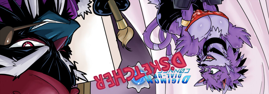
[1767] Artist: Sketch Meister | Title: CONNECT Banner: The Divine Four | Time: unknown
Pic #1767

Uploaded
Sketch Meister @ Sunday, January 17th 2016, 11:20 PM
avatar
And here be the Crown banner! Idea came from the last ending theme of Yu-Gi-Oh! 5D's, which I have been binging the last couple weeks.

One more to go!
Crescent @ Sunday, January 17th 2016, 11:29 PM
avatar
Oooh, this one's super cool * 3* (Yeah sure I'll admit some potential bias since this banner's mostly my characters >_>)

I really like the perspective on Dag's face, actually. I do love everyone's expressions. And going with the color-coded shading is indeed a nice artistic touch.
Benjamin @ Monday, January 18th 2016, 12:21 AM
avatar
I do like the perspective used for Dagrus.
Akurei Nagisa @ Monday, January 18th 2016, 2:06 AM
avatar
I like all the perspectives here, actually! Dag is great, but my favorites are actually Nana and Miguel.
YoshinoSuki @ Tuesday, January 19th 2016, 1:29 AM
avatar
Is it intentional that Miguel looks like Bruce Banner?> > 3>; XD

As for me, I kinda find myself really liking Godiva. ^ x^;; Actually... the entire banner, the more I stare at it, makes me think of the X-Men. @x @


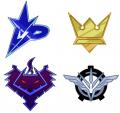
[1766] Artist: Sketch Meister | Title: Choose Your Side | Time: unknown
Pic #1766

Uploaded
Sketch Meister @ Wednesday, January 13th 2016, 1:13 AM
avatar
Unless of course your side is Sentinel or the Royal Knights. In which case fuck your side.

It's nice to finally have all of these next to one another...
Crescent @ Wednesday, January 13th 2016, 1:18 AM
avatar
Nadia: ~ 3~ I resent that

But yeah, awesome o 3o
Akurei Nagisa @ Wednesday, January 13th 2016, 1:34 AM
avatar
All four of the good factions! >_> Or at least the factions that aren't dedicated to naked tyranny and/or the Unmaking of Flesh.

Although given that Sentinel's emblem is basically just a stylized Crest of the Fallen, the RKs are the only faction whose symbol we HAVEN'T designed.
Sketch Meister @ Wednesday, January 13th 2016, 2:26 PM
avatar
I actually do have one for the Royal Knights. I just haven't drawn it yet. I could probably do them today.
YoshinoSuki @ Tuesday, January 19th 2016, 1:31 AM
avatar
Aph: Naked Tyranny is the best Tyranny, though.

Back in the box with you. I really like how they all came out. ^ o^ Though, I suppose it's time to update the emblems on the wiki, eh? ^^; Maybe I can wait for the Royal Knights' emblem. > 3>;


[1765] Artist: Sketch Meister | Title: Faction Emblems: Daedalus Initiative | Time: unknown
Pic #1765

Uploaded
Sketch Meister @ Tuesday, January 12th 2016, 11:15 PM
avatar
And finally, the revised Daedalus Initiative "winged gear". Especially after making the Mirai Archipelago flag I thought it might take a bit from it.
GoldClaw @ Tuesday, January 12th 2016, 11:17 PM
avatar
I think I do like this better than the old design. O___o I mean it feels more right with the Initiative as a whole. Plus I do love the wing design.
Crescent @ Tuesday, January 12th 2016, 11:23 PM
avatar
Yeah o 3o New touches are cool.
Akurei Nagisa @ Wednesday, January 13th 2016, 1:00 AM
avatar
Oh yes. ^^ I really like this one, these wings are a definite step up. Very nice.

...The gear is teeeeeechnically supposed to have more than three teeth but it's had three for so long it's almost a tradition, huh. XD;
Sketch Meister @ Wednesday, January 13th 2016, 1:20 AM
avatar
I looked really busy when I tried that... >_>;
Akurei Nagisa @ Wednesday, January 13th 2016, 1:37 AM
avatar
We'll just say the wings cover the other teeth. ^ o^;;


[1764] Artist: Sketch Meister | Title: Faction Emblems: Crowns | Time: unknown
Pic #1764

Uploaded
Sketch Meister @ Tuesday, January 12th 2016, 11:14 PM
avatar
The Crowns are a PMC, and thus a little more commercial than the other factions. I wanted something that screams "brand name". The additional elements were added to add just a touch of regality.

Honestly, I want this on a polo shirt.
GoldClaw @ Tuesday, January 12th 2016, 11:19 PM
avatar
I kinda have to agree. I would love to have a shirt with this on it. And have people wonder what brand it is. :P It would be funny.

But! I do like how it carries the regalia that the Crowns have been displaying. In addition to the standards that the faction has. Plus, it also looks like a fancy pin that one would get at super special events and such. o3o;;
Crescent @ Tuesday, January 12th 2016, 11:22 PM
avatar
Nana: u 3u I know what my next pair of panties are gonna be shaped like.

T____T

The more detailed crown shape and softer colors does increase the regality.
Akurei Nagisa @ Tuesday, January 12th 2016, 11:59 PM
avatar
The Crowns have gained some SUPAH SOOOOOUUULLLLL!!!! *guitar riff*

Seriously, though, this is boss. o 3o Nice upgrade.


[1763] Artist: Sketch Meister | Title: Faction Emblems: Paragon | Time: unknown
Pic #1763

Uploaded
Sketch Meister @ Tuesday, January 12th 2016, 10:16 PM
avatar
Took me a damn bit to figure out how to change up and clean up the Freelancer, now Paragon, emblem. Like with the Order of Stability I looked to the Xros Wars emblems, wanting to take from the Xros Heart emblem in particular. Something a touch heroic but also approachable. I also wanted something a bit like graffiti compared to the styles of the other emblems.

Thoughts?
GoldClaw @ Tuesday, January 12th 2016, 10:20 PM
avatar
I like it. I like it alot. Makes it stand out from the other symbols.

Though. I think the Daedalus and Crown emblems need to be updated.
Crescent @ Tuesday, January 12th 2016, 11:20 PM
avatar
Hrm. Looks kinda comic book-y in a way. Heroic and stuff >_> Definitely stands out from the other logos.
Akurei Nagisa @ Tuesday, January 12th 2016, 11:51 PM
avatar
Oooh. o 3o I like the character of it and the more tag/graffiti-esque aspect; while I liked the ol' Freelancer emblem, this is definitely a nice change.

...The only problem is looking at the dragon head next to the "P" wrong makes me see "CP" and that's...;___; I'm sorry if everyone else sees it now too.
Benjamin @ Wednesday, January 13th 2016, 1:15 AM
avatar
It remind me a bit of the Sigma/Maverick insignia from Mega Man X.
Crescent @ Wednesday, January 13th 2016, 1:42 AM
avatar
Hmmm good point, Ben, it kinda does
Sketch Meister @ Thursday, January 14th 2016, 3:30 AM
avatar
Hey, Sigma was right all along, OK? Humans are shit.


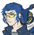
[1759] Artist: Sketch Meister | Title: Ichi and Quickmon Sketch | Time: unknown
Pic #1759

Uploaded
Sketch Meister @ Tuesday, January 5th 2016, 12:24 AM
avatar
Been trying to work out this design for awhile, and I think I finally have something solid. Ichimu is a member of Shugotenshi's racing team and will become a Tamer in Season 4.

>.> It..goes well?
YoshinoSuki @ Tuesday, January 5th 2016, 12:26 AM
avatar
Oh man, I like it. 8D I like the design cues for both Tamer and Digimon. ^ o^

It goes fantastically, what're you talking about? >.>
Akurei Nagisa @ Tuesday, January 5th 2016, 12:32 AM
avatar
>___> Oh boy, yeah, this is clearly gonna go Real Good. No river of misunderstandings here.

I dig his outfit and that hair is rad. o 3o Also Quickmon there is interestin'
Crescent @ Tuesday, January 5th 2016, 12:37 AM
avatar
3FAST4FURIOUS

Yeah, interesting design on Quickmon (CHANGE BEETLE >_>) Ichimu's design looking nice, too.

u___u Never any MISUNDERSTANDSINGS as far as Shugo's concerned


[1756] Artist: Sketch Meister | Title: Akurei Nagisa Season 4 Clothing Concept | Time: unknown
Pic #1756

Uploaded
Sketch Meister @ Tuesday, December 29th 2015, 3:11 AM
avatar
And here be Akurei's new look. Akurei's outfit is supposed to convey the idea that he has grown from the sullen little smoker he was when starting out. Rather than be clad in his uncle's lost and tattered trenchcoat, he has modified the jacket with the Kachidoki Spirits program, dying it in his colors and standing on his own two feet. To that end I wanted something that evoked the gallantry of a cape and the boldness of a jinbaori.

For his clothes beneath the coat the pants and shoes were't too difficult, with heavier shoes for the sake of grounding when he uses his railgun. The shirt came from a source I only stumbled on, as Graham didn't want Akurei wearing anything too formal but not overtly casual. The answer was actually in the current Super Sentai Ninninger and its leader Takaharu. His shirts are something like t-shirts mixed with a ninja's shozoku. I made a modification to that in the differently colored portion to better support his mechanical arm while also easily opening in a flap to allow for quick connection maintenance.

So thoughts?
Sketch Meister @ Tuesday, December 29th 2015, 3:17 AM
avatar
Jacket colors! Three words: Michael. Fassbender. Magneto.
Akurei Nagisa @ Tuesday, December 29th 2015, 3:25 AM
avatar
And they work, I think. The disparate influences that made the Kachidoki Raiment really come together here!

Plus I fuckin' love Magneto, so that's a plus. XD; But yeah~ I'm liking this. Also his shoes are cool and the thicker look is perfect.

...finally I would be skeptical but I love Ninninger and the arm access sells it. ^_^

Akurei: *T 3T* No one say it. Do not.

YOU'RE GETTING--

Akurei: *RAILGUN!!!* I MEAN IT! NO ONE!!
YoshinoSuki @ Tuesday, December 29th 2015, 7:42 AM
avatar
Oh man, I really like Aku's design. o 3o~ (Also lololol Firebird. XD I'll leave the jokes up to Justin. >_> He wanted it/them.) Taking cues from Takaharu works really well for Akurei. o 3o~ I really like how his coat echoes his ATHENA, but clearly isn't. 8D

I also find myself tempted to bother you for those modeling dummies, they came out really well. o:
Crescent @ Wednesday, December 30th 2015, 1:40 AM
avatar
Aku's getting really fired up 8DDD

Vega Crescent 12:13 am
anyway, sleep time x 3x I will make a bad fired up pun about Akurei's shirt in the morning

Graham Swanson 12:13 am
Goddammit

I am a man of my word u_u Except the part about the morning.

The colors and shirt design all come together really well o 3o
Akurei Nagisa @ Friday, January 1st 2016, 11:45 PM
avatar
Akurei: >_____<;; *MURDERS JUSTIN*

He's just not used to transcending keeping it goi--

Akurei: >________________o;;;; *MURDERS ME* ANYONE ELSE?!?! ANYONE?!?


[1755] Artist: Sketch Meister | Title: Robyn Markius Outfit Season 4 (Trial) | Time: unknown
Pic #1755

Uploaded
Sketch Meister @ Monday, December 28th 2015, 5:32 PM
avatar
Reuploaded. Had the wrong layers on.

ANYWAY. My concept for Robyn Markius' season 4 outfit. References were Mio and Kagura from ToQger, fitting as Loki and Soma's are referenced from the same series, Tokatii for Soma and Right for Loki.

Couple other things. I made a dummy for the females and will make one for the males as well. These will be used for future clothing concepts for both. Because of this I may actually make more swimwear and lingerie. Each one will also have the logo of the designer. It's just a little touch of world building and hey, Riiko can't design EVERYTHING.
Akurei Nagisa @ Monday, December 28th 2015, 10:47 PM
avatar
....Huh. I actually really like this, especially the skirt ( I have a thing for patterned, uniform-esque skirts anyway, so sue me *~_~*;; ); it's got Robyn's whole "plain but distinctive" style down. o 3o Also the patterned stockings pique my interest.

Hermes: > 3> I think we oughta see how they look in a--*thrown into a sack by his very own Tamer*

Loki: **>////////<** THIS LOOKS GREAT, THANK YOU CAM
Crescent @ Monday, December 28th 2015, 11:19 PM
avatar
Oh yeah o 3o The outfit definitely keeps Robyn's base look while injecting some subtle style into it.

A new variety of designs sounds cool v 3v Crown Sensuals can't have a lingerie monopoly I suppose.
YoshinoSuki @ Tuesday, December 29th 2015, 7:32 AM
avatar
I like the sort of monochromatic/faded shades of purple for this. I'm also not sure why something is screaming "DIGIMON STYLE" at the shoes. XD (Not in a bad way.)

I like it. ^^ It even sort of invokes a 'Senshi fuku' sort of design, which is a nice callback to her origins. ^ 3^


[1753] Artist: Sketch Meister | Title: Fate's Trumpeter | Time: unknown
Pic #1753

Uploaded
Sketch Meister @ Sunday, December 27th 2015, 3:00 PM
avatar
LOKI. YOU ARE A PAIN. FIRST YOUR DIGIVICE. NOW YOUR FUCKING PORTRAIT. FUCK. YOU.

ANYWAY, for this picture I wanted to show that Loki had well..aged from the last time I drew him. He's not a Freshman anymore, he's had time to grow, had adventures, and I wanted to show just how damn different he is from Akurei.

Loki is a junior now, lettered in band and more confident than he was starting out. He's still a damn nerd as seen with his hoodie having a d-pad artwork. His shades are different from the pair I gave him so long ago, though not the colored frames like I've done recently.

Thoughts?
Crescent @ Sunday, December 27th 2015, 3:04 PM
avatar
u___u; Be less pale, Loki. Geez.

I like it, though o 3o Loki in a moment on non-derpiness u 3u
GoldClaw @ Sunday, December 27th 2015, 3:04 PM
avatar
O_________o He looks so different than from the other drawn pictures. He looks... less derpish and more like a boss.

I mean, I can see the evolution of him growing up and such and man he just looks radically different.
Akurei Nagisa @ Sunday, December 27th 2015, 3:50 PM
avatar
Loki's Albinism: A Real Art Problem u_u

Hermes: u__u I would like to offer the use of Robyn's body for all even the most deviant sexual purposes as payment for the suffering you endured in--

Loki: **> 3<** HERMEEEEEEES~

That being said, I am seriously digging this design! I love the colors on his clothes especially, and they contrast with his nearly monochrome skin and hair really well!

Also this definitely shows an evolution away from his early-seasons frailty and unsureness. ^^ This is clearly a Loki who stands on his own two feet.

...Finally hahaha St. Nunnaly's colors make the perfect contrast to Akurei's new red coat. >_>
YoshinoSuki @ Tuesday, December 29th 2015, 7:38 AM
avatar
I think we've all had the 'Loki Problem'. v 3v

Aph: Mostly only Rob.

Robyn: What does that even mean?! T 3T

The difference between Loki and Akurei is amazingly clear, you did a great job with the differentiation. ^ o^ Also, I love Loki's hoodie. XD


[1752] Artist: Sketch Meister | Title: Little Miss Blue Bubbles | Time: unknown
Pic #1752

Uploaded
Sketch Meister @ Saturday, December 26th 2015, 1:23 PM
avatar
Alternate Title: Little Miss Blue Bubble (Butt).

Soma: >_< Cam-saaaaaan...

What? Booty like "pow pow pow" is literally IN her profi-

*RIDER KICK'D*

X___X; So yeah, Haruka based on the season 4 banner. The trident on the chest of the hoodie is the logo for the Poseidon brand of clothes, interestingly enough the same brand Asher wears. Oh these Aquan Tamers.
YoshinoSuki @ Saturday, December 26th 2015, 1:29 PM
avatar
She's adorable. I like her smile. The glasses are also adorable. ^ 3^

Aph: The trident's prongs kinda look like they're groping her, though. I like this branding! 8D
Crescent @ Saturday, December 26th 2015, 1:37 PM
avatar
XD

Nana: u_u I guess there are certain limits to Crown Brandings...

Yeah, cute pic o 3o; Haruka's really evolved to a dinstinct appearance
Benjamin @ Saturday, December 26th 2015, 1:40 PM
avatar
The hairstyle, glasses, and expression definitely convey that "girl next door" feel.
Akurei Nagisa @ Saturday, December 26th 2015, 2:09 PM
avatar
I love her S4 hair the most. I mean, her S3 hair was great too, and she needed a departure from the long tails, but this is just this great balance.

Also the softness of her face makes her extra cute. ^^ 

Hermes: >__> Softness of her--

Haruka: *> A<* *committing terrible Dark Side of the Force acts on Loki's partner*

Loki: u_u; *does not mind neither*


[1751] Artist: Sketch Meister | Title: A Come Hither Glance | Time: unknown
Pic #1751

Uploaded
Sketch Meister @ Saturday, December 26th 2015, 1:54 AM
avatar
Save for like a profile pic have I ever drawn Isabella in a state that wasn't undressed or about to get drilled?

...Whatever. MORE ECCHI!
Crescent @ Saturday, December 26th 2015, 2:00 AM
avatar
No, no you have not > 3>

However, this is really nice o 3o Haven't had a pose like this (or at least in a very long time ^^;). Expression's great. And nice Soft Engine 2.0 physics on her breasts >__>
GoldClaw @ Saturday, December 26th 2015, 11:41 AM
avatar
O-oh my~ This is so lovely and delicious. I am digging the eye effects and the boob physics. The overall pose is interesting to say the least. The best German eye candy that has come to Daedalus.

>_____> Whoever becomes her lover will be lucky.
Akurei Nagisa @ Saturday, December 26th 2015, 2:11 PM
avatar
o_o Dang, Roy, I did not realize your VC was so busty. Or maybe that's just the delicious squish.

I like this pose, though. <_< I almost want to suggest a pic series. We've seen pics of people in flagrante delicto, we've seen people in their underwear, we've seen the aftermath, but we haven't really seen much of this sorta "the moment before" stuff.
YoshinoSuki @ Saturday, December 26th 2015, 2:31 PM
avatar
I kind of admittedly have a thing for vampires, so. *>_>*;

I completely agree with the idea of more of these types of pics. ...I'm also very very distracted by delicious boob squish, yes. *_*


[1750] Artist: Sketch Meister | Title: The Mask of the Beauty | Time: unknown
Pic #1750

Uploaded
Sketch Meister @ Friday, December 25th 2015, 10:12 PM
avatar
And without effects. I was having a touch too much fun refining the original drawing.
Crescent @ Friday, December 25th 2015, 10:17 PM
avatar
The mask design is really good. It does bring across beauty as well power/regality u_u
GoldClaw @ Saturday, December 26th 2015, 12:29 AM
avatar
The mask does have a sense of regalness and authority to it... I wonder if Zealos should have a mask like this. >.>
YoshinoSuki @ Saturday, December 26th 2015, 2:32 PM
avatar
I really do like the mask detail.

For all my joking, Majora's Mask was still my favorite game, so I think there's something to be said for liking masks. > 3>;;;


[1749] Artist: Sketch Meister | Title: A Glamourous Knight | Time: unknown
Pic #1749

Uploaded
Sketch Meister @ Friday, December 25th 2015, 10:07 PM
avatar
>_>;; So this was done while playing hours of Undertale music. I'm...not entirely sure why.

Mask only pic coming up. I really dug the lighting and shading I did on it.
Crescent @ Friday, December 25th 2015, 10:14 PM
avatar
Ooh yeah o 3o Especially the hair looks great.
GoldClaw @ Saturday, December 26th 2015, 12:28 AM
avatar
>___> I wonder how she looks under the mask... Maybe she is pretty? Maybe she isn't the mask won't tell us.

What she needs is someone special in her life.
Mooncrafter @ Saturday, December 26th 2015, 1:40 AM
avatar
She's definitely pretty under the mask. One of her abilities is by taking off the mask she can hypnotize any male digimon into being her play thing.

She goes through men like most people go through dirty clothes >_>;;
Akurei Nagisa @ Saturday, December 26th 2015, 2:14 PM
avatar
That eye communicates that Troiamon is clearly just a nice girl in need of someone who understands her. Yep. 

The facial features on the mask are great, shading works really well.


[1748] Artist: Sketch Meister | Title: The Knights of the Fang | Time: unknown
Pic #1748

Uploaded
Sketch Meister @ Friday, December 25th 2015, 9:29 AM
avatar
This one has been on the burner for awhile, and I had a bad habit of walking away from it several times before just forcing myself to sit down and finish it.

The Holymon/Paladinmon were created all the way back in D-Zero, and originally were designed as grey skinned elven types under the armor. In DU this design has not changed except for a section of the Holymon line called the Beast-Stars, Knight Digimon that have been crossed with the data of wild beasts to improve their combat capabilities with extra abilities, senses, and the power of Mode Change. Of the thirteen Beast-Star type Holymon that Yggdrasil managed to save four have been revealed: Locke the Wolf (partnered with Yggdrasil and now Sariel), Shadow the Panther, Graves the Dragon (partnered with Serge Duscant), and Axel the Bear.

So yeah. Paladinmon "Locke" and Danareidmon "Serenity". Possibly enjoying some time after "The God Returns" thread.
Mooncrafter @ Friday, December 25th 2015, 10:19 AM
avatar
REally loving the smoothness of the shading in this. Her hair looks especially silky.

I'd have made her irises a bit bigger still to where they pretty much consume the whole eye space. Gives her that wolf-y look just a bit more, and I'd recommend the same for Locke. REALLY love the detail touches with the underbelly fur pattern on the hands.

Was well worth the wait V_V
Crescent @ Friday, December 25th 2015, 10:18 PM
avatar
>_>; While not exactly my cup of tea, I like the pose and the coloring. The helmet and mask also add a nice thematic touch.


[1745] Artist: Sketch Meister | Title: CONNECT Banner: Dark Moon | Time: unknown
Pic #1745

ShiPainter
Sketch Meister @ Tuesday, December 22nd 2015, 1:45 AM
avatar
Deleted the last one to put this one up. Found a sketch I liked more.
Crescent @ Tuesday, December 22nd 2015, 1:46 AM
avatar
Looking cool.

Speaking of which, are there more banners due before S4 starts? >_> I only recall the Paragon and Daedalus ones
Mooncrafter @ Wednesday, December 23rd 2015, 10:07 PM
avatar
I still love how the application kept making image glitches every time you rendered it. Like. Way to be super meta SAI.

It's really interesting to see these three images like this. I'll need to do a better moonlight painting later XD


[1743] Artist: Sketch Meister | Title: NEO NEW ZEALOS! | Time: unknown
Pic #1743

Uploaded
Sketch Meister @ Monday, December 21st 2015, 11:55 AM
avatar
>_>; So how long has it been since I drew Zealos? That long? Well the upcoming Season 4 is reason enough to get him some new art.

Some things have been happening to the Z-man for awhile now. This will be my time to do something I have not done with any Zealos in any canon.... give him character development. >_>;;

Lord help us.
Mooncrafter @ Monday, December 21st 2015, 12:01 PM
avatar
oh my damn the colors look amazing now that I'm not staring at it from across the room XD

Love how he still keeps the purple/gold thing, but the toned down colors do in fact reflect his personal growth and maturity. V__V
YoshinoSuki @ Monday, December 21st 2015, 10:11 PM
avatar
Something's wrong... I can look directly at his clothes.

WHAT IS THIS?! D:

But like, actually, I really like this art. 8D Even without the blinding fashion! Maybe that's the fault of Llamreimooooooooon! de aru.
Crescent @ Monday, December 21st 2015, 10:15 PM
avatar
Only Zealos can save us from C.R.E.A.M. u_u

The poofy shirt + vest is sufficiently Zealos-y without being Zealos-y overboard >_>

Nice job with the art, like the pose.
GoldClaw @ Monday, December 21st 2015, 11:28 PM
avatar
I know right? He looks... Well good.

Isabella: O___o This? This is Zealos? ... He actually looks attractive now.

Riemu: ... Does he have a girlfriend?

......

WHAT HAVE YOU DONE CAM!? WHAT HAVE YOU DONE TO MAKE FEMALES ATTRACTED TO HIM?!

Though, overall his art evolution has grown quite a lot. o3o
Benjamin @ Tuesday, December 22nd 2015, 1:30 AM
avatar
Stupid sexy Zealos.
Akurei Nagisa @ Saturday, December 26th 2015, 2:23 PM
avatar
...his enthusiastic grin is so different from, say, LOVE ZEALOS, but it's still our Z-MAN. XD I already like this.

Llamreimon: ~___~ PEOPLE OF CYAN!!! PREPARE FOR THE NEW REBIRTH!!!! OF A LEGEND~!!!!!! de aru.

*obnoxious trumpet fanfare, "Joxer The Mighty"-esque theme song*


[1734] Artist: Sketch Meister | Title: Hoofmon Rewrite (Beta) | Time: unknown
Pic #1734

Uploaded
Sketch Meister @ Monday, November 16th 2015, 12:32 AM
avatar
Trying out an older design for Godiva's partner Hoofmon. At this point also considering changing the name of the form. >_>;;
Crescent @ Monday, November 16th 2015, 12:37 AM
avatar
"Are we gonna stick with Hoofmon or go with a new name?" was actually a question I was gonna ask >_>;

So far, so good. Like the design overall, and it's a sound progression from the younger design. I'd stick with the scarf, too, it's a nice touch.
Akurei Nagisa @ Monday, November 16th 2015, 5:36 PM
avatar
I'm generally all for burning down the house a certain person built, but in this case I'm gonna advise strongly you keep the name Hoofmon, or at least a variant of it--it seems like it cuts the continuity of character otherwise. After all, it's not like she's a totally different being--she's just not a kid anymore, and her new form reflects that. Essentially she's passed the Digimon age of "needing to grow up", hence the Rewrite. It's like how Meir's still a Ginkamokumon, just he's remembered how to fight.

ANYWAY. This is a hella good update to the design, and I give props. o 3o
Mooncrafter @ Wednesday, November 25th 2015, 7:29 PM
avatar
I personally still like the name Hoofmon. The name itself didn't really denote baby-ish or anything, so the design uplift is fine as is.

She's also way more interesting now that she isn't basically a toddler 24/7 XD


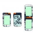
[1731] Artist: Sketch Meister | Title: Nagisa Loki's Champion Phone | Time: unknown
Pic #1731

Uploaded
Sketch Meister @ Monday, November 9th 2015, 12:15 AM
avatar
..This was a fight.

...This was every fight. T__T FRACTALS?! CHAOS THEORY?!?!

....

*SHAKES THE HELL OUT OF LOKI*
Akurei Nagisa @ Monday, November 9th 2015, 12:17 AM
avatar
I warned you dogg u 3u I warned you about his phone

It came out really well, though! >_> Everything works!

Loki: ; 3;
Mooncrafter @ Monday, November 9th 2015, 12:26 AM
avatar
Loving this phone design, and not just cause it fills me with joyful Jurassic Park feels <3

The way the fractal switches colors between the white plates and darker plates really gives it a sort of ethereal feel to it.
YoshinoSuki @ Monday, November 9th 2015, 2:22 PM
avatar
It's true, he did! D:

But it did come out great. ^ o^;


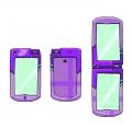
[1730] Artist: Sketch Meister | Title: Yoshino Shurensuki's Champion Phone | Time: unknown
Pic #1730

Uploaded
Sketch Meister @ Sunday, November 8th 2015, 9:56 PM
avatar
And my take on Suki's Season 4 Digivice. Seeing the Red Cross charm Suki has hanging off of it, I included the design on the phone back and interior in her color.

You can call it the Yama Cross. 8D
Akurei Nagisa @ Sunday, November 8th 2015, 10:31 PM
avatar
Pfffffff the Yama Cross. XD

The coloration scheme really fits together, though! o 3o
Mooncrafter @ Monday, November 9th 2015, 12:28 AM
avatar
http://www.youtube.com/watch?v=PInuVXgxO1g

Joking aside, the Red Cross reference in her design is really nice and I'm digging all the different shades of purple in this.
YoshinoSuki @ Monday, November 9th 2015, 2:20 PM
avatar
.......that thing lights up when she Final Charges, doesn't it. D: That streamlined Yama Head on the front is no joke, Son! NO JOKE. HAVE YOU SEEN THE IMPACT CRATER OF A YAMA AT TERMINAL VELOCITY?! D:


[1729] Artist: Sketch Meister | Title: Robyn Markius' Champion Phone | Time: unknown
Pic #1729

Uploaded
Sketch Meister @ Sunday, November 8th 2015, 9:49 PM
avatar
And my take on Robyn's Digivice. The Season 3 design was very simple in terms of color placement, so I tried to see if I could get an emblem going, the basis being the pendant that Robyn wears all the time.

The cellphone charm shaped like a coffee cup is still present, I just didn't make it on here. >_>; Same for any others.
Akurei Nagisa @ Monday, November 9th 2015, 12:19 AM
avatar
Ooooooohhhh I dig the hell out of this. o 3o The pendant mark is a really nice touch.
YoshinoSuki @ Monday, November 9th 2015, 2:18 PM
avatar
Hey.

Hay.

Listen.

That's the Lens of Truth. o:

icwatudidthar.png
Sketch Meister @ Monday, November 9th 2015, 6:26 PM
avatar
..TOTALLY UNINTENTIONAL.


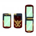
[1728] Artist: Sketch Meister | Title: Jace Allen/Ben Valor's Champion Phone | Time: unknown
Pic #1728

Uploaded
Sketch Meister @ Sunday, November 8th 2015, 4:22 PM
avatar
"Very good timing. It's still red and gold, but probably a darker shade of crimson on the main body. He's also going whole hog with the phoenix imagery, though if a lightning bolt could be added to it, then I'd be for it."

>_> This is what happens when I'm given a base idea and then given free reign of that idea.

The smaller emblem is called the Wings of Valor, and is a family emblem of the Valor family. The back crest is called Phoenix Force, and was specially made for Jace by Riiko, factoring into some of his new clothes.

>_>; Looks hella heroic. I took a few cues from Magiranger and Goseiger in getting the logos down.
Benjamin @ Sunday, November 8th 2015, 10:43 PM
avatar
Man, I really love this. Especially the Phoenix Crest and how it incorporates the lightning bolt.

It is also worth noting that the colours used are those of the Calgary Flames, Jace's hometown NHL team. Though I hear they've been sucking as of late.
Akurei Nagisa @ Monday, November 9th 2015, 12:22 AM
avatar
I can see the Goseiger influences, but given Jace's background, they work. Whole thing has a superhero/sentai/possibly even a metal hero feel. o 3o;
Mooncrafter @ Monday, November 9th 2015, 12:28 AM
avatar
Not gunna lie, with just the thumbnail I thought it made a pretty good Regulus D-Phone as well with those colors. DIGGING the hell out of the design flourishes on this.
YoshinoSuki @ Monday, November 9th 2015, 2:23 PM
avatar
I also thought it was Regulus Phone. ^^;;;

But I like how it all came out/came together. ^ 3^


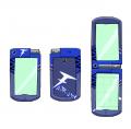
[1727] Artist: Sketch Meister | Title: Iris Karhl's Champion D-Phone | Time: unknown
Pic #1727

Uploaded
Sketch Meister @ Sunday, November 8th 2015, 3:13 PM
avatar
And another one for Season 4, Iris' D-Phone probably went the most drastic in terms of color scheme change, away from the oddly pink and gold design she had running from Season 1-3 with the bunny emblem. The last vestiges of it lie in the LoE Indicators on the side.

I also figured it was time to redo the Fairlion emblem, taking it from the overt cat theme to the more general fang theme. >_> I may have looked at Kamen Rider W for a solid letter design.
Crescent @ Sunday, November 8th 2015, 3:15 PM
avatar
I do approve of the new emblem, regardless >_>

Color scheme looks good. Fang pattern got worked in well, and it's fitting how the Fairlion emblem on back looks almost like graffiti.
Akurei Nagisa @ Monday, November 9th 2015, 12:19 AM
avatar
IRIS YOUR PHONE DOES NOT TURN INTO A DINOSAUR STOP THAT
YoshinoSuki @ Monday, November 9th 2015, 2:26 PM
avatar
ガブリンチョ! + ファング! 8D


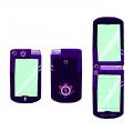
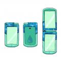
[1726] Artist: Sketch Meister | Title: Shiodamari Haruka's Champion Phone | Time: unknown
Pic #1726

Uploaded
Sketch Meister @ Sunday, November 8th 2015, 12:39 PM
avatar
And here be Haruka's version. I wanted to try out other styles of decoration like the imposed stars on Kai's phone, and figured rather than just give our glasses girl a blue toned phone, but instead show off the shifting oceanic pattern on the outer frame.
Akurei Nagisa @ Sunday, November 8th 2015, 1:45 PM
avatar
Shiny~. o 3o I like it, the sea-effect came out really good.
Crescent @ Sunday, November 8th 2015, 3:15 PM
avatar
Yeah, the ocean pattern's really cool o 3o
YoshinoSuki @ Monday, November 9th 2015, 2:26 PM
avatar
The water pattern is distractingly fascinating. I like how it came out. o 3o


[1725] Artist: Sketch Meister | Title: Mike Drayous' Champion D-Phone (Ver. 2) | Time: unknown
Pic #1725

Uploaded
Sketch Meister @ Sunday, November 8th 2015, 12:37 PM
avatar
As I said in my last comment to Mike's Digivice I would try out a lineless emblem and I think it turned out nicely.
YoshinoSuki @ Monday, November 9th 2015, 2:27 PM
avatar
I think the lineless icon looks a bit better, here, yeah. ^ 3^ Still looks like a Yellow Ranger's device. 8D (Not a bad thing!)


[1724] Artist: Sketch Meister | Title: Mishima Synne's Champion D-Phone | Time: unknown
Pic #1724

Uploaded
Sketch Meister @ Sunday, November 8th 2015, 4:37 AM
avatar
And hey! Here be Synne's D-Phone. Was interesting translating the original color scheme over to the new design, and after trying out a few combinations the white had to go.
YoshinoSuki @ Sunday, November 8th 2015, 4:40 AM
avatar
It's still more pink than I expect it to be. lol ^ 3^ Looks good, though!
Crescent @ Sunday, November 8th 2015, 4:43 AM
avatar
What Jess said XD I think you managed to make the asymetric purple and red work o 3o Good job with that.
Akurei Nagisa @ Sunday, November 8th 2015, 7:12 AM
avatar
This is really cute and very Synne, but there are not NEARLY enough Culumon scribblings on here
Mooncrafter @ Monday, November 9th 2015, 12:29 AM
avatar
That's what I said! It's not a Synne D-Phone pic without Culumon taking her messages V__V


<<PREV · [1][12] [13] [14] [15] [16] [17] [18] [19] [20] [21] [22][44] · NEXT>>