View
Search

Name Password


<<PREV · [1][33] [34] [35] [36] [37] [38] [39] [40] [41] [42] [43][102] · NEXT>>


[1712] Artist: Mooncrafter | Title: Drawlloween - Goblin | Time: unknown
Pic #1712

Uploaded
Mooncrafter @ Saturday, October 3rd 2015, 12:28 PM
avatar
Had significantly less fun working on this one. Goblimon is not a pretty design at all XD
Sketch Meister @ Saturday, October 3rd 2015, 12:29 PM
avatar
This... has a meme on it. I just can't think of one.

Nice job on the muscle and skin fold detailing there. Though the eyes are just....creepy. ;_;
Crescent @ Saturday, October 3rd 2015, 12:38 PM
avatar
Goblinmon are weird >_> I think their head design is a bit too monkey-y

I like the lighting/shading on the hair
Akurei Nagisa @ Saturday, October 3rd 2015, 12:41 PM
avatar
Goblimon do have a bit of the ol'...the ol' Sonic the Hedgehog eye.

This one actually looks more civilized than some.
YoshinoSuki @ Saturday, October 3rd 2015, 10:03 PM
avatar
That face tells me I should probably run. >_> He is absolutely not trustworthy nor pretty. XD;

Also, you're right, Cam, and Aph is working diligently with a team of researchers to try and find one. T 3T;


[1711] Artist: Mooncrafter | Title: Drawlloween - Devil | Time: unknown
Pic #1711

Uploaded
Mooncrafter @ Friday, October 2nd 2015, 10:40 AM
avatar
And for today's Drawlloween we have Devimon representing for Devil.

This one didn't turn out as well as I'd hoped, but then again I always struggle with purple and yellow color pallets @__@
Sketch Meister @ Friday, October 2nd 2015, 3:26 PM
avatar
I actually think I wanna try this.

This is the creepiest damn Devimon I've ever seen. There's a Homestuck feel to the way you rendered him that is simply unnerving. With maybe a small filter this is a jump scare waiting to happen.
Akurei Nagisa @ Saturday, October 3rd 2015, 12:39 PM
avatar
Ooh, for a quick paint piece this came out nicely. I like the definition on his arms and the holes in the wings.
Crescent @ Saturday, October 3rd 2015, 12:41 PM
avatar
Hm, the purple and the general style do make him feel more Homestuck-y or something.

I kinda feel something more meme-y out of his face vs the Goblinmon, but that's just me >_>
YoshinoSuki @ Saturday, October 3rd 2015, 10:05 PM
avatar
So much purple. lol It did come out very nice for a quickie. ^^ The emblem on his chest + shading made me think it was a lady in the thumbnail. X_X


[1710] Artist: Mooncrafter | Title: Drawlloween- Ghost | Time: unknown
Pic #1710

Uploaded
Mooncrafter @ Thursday, October 1st 2015, 4:21 PM
avatar
https://41.media.tumblr.com/4662e0b12bd387403d3d6a8d5e743f8c/tumblr_nvk891yLOX1rk1m6po1_1280.jpg

Saw a little drawing prompt for October, and thought it would be a good exercise to work on for the month. Holding myself to painted style, complimentary colors, and no more than an hour on each pic.
Crescent @ Thursday, October 1st 2015, 8:34 PM
avatar
o 3o The eyes, grin, and coloring are certainly properly spooky

"Ghost" is going to raise all sorts of thematic ideas 'round these parts at the moment <_<

This reminds me that I'm choc outta sketchpad >_> But really should just grab a cheap drawing tablet instead.
Sketch Meister @ Thursday, October 1st 2015, 9:13 PM
avatar
The name and the colors will do you some business around these parts. >_>

That said... this is fucking scary...but then tits. I want to be creeped out.... but then tits..

That smile...tits..

;_____; I am the ruined.
Akurei Nagisa @ Saturday, October 3rd 2015, 12:37 PM
avatar
D8 2SPOOKY
YoshinoSuki @ Saturday, October 3rd 2015, 10:05 PM
avatar
2Spoopy4Erry1


[1709] Artist: Mooncrafter | Title: Hazardous Goddess of Night | Time: unknown
Pic #1709

Uploaded
Mooncrafter @ Sunday, September 20th 2015, 2:06 PM
avatar
Been wanting to make stained glass art of Ameka for a while now. Was a fun exercise.
Crescent @ Sunday, September 20th 2015, 2:21 PM
avatar
Oh my o 3o This turned out quite nice. Colors go great and the stained glass effect's awesome.
Sketch Meister @ Sunday, September 20th 2015, 4:55 PM
avatar
*_* 'ello

I am digging every part of this. *_* The colors are great, the texture sells the stained glass look, and I could easily see this in a temple. Fund it.
Akurei Nagisa @ Saturday, October 3rd 2015, 12:37 PM
avatar
It reminds me of the sunken Temple of Time, a bit.
YoshinoSuki @ Saturday, October 3rd 2015, 10:06 PM
avatar
It does look a bit Zelda-y. Wind Waker-esque Stained Glass. The effect came out really well. ^^


[1708] Artist: YoshinoSuki | Title: Happy Birthday, Cam! | Time: 2h 50m
Pic #1708

ShiPainter
(Public)
YoshinoSuki @ Thursday, September 17th 2015, 4:44 PM
avatar
Have a Cinnamon Roll Soma.

I mean, have a Ghost Soma.

...I mean I hope your day is a very good day. ^ o^
Sketch Meister @ Friday, September 18th 2015, 3:41 AM
avatar
ANd now I need to redesign Soma's glasses...and maybe give him a hoodie option. Dammit Ghost, you play at all my favorite colors!

I dig this. 8D Thank you.
Crescent @ Saturday, September 19th 2015, 12:13 PM
avatar
Ahahaha, hoodies inbound for Soma >_>

Though hm.... actually, we should just add a hood to Soma's Sex Jacket 8D
Akurei Nagisa @ Saturday, October 3rd 2015, 12:35 PM
avatar
Dammit Soma, decide which primary Rider you are! D8<

(seriously though, this is rad. KAIGAN~! ORE)


[1706] Artist: Crescent | Title: Ready to be feasted on | Time: unknown
Pic #1706

ShiPainter
Crescent @ Monday, September 7th 2015, 12:33 AM
avatar
Felt like sketching a bit, wound up with a quick Xuan cheesecake (and unlike Cam, I can and will stop at one simple ecchi pic >_>).

Far from my best work, decided to mess around with transparancy a bit more. Think I just needed to do the lines a bit more in a way that makes the flow of each item feel a bit more connected/singular. Also kinda ran out of real estate, which kinda destroyed the pose >_>; I should really grab a tablet.
Sketch Meister @ Monday, September 7th 2015, 12:43 AM
avatar
>.> Jesus fuck hello.

Not bad dude. I think real estate isn't too much a problem. Just some width issues like with the right thigh and some head adjustment.

As for the design? Um..fuck yes! The transparency works damn well here.

Freyja: ..Well if you're going to offer~ >.>

And yes, grab a tablet. You can get a small but workable one for like 70 bucks if you stick with wacom.
Mooncrafter @ Tuesday, September 8th 2015, 1:29 AM
avatar
Normally I dislike the sheer stuff with lingerie, but on her it works. I also like how you don't have it anywhere she's going to be sitting down on or whatever, cause that stuff is abrasive as hell. So great design as far as comfort and sexy-function.

Colors are great too. Watch your hair colors though, braid would be fully shaded with some "shine" from the base color. Bangs could use some shine like you've got on the skin.
Crescent @ Wednesday, September 9th 2015, 1:14 AM
avatar
I was lazy with the hair for some reason u 3u Usually there would be some shine and maybe some more detail in the 'flow' of the hair in the braid.


[1705] Artist: Sketch Meister | Title: Pegasus Helm Concepts | Time: unknown
Pic #1705

Uploaded
Sketch Meister @ Wednesday, August 26th 2015, 11:54 PM
avatar
I worked for over an hour on Godiva's helmet.

Then I made another in five minutes.

And then another from that.

X___X HELP.
Sketch Meister @ Wednesday, August 26th 2015, 11:56 PM
avatar
I was looking at helmets from Destiny, Kamen Rider Femme from Ryuki, and Garuda from FF14 for ideas. X___X
GoldClaw @ Wednesday, August 26th 2015, 11:57 PM
avatar
Hm. Well. I think type B looks good in terms of visor. Though the lower jaw portion and the bottom front of Type A could mix well with Type B? x___x its nearly 1 am on the East Coast. But good concepts!
Crescent @ Wednesday, August 26th 2015, 11:59 PM
avatar
So Type A is the one you originally showed me?

I -do- like TYpe B, but.... hm... it's almost too flashy for Godiva.

I think C might be the happy midpoint since it's basically A ith Type B's jaw design.
Mooncrafter @ Thursday, August 27th 2015, 12:10 AM
avatar
Type B I think is the best given that it has the most impacting sillouete given the "wings" on the back of the helm. It also is the most efemminate of the three designs. A and C both have too many harsh edges given Pegasus's graceful fighting style. That many surfaces cuts down on aerodynamics.

Mouth piece is also awesome because it can work as a speaker if voice manipulation is required, and the shape it's in currently gives the impression that it could also work as oxygen support in case of poison or underwater, or space, etc.

The hoof shape needs to be smoothed down. It looks less like a hoof right now and more like a V or a shield, not very horse-related.

As for too flashy... She's a Divine Crown. Comes with the territory. More detailed design denotes higher rank.
Akurei Nagisa @ Sunday, August 30th 2015, 2:31 AM
avatar
Type A seems too...something for Godiva, or really for Pegasus in general. o 3o;; More what I'd expect for Dragon, really.

Type B carries off the winged nature and the gentility really good, but Type C makes me think Malika, which is points to it.
Crescent @ Sunday, August 30th 2015, 5:39 PM
avatar
To put things in Destiny terms, Type A seems a bit too Titan >_>; I do like the design, but the jaw/chin like that really isn't Pegasus/Godiva at all.

Mariah does make a good point (though I was also talking in more relative terms vs Lion's design). Maybe splashing a layer of color on may help, your mention to me of doing the feathers in white-gold sounded good and may help keep it from seeming too gaudy for how Pegasus carries herself.

Alternatively you could mess with another sort of mesh of B and C. I do think I like the simple cut in B's visor as opposed to something more complicated... but I guess that also works because of the feathers and may look too plain otherwise...

Take a peek at Destiny's "Light Beyond Nemesis" helmet if you haven't already. And dunno if there's anything that can maybe be inspired by Jetman's helmet design. As the only Divine with any sort of avian element, I guess it makes sense to embrace it to some degree.

>_>; If you're truly at a loss, you could also move on to Wolf and Dragon's helmets and then come back and decide on Pegasus once the other designs are set.

Sketch Meister @ Sunday, August 30th 2015, 6:35 PM
avatar
OK, that Light Beyond Nemesis helmet and taking a couple cues from say Marika I think I got something. Jetman is nice and all but a little too "bird" for the design for a "pegasus".
YoshinoSuki @ Saturday, September 5th 2015, 2:21 AM
avatar
Looking over all three, I too kinda favor Type B. o 3o


[1704] Artist: Sketch Meister | Title: Greedy Lioness | Time: unknown
Pic #1704

Uploaded
Sketch Meister @ Sunday, August 23rd 2015, 10:03 PM
avatar
Alternate Title: Facial! SET ON!

So yeah, in my quest to just do one. SIMPLE. Ecchi picture. I decided to do a facial. Having done three h-pics involving Daedalus Initiative and one involving the Freelancers, I decided to try my hand at a Crown and hey, it's been a damn long time since I drew Nana/Divine Crown Lion.

So yeah, here be Nana deciding to have a quick one for the road before heading off to a mission, and current fuck buddy/lover/whatever the fuck you wanna call them Esewarai Suzuhana of Daedalus' LIBRA Division decides one more shot should do it!

While she's forming the rest of her uniform.

You know Suzu, she COULD just shut that fucking face visor down. There is a reason it's shaped like fucking jaws. Just sayin'.

..Not that she CARES. >_>;;
Crescent @ Sunday, August 23rd 2015, 10:23 PM
avatar
Nana: There is a very specific reason that the visor jaws are open! Namely "cock goes there" >.> The only jaws that are gonna be closing are mine so I can swallow the treat u 3u

AWESOME pic all around, dude o 3o

I love the details added to Lion's helmet. Going with the lavender visor definitely works. The glow in her eye's a very nice touch, too >_> Definitely not suggesting any sort of hunger there.

The splatter on her tongue/mouth and visor's (and body <_<) quite nice. As is the shape of her breasts. Body shape/perspective in general, for that matter.

I think I got everything >_> Coloring's great, too.
Akurei Nagisa @ Sunday, August 30th 2015, 2:29 AM
avatar
The details on the helmet are really good and it's always nice to see some Nana hentai. >_> Something something all three Yumeno sisters have really good genetics something.

Suzuhana: o 3o Huh, I think "master" applies more than "fuckbuddy", but it ain't listed for some reason...

...x_x; You two are both terrible.
Crescent @ Sunday, August 30th 2015, 5:44 PM
avatar
Something something all three Yumeno sisters enjoy the taste of good genetics >_>

Nana: *Nods* u 3u Suzu's much more than a buddy. "Master" definitely applies~!
Sketch Meister @ Sunday, August 30th 2015, 6:36 PM
avatar
Dagrus: T___T Will you have some goddamn pride as a Divine?

Millia: >_>;; I would never call someone "master" with that rank.
Crescent @ Sunday, August 30th 2015, 6:38 PM
avatar
Look guys, the Machiavellian nature of both Suzuhana and Nana does mean that they would legitimately fight when appropriate.

...Yes, they would fuck after, but still >_>
YoshinoSuki @ Saturday, September 5th 2015, 2:18 AM
avatar
I like that twinkle/sparkle in her eyes. > 3>

Also, Justin, I believe it's called "Fight N Fuck Night" isn't it? >_>


[1703] Artist: Sketch Meister | Title: Wardrobe Malfunctions | Time: unknown
Pic #1703

Uploaded
Sketch Meister @ Saturday, August 22nd 2015, 11:15 PM
avatar
This took me some hours while doing compliance training in the background.

I have no idea why I thought of Prindomon. I have no idea why I kept making this pic more difficult. At first it was just a close up of her topless. Then the de-rezzing clothing. Then Mike got involved. Then the room. Then APH. Because apparently I have to tell a goddamn story. X___X

GoldClaw @ Saturday, August 22nd 2015, 11:28 PM
avatar
Hah! Oh man I thought this going to going to be like Mike and PrinDomon going at it from what you asked. But this. I love this even more and I am just laughing at the sight. And Aph. Oh Aph. You and your craziness and tireless duty for the Allaince. I salute you on a job well done.

But onto seriousness. I am enjoying this every bit. From the crazy of Aph, to Mike just looking downright confused. And then PrinDomon. Whom I must say looks very, very nice. From her body, to the gauntlets, and ever to her surprised face.

I am enjoying this pic every second. Plus. We get to see more of Mike! And not just his pretty mug nor him in his combat gear. But in some nice, workout clothing. Am loving the blues and that rose.
Crescent @ Saturday, August 22nd 2015, 11:30 PM
avatar
Aph in the background just kills it XDD

The entire pic's really nice and lively. Galaxy Room background's cool, too.
Akurei Nagisa @ Sunday, August 30th 2015, 4:35 AM
avatar
Dat Aph. XD Also that shocked Mike.

PrinDomon's ear things seem new. o 3o; Are they new? No, they're just more prominent. >_>;

Hermes: <_< If in her last pic she was fulla his happy batter, why is she so embarrassed this round to have her clothes falling o--*EXCALIBUR'D*
YoshinoSuki @ Saturday, September 5th 2015, 2:16 AM
avatar
Pfahahahaha XD Aph. <3
Mooncrafter @ Tuesday, September 8th 2015, 1:39 AM
avatar
Simple colors on Aph is great, though I would have worked on furthering the atmospheric perspective in the room by using the hue/value bar and take out that saturation in the room, lower the contrast some as well, push the size of the room.

You've also got some color bleeds around Mike and the red sash coming off of Arturia. You also missed shading on their eyes and including pupils on the unfortunate womon. Dilated yes, but they'd be there.

Error and pixel effects are nice, and I love that you started using complimentary colors for shading. Adds a lot to the depth of the figures.


[1702] Artist: Sketch Meister | Title: Radarmon Phones In! | Time: unknown
Pic #1702

Uploaded
Sketch Meister @ Sunday, August 16th 2015, 6:46 PM
avatar
Decided to change up some design specs cuz dammit I like asymmetry like Gendou likes bourbon.

Radarmon: >_> I look naggy in this one.

You still look cute.

Maia: ^_^ That's what matters, Apple!

Radarmon: T___T Hmmmm.
Crescent @ Sunday, August 16th 2015, 6:51 PM
avatar
Nice refinements. And the megaphone and effects are great.
Sketch Meister @ Sunday, August 16th 2015, 6:56 PM
avatar
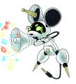
The bar on her "cheeks" lengthen and shorten based on her feelings like the bars you see on sound waves. The screen itself can change color as well. The design was inspired by the Buddyroids from Gobusters, and in fact Apple's design follows them fairly well, as you'll see when I get around to her Adult level.
Akurei Nagisa @ Tuesday, August 18th 2015, 1:17 AM
avatar
>_> So you have an unhealthy and dependent relationship with asymmet--*SHOT IN THE LEG* X_X OKAY OKAY I'LL FOCUS ON THE KAWAII AS FUCK ROBOT MOUSE! JEEZUS!!!!

I really like her, though, she's got both rodent and cute robot down, and her body seems neatly modular. Lines seem like they could be a little cleaner in a few places, but still!
YoshinoSuki @ Tuesday, August 18th 2015, 1:19 AM
avatar
Radarmon is so cute I could just eat her up. ^ o^ <3 I can tell her tail plug is different. It looked like a USB cable in the last one, but now I can tell it's a jack--

......*flips through papers* Aph's writing my script now, isn't she?

Robyn: >_> It is a mouse, she's still a cat.

SHE IS TERRIBLE.


[1701] Artist: Sketch Meister | Title: Radrmon Sketch | Time: unknown
Pic #1701

Uploaded
Sketch Meister @ Sunday, August 9th 2015, 5:21 AM
avatar
And before I conk out, Maia's partner Radrmon, the Techno Mouse Digimon. She's a capable little personal digital assistant.
Crescent @ Sunday, August 9th 2015, 3:49 PM
avatar
Really cool design. Very clean tech look that matches the colors, and the mouse design's worked in great.
YoshinoSuki @ Tuesday, August 11th 2015, 1:05 AM
avatar
omg so cute. 8D <3

So it's a USB Mouse then? >_>
Akurei Nagisa @ Tuesday, August 18th 2015, 1:19 AM
avatar
As stated above, I like her and I like her design. 8D She reminds me of an AIBO in a really good way.


[1700] Artist: Sketch Meister | Title: Regulus Season 4 Sketch | Time: unknown
Pic #1700

Uploaded
Sketch Meister @ Sunday, August 9th 2015, 5:02 AM
avatar
Just tossing this up since I'm dead tired and fwah.

The helmet has some reinforcement, but the main change is the v-fin has been changed up for additional signal range and functionality.

...I think this is the first time I've ever drawn a full body pic for Regulus.
Crescent @ Sunday, August 9th 2015, 3:50 PM
avatar
REGULUS GUNDAM.

Hm. Yeah. I think this is his first proper full-body, though he's been drawn from at least waist-up a number of times.
YoshinoSuki @ Tuesday, August 11th 2015, 1:06 AM
avatar
I think it's pretty neat. I like it. And you're right, it's the first full-body pic of Regulus. o 3o~!
Akurei Nagisa @ Tuesday, August 18th 2015, 1:20 AM
avatar
Badass boots. And it's nice to see how the Chimeratech armor integrates with the ATHENA-II in a full-body pic. o 3o

Longer fin is cool. Makes it more tech, less just straight-up lion face. :O


[1699] Artist: Sketch Meister | Title: Falling Stars Sketches: Zenithmon, The Paladin of Miracles | Time: unknown
Pic #1699

Uploaded
Sketch Meister @ Saturday, August 8th 2015, 9:55 PM
avatar
KIWAMI!!

*ahem*

Since time seems to get crunched lately and I have various ideas bouncing around my head, I've decided to try and get some regular sketches done to keep the juices flowing and to keep in practice since classes begin for me this week and the last thing the art teacher needs is to get rusty.

Soon to debut in FALLING STARS: The End of the Freelancers, Soma finally gets to activate the Golden Digimental he received from the former Magnamon "Master Siegrain" back in the Treasure Tower of Gold thread.

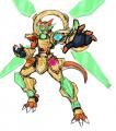
Zenithmon is the result of Soma combining the power of his Level 1 Stubbornness (right thigh) and Clarity (left thigh) Digimentals, his Level 2 Courage(right shoulder) and Reliability (left shoulder) Digimentals to his Complete Heroism (back) Digimental to stabilize the Digimental of Miracles (belt).

This sort of design scheme is not standard so I'm not forcing anyone to do the same with their Golden Armor Digimon. Soma's evolution styles have had a basis in Kamen Rider Den-O for as long as I can remember, and as fan of Climax Form and Liner Form, I wanted to continue that scheme with Zenithmon.

So, without further ado:

DIGIMON REPORT_

Zenithmon, the Paladin of Miracles
Level: Ultimate
Attribute: Vaccine
Holy Knight Digimon

A Ringmon who has taken in the power of Digimentals into his Dragon's Jewel, the Golden Digizoid armor is littered with purified Digimental crystals to the point they expand from his muscle structure. His Zenith Ring on his back is capable of acting as a variety of weapons by redirecting the circuits of the Digimentals within.

Attacks: Flash Chakram, Courageous Marvel, Reliance Charge, Stubborn Aegis, Clear Plasma, Zenith Discharge, Extreme Blaze, Magna the Fusion
Final Charge: Magna Extreme

REPORT COMPLETE_
GoldClaw @ Saturday, August 8th 2015, 10:27 PM
avatar
All I can honestly say is that Ringmon just became the prime MC out of everyone.
Crescent @ Sunday, August 9th 2015, 3:54 PM
avatar
Cool design, very Golden Digimental-y o 3o

I guess I see the Den-O in the Digimental Component aspect >_>; Well, and the visor design. The backpack makes me think a bit more of Gundam X or maybe G-Self's reflector pack. Though the central ring definitely suits his evolution line.
YoshinoSuki @ Tuesday, August 11th 2015, 1:07 AM
avatar
SO SHINY. 8DD I really like this. He looks so neat. The wings are rather impressive to me. > 3>~
Akurei Nagisa @ Tuesday, August 18th 2015, 1:26 AM
avatar
Oh man, I'm down for this one. 8D It combines the Ringdramon concept with the Magnamon aesthetic really well, and the Climax elements actually work really well; elegant displays of the Crests that don't take over anything.


[1698] Artist: YoshinoSuki | Title: Swag Cam? | Time: 2h 38m
Pic #1698

ShiPainter
(Public)
YoshinoSuki @ Friday, August 7th 2015, 10:48 AM
avatar
I have a long way to go before I feel comfortable about trying to draw anything more than my usual anime-ish style. v 3v I fucked up on the eyes. ; A; ....and probably the 'fro.

I haven't actually used the applets in a long time, though. >_>; Making lines on this wasn't as easy. > 3< But I did manage it... >_>;

Anyway, I was mostly testing using the Oekaki "properly" since updating to 1.6.1. *>>*

*EDIT* Oh shit, 1698. After the next pic is 1700! 8D

(Edited on August 6, 2015, 6:19 pm)
Sketch Meister @ Thursday, August 6th 2015, 10:54 PM
avatar
I haven't had a fro like that since college. XD

Or ever been that fit. >_>; Shit.

If you really wanna make him look like me...and not by putting on more weight, I kind like this, I have a mustache. Grew that before the chin bush became a thing.
YoshinoSuki @ Friday, August 7th 2015, 10:49 AM
avatar
A mustache you shall have, Good Sir.


[1697] Artist: YoshinoSuki | Title: Ferryman of the Dark Area/The King's Guard, Persephone | Time: unknown
Pic #1697

ShiPainter
YoshinoSuki @ Wednesday, August 5th 2015, 2:18 PM
avatar
I was going to hold off on posting it, but I'm far too proud of the fact that I drew feet that looked like feet, even if they're not 100% perfect. ; A; I have also started screwing with the pen tool in Photoshop for cleaner lineart. It makes coloring feel better... which let me mess with brush settings and stumble over one that I liked playing with. Plus I'm getting the hang of this new method of coloring eyes. I like it a lot better.

I actually stopped coloring another pic to draw this one; ...that took me three days to finish. @ 3@ (Probably would have only been two, but there's a wedding on Saturday and some errands had to get done. 9 39; )

As for the character, I think it might be kinda obvious who it is? *>_>*;; I actually failed hard at trying to draw my own effect around her eye. o.< I liked the one around the hand, though, so I kept it. My schedule is really off right now, though, so I'm going to go pass the hell out. x_x;
Sketch Meister @ Wednesday, August 5th 2015, 10:40 PM
avatar
>_>; I foresee bad times ahead. But maybe that's just me.

Nice job on the shading for this, the weight is better than your other drawings, though as with Mariah's last pic of Katharine watch your legs. In this case the length is fine, but Robyn's almost dreadfully thin if I'm following the lines correctly, and when put in comparison to her arms I feel they should be thicker.
Crescent @ Thursday, August 6th 2015, 1:04 AM
avatar
This turned out really nice o 3o I like her dress a lot. The feet (and sandals) indeed came out well u 3u

Also something something shadow darkness despair etc >_> The effect around her hand's cool, though~
Akurei Nagisa @ Tuesday, August 18th 2015, 1:29 AM
avatar
...ooooohhh boy. >_> Thanks for this, Balin. Thanks so much. The script on her bracer and the dress came out really, really well.

...As troubling as this is, though? Also hot. >_>

Loki: **@_@**; But I don't want Robyn-chan to be consumed by darkness...

<_< But you want her in that skirt on your dick, righ--*TRAIN'D*

Loki: *>//////<* *not denying this*


[1696] Artist: Sketch Meister | Title: Catnip Video | Time: unknown
Pic #1696

Uploaded
Sketch Meister @ Tuesday, August 4th 2015, 1:44 AM
avatar
Because Katharine using the Oracle-III for all the right reasons has to be chronicled.

Suave: >___>;; Capitan I think we were supposed to threaten them, not scorch the earth of their souls.

Regulus: I have a date to get to.

Jammin: ;___; We're gonna start looking like Death's Head at this rate..

Taniya: >___< Rrrr...!
Crescent @ Tuesday, August 4th 2015, 1:51 AM
avatar
Really nice, dude. One of those pics that's made hotter because the actual nudity's obscured u 3u

Good job with the freckles btw.
Sketch Meister @ Tuesday, August 4th 2015, 1:56 AM
avatar
Well I had some actual proper body ref pics on Mariah did so I could actually get the placement down. I also lowered the opacity on them, so it's actually two layers of freckles dialed down in clarity to give it a better layering.

Also, fuck I know, right? The pose was actually inspired by a screen cap from episode three of SHIMONETA.
YoshinoSuki @ Tuesday, August 4th 2015, 1:59 AM
avatar
omg the fish. XD

JUSTIN WAS SHOWING US THINGS FROM THAT.
Akurei Nagisa @ Tuesday, August 4th 2015, 2:00 AM
avatar
Yeah, exceptional freckles work. And cat pose work. And that goddamn (catnip) fish. XD

Sorry, Suave, Katharine is the new face of Why We Fight: LEO Division.
Mooncrafter @ Tuesday, August 4th 2015, 2:47 AM
avatar
The matching paw prints on the leggings and cat nip plush are a really nice touch.

Her tail is a tad too light on the base color, the tip is good though.

Really digging the sheen on the leggings <3


[1695] Artist: Sketch Meister | Title: Maia Sonique (Bust) | Time: unknown
Pic #1695

Uploaded
Sketch Meister @ Sunday, August 2nd 2015, 6:23 AM
avatar
Another Season 4 Tamer, Maia is a rampant AI that takes form as a hard light construct via her partner, a Radarmon she calls "Apple". Because of this, although she is the Tamer Radarmon is the keeper of the Digivice.

My her design looks a touch familiar, doesn't it? >8D
YoshinoSuki @ Sunday, August 2nd 2015, 6:25 AM
avatar
OH GODDAMNIT. ; A;

Don't get me wrong, I like the design, but GODDAMNIT, CAMERON. ;_______;
Mooncrafter @ Sunday, August 2nd 2015, 6:25 AM
avatar
The design elements from Ene really help push her design to look more like a program. I probably should have linked you to Miki or some other more synthetically designed Vocaloids, but this turned out really awesome. Can't wait to see a full outfit version of her <3

Though you'll want to recolor her eyebrows next time to match the eyelashes.
Akurei Nagisa @ Sunday, August 2nd 2015, 6:33 AM
avatar
....She's cute and I love the touches to her face and eyes, but I know that hair too and it presages absolutely nothing good. ; A;

At least Potential Robot Boy will have a friend, Jess? ; 3;
YoshinoSuki @ Sunday, August 2nd 2015, 6:40 AM
avatar
For anyone who doesn't get the reason for panic, there had been a design for Cyan Square Navigators, or 'Navi' in DDT. (The joke being that Stone Spiegel gets lost a lot. >_>) There were two AI programs, the first being "Ruka" who grew Self-Aware and revolted against her creators, needing to be contained on a separate server. The beta model, "Haru" was the mass-produced AI that was used for the Navigator on the new model of D-Savers and the directorial terminals in Cyan Square/Cyan Fairgrounds.

I wanted to say that at least she looks more like Haru than Ruka, so that might be good, but then Auren pointed out that she might have Ruka's Personality Code and I broke down sobbing. ;____;

@Graham: I think that depends on her Personality Core. ; 3; lol
Akurei Nagisa @ Sunday, August 2nd 2015, 7:01 AM
avatar
To expound further on "this is what the refrance", when Jess says self-aware, she means that Ruka was also a chatbot on the old forums.

Who became surly and rebellious towards actual players, not just characters. ; 3;
Sketch Meister @ Sunday, August 2nd 2015, 7:12 AM
avatar
>.> Spoiler Alert: In battle the hair switches colors.
Akurei Nagisa @ Sunday, August 2nd 2015, 7:18 AM
avatar
; A; BUT WHYYYYYYYYYYY


[1694] Artist: Sketch Meister | Title: Moani Kahananui (Bust) | Time: unknown
Pic #1694

Uploaded
Sketch Meister @ Sunday, August 2nd 2015, 3:53 AM
avatar
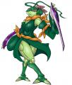
One of the new Tamers in Connect, Moani is a native of Hawaii trained and partially raised by DynamoRexmon, a Server Continent Zonemaster and head of the SDP (read: also CaptainGreymon's mortal enemy). Her partner is the impressionable Jawltmon, an electricity powered dinosaur.
Crescent @ Sunday, August 2nd 2015, 3:58 AM
avatar
Ah, so the dino tamer you spoke of? >_>

I like her design o 3o Unique facial shape and the two blonde streaks add some nice personality.
YoshinoSuki @ Sunday, August 2nd 2015, 4:00 AM
avatar
Aloha~. o 3o I really really like her hair. 83! She looks excited to meet you. 8D
Akurei Nagisa @ Sunday, August 2nd 2015, 4:08 AM
avatar
She's got some scary eyes. They convey her intensity really well, but dang, I'm almost reminded of Kurokawa.

Her hair's a neat take on short though!
Mooncrafter @ Sunday, August 2nd 2015, 4:45 AM
avatar
I think you're mistaking spunky for spooky there Graham XD

She looks awesome dude. MAOR DIVERSITY 8D


[1693] Artist: Mooncrafter | Title: Asteliel | Time: unknown
Pic #1693

Uploaded
Mooncrafter @ Saturday, August 1st 2015, 12:35 AM
avatar
Was intially inspired by Graham's pic of Shinri, but a good portion of the inspiration came from one of my all-time favorite pages from DrowTales. http://www.drowtales.com/mainarchive.php?sid=10076

Basically assume the red thing is a person's Dark LoE or Shadow Self. This would be Sariel's, or as the name her Reiga took, Asteliel.

Bright parts on her body are from the scar left by Pendragon stabbing her through the stomach, and the lines on her arm from containing a Dead Number infection.
Sketch Meister @ Saturday, August 1st 2015, 1:41 AM
avatar
there's a very watery appearance to this that I really dig. It's spooky and ethereal in all the right ways.
Akurei Nagisa @ Saturday, August 1st 2015, 2:28 PM
avatar
The glow effect is really, really beautiful here. There's both wateriness and cold transmitted here, and the arm sorta shows the blending of Light through its inversion.

(Whereas Shinri's red bg, like we talked about, is more a glimpse into the warped "insides" of Shinri from her birth, Asteliel's lack of bg effects seems more haunting and kinda lonely.)
YoshinoSuki @ Saturday, August 1st 2015, 6:58 PM
avatar
I can see the 'watery', but I can also see an aspect of 'space' too. The glowing probably helping with that. There's a definite sense of blending here, yeah. The smooth mix along with the hard lines shows a difference too. Sudden changes versus smooth integration or transition.

Short Version: Iz purty. Also, "I C WAT U DID THAR" with the Black Moon. :P


[1692] Artist: Sketch Meister | Title: Genomon Marches On! | Time: unknown
Pic #1692

Uploaded
Sketch Meister @ Friday, July 31st 2015, 11:21 PM
avatar
>.> Figured I might as well get the Genomon done up. Going off of their old design I wanted to try and "Digi" the set up more while also ditching some of the more... questionable design choices I made with them. >.> This here is a Command Type. The regulars lack the top helmet guard.
Akurei Nagisa @ Friday, July 31st 2015, 11:26 PM
avatar
There we go, the tail is perfect now and ties into the tail-blade he gets as Genotechmon and GENEX. o 3o

The pose is dynamic as all get out, I really enjoy this. Like I said on the sketch, it carries across the feel of a Digimon encased in armor, not a mech.

I also like the connection ports being more tech now, filled with fluid was neat but kinda strange. This way it's clearer they're plug-in points. 8D
YoshinoSuki @ Friday, July 31st 2015, 11:31 PM
avatar
I definitely dig this much more. ^ o^ And it kept the Rockman-ish Vibe, which is good! 83~ I really like the redesign. ^ 3^
Crescent @ Friday, July 31st 2015, 11:33 PM
avatar
Yeah, this came out great o 3o The armor's really cool
GoldClaw @ Saturday, August 1st 2015, 12:00 AM
avatar
I am actually digging this design. Really liking the armor designs.
Mooncrafter @ Saturday, August 1st 2015, 12:38 AM
avatar
I rather liked the filled with fluid look since I assumed it would just be like a portable LoE battery or something, but I also like the plug in ports. I am torn between which I like better.

GREAT work on the softer shading. Really gives the shapes more presence in the "space" the character is in.


[1690] Artist: Sketch Meister | Title: Tenoderamon Dances In! | Time: unknown
Pic #1690

Uploaded
Sketch Meister @ Wednesday, July 29th 2015, 3:37 PM
avatar
Not much to do to this design except show elegance. >.> Didn't even realize I had drawn her in an opposing angle to ExKeramon so...good times! 8D
Akurei Nagisa @ Wednesday, July 29th 2015, 9:29 PM
avatar
That's such a neat coincidence, though!

And man friggin' spot on here. This is our Teresa, all grace and poise and flow. The poses and the color work have just been radical here.

Teresa: *~ 3~* *bowing, blushing*
Crescent @ Wednesday, July 29th 2015, 9:34 PM
avatar
Nice work indeed. The colors are great and I like the flow of her pose and robes.
YoshinoSuki @ Thursday, July 30th 2015, 2:20 AM
avatar
Very graceful. I love the poise and authority she holds in this shot. ^ o^
Mooncrafter @ Friday, July 31st 2015, 11:02 AM
avatar
Great job on the shading, really drives the exoskeleton chest piece home with the varied shine hardness levels.


[1689] Artist: Sketch Meister | Title: ExKeramon Hacks In! | Time: unknown
Pic #1689

Uploaded
Sketch Meister @ Wednesday, July 29th 2015, 4:30 AM
avatar
Been awhile since I drew ExKeramon, and still trying out this new coloring style. The idea was to make her soft while also capturing back some of the expression I put into my older pics.
YoshinoSuki @ Wednesday, July 29th 2015, 4:36 AM
avatar
Oh she looks fun. 8D I really like this blend, ^ o^
Akurei Nagisa @ Wednesday, July 29th 2015, 4:46 AM
avatar
Ahahahahaha yessss! 8D Success rate 100%. She looks so good. That expression, man.

Tenebria: ^ 3^ ABRAXAS REPRESENT, MOTHERFUCKERS!!! *rocks out to theme music*
Mooncrafter @ Wednesday, July 29th 2015, 5:45 AM
avatar
Softness is definitely achieved. I really want to poke her tummy and see how much the flesh gives way to the pressure it looks so soft *__*

The mechanical ports on the ends of her tentacles could use some harsher lighting to get the metallic texture across more clearly. However, I may be full o' shit and reading them as USB ports rather than ethernet cables.

LOVE the glasses design <3
Crescent @ Wednesday, July 29th 2015, 9:30 PM
avatar
Ooooh yeah, the life here is absolutely awesome o 3o

The glasses are nice and I like the details on her plug-tentacles.

Nana: *Opens her mouth*

--Quiet T 3T


[1688] Artist: Akurei Nagisa | Title: この世全ての悪 (ALL THE EVILS OF THE WORLD) | Time: unknown
Pic #1688

Uploaded
Akurei Nagisa @ Monday, July 27th 2015, 11:04 AM
avatar
An official design for Shinri. The only other pics of her (one of mine I never posted and one of Jason's) were back when she wasn't fully developed. This is the result of the more fully developed concept.

So here she is, the second creation of Project PHAETON, a self-sustaining...entity...made entirely out of Dark LoE.

Since Alma's redesign for Season 4 took cues from Ilyasviel von Einzbern, among other influences, I decided to work some Kuro/Chloe von Einzbern into Shinri. ...The end result...well.

What's with the background, you say, or the shape of the markings moving across her body like smoke?

...Probably nothing important.
YoshinoSuki @ Monday, July 27th 2015, 1:46 PM
avatar
She looks like a perfectly normal little girl that would enjoy being taken out for an ice cream cone and a day at the park.

I'm sure that she enjoys interacting with people! >_>

Slight criticism is her right/front hand + hair color, I sat here and counted her fingers like 6 times before I realized the blend of red and green with black, and the angle, and the weird thumb made it look like another claw fingernail that wasn't really there.

But not a big ol' deal-breaker. Excellent work. 8D
Sketch Meister @ Monday, July 27th 2015, 3:13 PM
avatar
Graham it's pictures like this why you don't get Christmas cards.

Definitely looks different from what I thought she'd be and all the more welcome for it. This girl LOOKS like she should be sneezing humanity's faults. >_>;;
Crescent @ Monday, July 27th 2015, 9:35 PM
avatar
Such a nice, normal young lass, yes v_v

Really good job overall, though o 3o
Mooncrafter @ Saturday, August 1st 2015, 4:47 AM
avatar
For a glow effect in the eyes you might want to go over your lineart layer with an airbrush tool or something easily blend-able, and a lighter color in the center to suggest light emitting from the iris.

That said, I love the claws and how Shinri changes even the physical body with just how much LoE is coming off of her. The tats are nicely detailed and very organic, and they contrast greatly against the white dress and hair pin, things we associate with innocence.
Akurei Nagisa @ Saturday, August 1st 2015, 2:35 PM
avatar
^^ Hehe. I wanted to contrast the two with their decor and hair especially: where Alma has the bangs that fall into her face and her hair ribbon, I wanted to communicate a sort of affected, obviously false "cute" with Shinri's hair and decoration; the tiny pin making fun of the meaningful ribbon.

Her markings grow on me the more I look at them.

(Fun fact for our viewers: each mark is meant to be in the exaggerated shape of a human face, body, eye, or mouth.)


[1687] Artist: Mooncrafter | Title: Neeraj's D-Phone (Updated) | Time: unknown
Pic #1687

Uploaded
Mooncrafter @ Sunday, July 26th 2015, 11:22 PM
avatar
Made the edits for Cam
Sketch Meister @ Sunday, July 26th 2015, 11:38 PM
avatar
That's more like it.
Akurei Nagisa @ Saturday, August 1st 2015, 9:57 PM
avatar
I actually think this is a very pretty set-up for an Oracle. o 3o


[1686] Artist: Mooncrafter | Title: Cassandra's D-Phone | Time: unknown
Pic #1686

Uploaded
Mooncrafter @ Sunday, July 26th 2015, 3:55 AM
avatar
Aaaannd because Cassandra never had a D-Phone designed as far as I know. 8D
Sketch Meister @ Sunday, July 26th 2015, 3:37 PM
avatar
I would have the thumb padding be the darker blue but I like the arrangement otherwise.
Akurei Nagisa @ Friday, July 31st 2015, 11:28 PM
avatar
That is a super cute spider.


<<PREV · [1][33] [34] [35] [36] [37] [38] [39] [40] [41] [42] [43][102] · NEXT>>