View
Search

Name Password


<<PREV · [1][37] [38] [39] [40] [41] [42] [43] [44] [45] [46] [47][102] · NEXT>>


[1607] Artist: Akurei Nagisa | Title: Agito Mizuru -- "The Bare Necessities" | Time: unknown
Pic #1607

Uploaded
Akurei Nagisa @ Wednesday, March 18th 2015, 10:16 AM
avatar
MILF WEEK 2015 -- PIC #2!

Alternate title: "Swiggity Swooty, Mizuru Gonna Tap The Booty".

Because, you see, Mizuru, former leader of the Chosen Children and mother to the Agito family, doesn't strike me as the meek type in bed. >_> She strikes me as the type who tells dear sweet Takeru-chan where and when she wants it, and he says "yes ma'am" because why would he argue.

Perspective is a little wonky, the background is cheap but legit. D: The lady herself, however, I really like. Had a lot of fun playing with lighting.
Crescent @ Wednesday, March 18th 2015, 7:38 PM
avatar
So is Mizuru the Ke$ha to Takeru's Madoka's Father? 8D

All things considered, I think you actually did a really good job with the perspective o 3o

And the insertion shot is pretty nice > 3>
Sketch Meister @ Wednesday, March 18th 2015, 10:25 PM
avatar
Mizuru could use a little more curve but I am digging the hell out of this.

>_> Also Mizuru seems to have a thing for... enjoying the great outdoors.

Soma: ..Oh god... Mom... were we conceived on camping trips? ;_;

Mizuru: >.> Weeeeell~

Riiko: MOM!
Akurei Nagisa @ Wednesday, March 18th 2015, 10:28 PM
avatar
@Cam: >_> She really does, doesn't she? Don't worry, Soma, maybe other dark secrets of conception will be revealed in this pic series.

@Justin: I could totally see Mizuru and Kaname Junko hanging out, as I noted to you. XD

...Hell, I could see Soma and Madoka hanging out. Right until Homura went all yandere on everything. >___>


[1606] Artist: Akurei Nagisa | Title: WELL DONE SON | Time: unknown
Pic #1606

Uploaded
Akurei Nagisa @ Wednesday, March 18th 2015, 8:01 AM
avatar
(vegacrescent) somebody needs to draw Gendou giving a thumbs up, with a complimentary bagel in his other hand, and "Good Job da na" <_<

...This can sorta be considered companion material to #1603. >_>

<_< You made daddy proud, Aku. You made daddy proud.
Crescent @ Wednesday, March 18th 2015, 7:36 PM
avatar
GOOD JOB だな

The look on Aku's face is great, though XD

"You knocked up a girl. Well done."
Sketch Meister @ Wednesday, March 18th 2015, 10:26 PM
avatar
>_> Even when he has an attractive girlfriend, the respect of his peers, and more control over his powers, it's still all dat misfortune.


[1605] Artist: Sketch Meister | Title: Early Bird Bust | Time: unknown
Pic #1605

Uploaded
Sketch Meister @ Tuesday, March 17th 2015, 9:30 PM
avatar
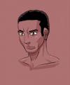
Don't know why I suddenly felt like drawing Malcolm. But yeah, here be a quick bust of Malcolm. >_>;;
Akurei Nagisa @ Tuesday, March 17th 2015, 9:49 PM
avatar
DOES THAT SEEM RIGHT TO YOU? > 3>

Looks good, though. Has his habitual "goddamnit" look from lately going on. It's hard to be the head of Section-III. It's hard and no one understands.
Crescent @ Wednesday, March 18th 2015, 12:01 AM
avatar
I question whether or not this particular item seems correct >_>

That indeed looks like the face of a man who's all "So my relationship with my girlfriend is kinda rocky, not even withstanding the fact that she is also a flirtatious magician who has slept with several of my rivals and comrades, and I'd like to focus on that some more but I'm a bit busy trying to contain that fact that Captain Espinosa leveled half of downtown trying to chase down a Ratchetmon. At least I can trust my Deputy Director to handle..... Urara please try not to get drool on my suit while you're busy looking over that girl in the glasses." <_<
Sketch Meister @ Wednesday, March 18th 2015, 3:21 AM
avatar
>_>;; Will this man EVER be happy?


[1604] Artist: Sketch Meister | Title: Ringmon (S4) | Time: unknown
Pic #1604

Uploaded
Sketch Meister @ Monday, March 16th 2015, 10:15 PM
avatar
Taking some of the criticism from the last time I drew Ringmon, I decided that maybe future drawings would go better if I had a proper standing pic of him to use as reference, and here it be.

Not... not entirely sure what prompted this but I'm proud of it. I think I fixed the anatomy concerns from before.
Akurei Nagisa @ Monday, March 16th 2015, 10:18 PM
avatar
There's good ol' Ringo! o 3o The wonderfully ambitious little bastard that he is!

The proportions are much more better, I think, or at least they're what we're used to again. This feels kinda like a refinement of all the previous pics of our hero-dragon, and I like it. Feels like an artbook pic, even.
Crescent @ Monday, March 16th 2015, 10:23 PM
avatar
I'll be lazy and say "what Graham said" >_> Though it is great stock art for him and really gives a good sense of his proportions.
YoshinoSuki @ Tuesday, March 17th 2015, 9:50 PM
avatar
I really like this one. It looks like it comes right from an Artbook. The shading, the lines, all of it. ^ o^

He looks awesome. 8D


[1603] Artist: Akurei Nagisa | Title: Sayokyoku Cadence -- "Lullaby of Indiscretion" | Time: unknown
Pic #1603

Uploaded
Akurei Nagisa @ Monday, March 16th 2015, 9:46 PM
avatar
MILF WEEK 2015 -- PIC #1!

Welcome to MILF WEEK 2015!

Where, resurrecting a tradition from the very early days of the Sketcher, we will give you a pic series consisting of dirty pictures of ladies who have given the world a child. Or are going to, in the case of Cadence here. 8D

That bed is actually also from an early Sketcher pic, but upgraded thanks to ideas I got from a pic Cam did. XD >_> That's how the Sayokyoku girl's bedroom looks! And hey, it's Akurei, he's here too!

The only thing I don't like here is the bed, but eh. I'm still learning how to GIT GUD with fabric.

A high-def version because the Sketcher decided to be a shit about sizes and quality. T 3T.
Crescent @ Monday, March 16th 2015, 9:53 PM
avatar
LIES AND BLASPHEMY. Cadence ain't a milf. Yet >_>

Dere Aku is also dere <_<

I like the work on Cadence's gloves and stockings o 3o both the shading and the butterfly patterns.

As far as the background goes, I think the outline on the window should be a bit more pronounced or maybe have a bit of a shadow and/or maybe add some slight glare to the windows or something; I do really like the moon and the sky in general, but it kinda looks like it could be a painting.
Akurei Nagisa @ Monday, March 16th 2015, 9:57 PM
avatar
Ah hell, I forgot the window glare. D8 I was gonna add that, too. Whoops. Oh well. ; 3; It's okay without it.
Sketch Meister @ Monday, March 16th 2015, 10:18 PM
avatar
And so it begins..

As Justin said, though I also wanna add that you may want a frame around the window, otherwise what's holding the glass in place?

Fabric shading/lighting really depends on the linework in that you need as little as possible to show a smooth surface. If you look back at the Langhuamon pic I did the folds of the fabric hardly use any drawn lines, I let the color and shading make the lines for me. It's a thought, and only my method.

...are those LoE hearts? God I hope those are canon. XD
Akurei Nagisa @ Monday, March 16th 2015, 10:23 PM
avatar
Bingo, they totally are. XD I support their canonicity. Also wanted to show a role-reversal--the usually snarky/trolly/less-excitable Cadence totally losing her shit and normally grumpy Akurei being sweet and nervous. >_>

Noted on the window, yeah. o 3o; Should at least add thicker lines next time...and yeah, I've found that too, the less lines the better. I'm getting to the point I try not to use any drawn lines myself. It'll happen, with practice. :3

Also, Justin, NO U A LIE. >:( PREGNANT LADIES COUNT AS MILFS. DECREE'D.
Sketch Meister @ Monday, March 16th 2015, 10:27 PM
avatar
Yeah, Justin, gotta go with Graham on this one. Bun in the oven means MILF.
YoshinoSuki @ Tuesday, March 17th 2015, 9:55 PM
avatar
Overall I like it. The shading's really good, the non-photo background wins points, and I'm glad my vote for ahegao worked out. >> XD

The only things that bug me are Aku's arm; it looks a little disproportionate to his body and draws my attention a lot; and Cadence's foot; it seems a little small, but also if she's wearing stockings, you probably wouldn't see the foot that clearly... unless they're sheer stocking... in which case, excuse me. >_> But even then, you'd see the fabric a bit differently... that gets into Cam's help though, so yes. ^^

Still, like I said, I like it. ^^
Akurei Nagisa @ Tuesday, March 17th 2015, 10:01 PM
avatar
I'm glad the ahegao worked out too! 8D It's not an expression you usually see on Cadence, but it works good here. I'm proud of how far I've gotten with faces, tbh. o 3o;

Akurei's arm...yeah, looking at it it's...a bit big? I think it's me trying to play with perspective tricks and only sorta succeeding. <_<; I should do a character sheet for Akurei. Especially with S4 coming up. >_>;; Maybe I can do one for Cadence, too, because as you've said she should be on the Sketcher with clothes more.

...the toes on the stocking were a dumb mistake. D: SHE'S JUST CURLING THEM THAT HARD OK


[1602] Artist: Mooncrafter | Title: Taurus Dress Uniform | Time: unknown
Pic #1602

Uploaded
Mooncrafter @ Monday, March 16th 2015, 4:52 AM
avatar
this took much longer than I had expected @__@ but I'm rather proud of how she turned out. Did a lot of experimenting with coloring.
Akurei Nagisa @ Monday, March 16th 2015, 4:59 AM
avatar
The skin in particular did turn out really nicely. o 3o Shiny buttons errywhere!

The uniform still looks really cool, just maybe need to throw on a few Initiative symbols with the winged gear, possibly some sort of THESEUS seal (like the various eagle motifs used by the US Army/Navy/Marines; I imagine THESEUS has some sorta variant on the winged gear motif. ICARUS has the winged boy or just his wing, ORPHEUS would have the lyre, maybe THESEUS has like a sword crossing through the gear or something? Dunnolol). A flag for Mirai to indicate her posting might help, or the UN given the whole UNCF connection.

ANYWAY. It's rad tho. o 3o;
Mooncrafter @ Monday, March 16th 2015, 5:00 AM
avatar
Yea I knew I needed to throw some of that stuff in there, but I'll need to make more solid reference pics I think since we'll need to figure out where the rank pins go and such.
Akurei Nagisa @ Monday, March 16th 2015, 5:02 AM
avatar
Agreed. o 3o We at least have a rough idea to go on from the initial sketch you did with the ribbons/awards and such, but it can be expanded on.

For now it's neat to see how someone actually looks in it.
YoshinoSuki @ Monday, March 16th 2015, 5:29 AM
avatar
So many buttons. o 3o I like how she looks in it. I agree, definitely gives a much clearer picture of how it looks when it's on someone versus a reference pic.

Her hair is also rather awesome, color-wise. ^^
Sketch Meister @ Monday, March 16th 2015, 5:56 AM
avatar
Blues: *is already making posters and working on the typeset*

I am definitely digging this. It just looks so damn clean and a definite contrast from the almost State Alchemist -esque combat uniforms.

We need to have like an Initiative Ball or something to use this in, maybe a meeting of ranked officials on the Shai-Hulud. >.> Would be a nice prequel event to that THING, right Graham?

As for a flag... lemme see if I can't get some sketches done today for a potential Mirai Archipelago flag. Though I do support the use of the UN forces, there should still be the flag of Mirai to tell their acquired forces from the rest of them.

Crescent @ Monday, March 16th 2015, 9:58 PM
avatar
Shiny buttons are indeed shiny o 3o

The shading on her hair and skin is really nice. And I really like the background and its complimenting colors.


[1601] Artist: Sketch Meister | Title: The People's Prime Minister | Time: unknown
Pic #1601

Uploaded
Sketch Meister @ Sunday, March 15th 2015, 2:52 PM
avatar
Coming in "Dial-Up CONNECT", it's time to find a new Prime Minister. Mr. Sayokyoku is in the running circa near the end of season 3.... season 4 brings his opponent.

A veteran of running a tight ship here and across the globe, and a hero of the citizenry.

A brighter future.

Vote Albert Pendragon for Prime Minister of the Mirai Archipelago.
YoshinoSuki @ Sunday, March 15th 2015, 2:54 PM
avatar
Pffffffaaaahahahahahahahahahahaha. HAHAHAHA.

I can't. Even.

Fffffffppfffahaaaahahahaha. *rolling*

Mechakucha: Let us Fight Like Gentlemen, Sir.

Cadence: ...................Yeah, I haven't got the heart to tell him. Nor the patience to explain...
Akurei Nagisa @ Sunday, March 15th 2015, 2:55 PM
avatar
ORDER.

JUSTICE.

EFFICIENCY.

THE UNMAKING OF ALL FLESH IN THE GLORIOUS NAME OF THE GOD-MACHINE FAMILY VALUES.

PENDRAGON. ( ・∀・ )ゞ
Mooncrafter @ Sunday, March 15th 2015, 2:56 PM
avatar
Primary colros really make him look far more trustworthy than he actually is, and the brighter versions of said colors also help immensely in carrying that idea across.

Colors are a lot more well contained in this one, and linework is getting smoother.
Crescent @ Monday, March 16th 2015, 10:00 PM
avatar
....Yeah.

He is way too trustworthy here <_<

And kind.

It's all wrong ;_;


[1600] Artist: Mooncrafter | Title: Daedalus Dress Blues | Time: unknown
Pic #1600

Uploaded
Mooncrafter @ Sunday, March 15th 2015, 1:38 PM
avatar
Rough sketch designs of the Daedalus THESEUS dress blues.

ignore the ribbon designs. I just threw on random color to show what decorated officers would look like.

Colors vary depending on what Division they're from. Pants/skirt are based on the Division's color and the trim is the complementary color of said fabric. Blazer color is a very dark, very desaturated version of the Division color. Only highly-ranked Officers have cords or members of the band/drill team/etc.

Will do a more detailed version in the near future I believe.

Girls also don't HAVE to wear the skirt. They can wear the pants.
Akurei Nagisa @ Sunday, March 15th 2015, 1:46 PM
avatar
I watched these get sketched but they're still really cool. o 3o I like the color schema and the jacket especially.

Also congrats on 1600! o 3o;; *plays Hail to the Chief in honor of the dress uniforms*

Akurei: T_T; That's completely inappropriate unless a head of state is visiting, you jackass!

>_> Maybe Cadence's dad could if you hadn't--*RAILGUNNED into the stratospheeeeeeerrrrrrrreeeeeee....*
Sketch Meister @ Sunday, March 15th 2015, 2:53 PM
avatar
...I foresee a new run of "Uniforms for Sexin'". Strictly Daedalus Edition.
YoshinoSuki @ Sunday, March 15th 2015, 3:01 PM
avatar
Given that their Civilian Covers are Military, this works rather well for that. ^^ I like the designs.

I'm reminded of when I did Dress Uniforms for the Guard Teams in DDT. It was one part Gundam SEED Destiny and one part Star Trek. lol >_> I believe the excuse was that they had them, they just never wore the damned things. XD To be fair, half the Guard Tamers also didn't use their D-Tanks either, so there's probably something to be said for DDT Chars, "not using what was issued". <_<; XD
Akurei Nagisa @ Sunday, March 15th 2015, 3:05 PM
avatar
I was going to note, these work both for formal events (conferring promotions, awards, etc. within the Initiative) and for the cover of totally being UN Combined Forces officers/NCOs.

(The UNCF is what I picture is Mirai's mundane military--since it's kind of a joint project of various nations, it doesn't really raise its own army so much as just use the UN's.)
Crescent @ Monday, March 16th 2015, 10:03 PM
avatar
It's cool having a design for the dress uniforms. They're nice.

...Even if half the PCs still wouldn't wear them to code for anything but the most super srs of occasions <_<;
Sketch Meister @ Tuesday, March 17th 2015, 3:44 AM
avatar
>_> Which given the Daedalus Initiative's place in the UN Combined Forces means... everything.

Yeah sorry dude, but this ain't SEED. Time to button that shit up. Free spirits are great and all but not even Roy is going to cross the General or Gendou on this.

Roy: >_< *is combing his hair in defeat*


[1599] Artist: Mooncrafter | Title: Merci Dubois | Time: unknown
Pic #1599

Uploaded
Mooncrafter @ Sunday, March 15th 2015, 11:42 AM
avatar
Warm-up picture to get back into the hang of coloring as well as getting some good practice in for Merci's dye job in her hair. Will end up resizing this for a signature on the board.
YoshinoSuki @ Sunday, March 15th 2015, 11:45 AM
avatar
I really like how it came out. She's adorbs. ^ 3^

Personally, though, I think with this aspect, it would fit much better as your Avatar than a Signature, since the height would mean it has to be smaller than it would be length-wise, but it could work.
Akurei Nagisa @ Sunday, March 15th 2015, 11:45 AM
avatar
Oooh, the color of her hair flows nicely, and I like how her outfit came out. The placement of the symbols works well. o 3o
Mooncrafter @ Sunday, March 15th 2015, 11:51 AM
avatar
well, it'll get shrunk down either way, and I'll be making Katharine and Cassandra chibis to go with it for the sig
Sketch Meister @ Sunday, March 15th 2015, 11:53 AM
avatar
>.> The TAURUS 5th seat is fucking adorable. I LOVE that hair, I mean damn.

Blues: I approve.

Vaati: You just like that she wears her uniform to code.

Blues: That is besides the point, Romeo.


[1598] Artist: Sketch Meister | Title: I don't know why you like it when I wear these... | Time: unknown
Pic #1598

Uploaded
Sketch Meister @ Sunday, March 15th 2015, 3:41 AM
avatar
Vaati likes him smart chicks. >.>

A bit of continuation from pic 1544, Tenebria has LoE glasses. >.>

.... Meganeeee~
YoshinoSuki @ Sunday, March 15th 2015, 3:45 AM
avatar
I actually really like her hair in this one. Her tits are delicious, don't get me wrong, but I feel like I could actually see the movement in her hair, despite it being a still. Awesome work.
Akurei Nagisa @ Sunday, March 15th 2015, 3:51 AM
avatar
You lie, Tenebria. You know why he has that boner. You know precisely why. >_>

I really like this take on her myself. From the hair to the glasses to the boobs. The lines are gorgeous and it has soul. o 3o
Sketch Meister @ Sunday, March 15th 2015, 4:24 AM
avatar
>_>; You should have seen her hair before I said fuck it and opted for the subtractive method. Looking back that shit was flat as hell.
Mooncrafter @ Sunday, March 15th 2015, 11:43 AM
avatar
You're definitely improving with the program though I'd like to see you start going back over your lines to create more depth. You've got smooth down, now let's get that gradiation and some clean up in.

LOVE the effects on the LoE glasses.
Crescent @ Monday, March 16th 2015, 10:06 PM
avatar
Basically what Jess said >_>

And again, the colors really pop great.


[1597] Artist: Sketch Meister | Title: P-Please...Let me... | Time: unknown
Pic #1597

Uploaded
Sketch Meister @ Sunday, March 15th 2015, 12:05 AM
avatar
>_>;; So as the ease of Justin finding me a reference picture shows, Teresa/Tenoderamon/Langhuamon is probably my favorite Digimon girl in the game. In my further experimentation with SAI, here be a simple bit of cheesecake.

Always fun to break the proper ones... >.>
Crescent @ Sunday, March 15th 2015, 12:07 AM
avatar
Wow the colors pop great o 3o

Also I'll beat Graham or Jess to "dem titties" >_>
Akurei Nagisa @ Sunday, March 15th 2015, 12:11 AM
avatar
o 3o Oh my this is a nice pose. Unf. And I like this nose! And also the subtle honey! And the delicious tongue/tits. *_* Damnit.

Teresa: **u//////////u** *tries to make a comment about not being broken but hahaha she can't becau--oh damn it I got Chainsaw Farandole'd*
YoshinoSuki @ Sunday, March 15th 2015, 12:11 AM
avatar
They are, in fact, very nice... Squishy... 83
Sketch Meister @ Sunday, March 15th 2015, 4:23 AM
avatar
Kinda wish I included a Blossom Scarf now. >_>;
Mooncrafter @ Sunday, March 15th 2015, 11:46 AM
avatar
Pose and facial expression is great, though I probably would have raised her eyebrows up and slighly lifted her lower eyelids to give that neediness across. Good use of lineart recoloring. Watch your coloring though, you've got several bleeds.


[1596] Artist: Sketch Meister | Title: Portrait of a Genetic Demon | Time: unknown
Pic #1596

Uploaded
Sketch Meister @ Saturday, March 14th 2015, 10:02 PM
avatar
Iiiiiiit's VAATI. Well, in his Genotechmon NATURAL state.

Crescent @ Saturday, March 14th 2015, 10:09 PM
avatar
Who cares about Vaati >_> MAPS. MAPS are what the people care about <_<

The art and coloring's great, though. And I do like the non-human points of the anatomy.
YoshinoSuki @ Saturday, March 14th 2015, 10:12 PM
avatar
He has the shiniest hair.

Does he use Pantene Pro-V? 8D
Akurei Nagisa @ Saturday, March 14th 2015, 10:16 PM
avatar
Hot damn the lines are smooth on this one. o 3o Shows off his features from the design real nicely. BUT GODDAMNIT MAN WE'RE SUPPOSED TO BE DOING MOM-THEMED PORNOGRAPHY, GET YOUR SHIT TOGETHER D8<

Akurei: *RAILGUN!* T___T; You never officially announced MILF Week 2015, you idiot! Also, don't be an asshole!

Cipheramon: *was too busy making this her computer wallpaper to kill me, but has infected my respawn machine with Abraxas Strain, the bitch*
Sketch Meister @ Sunday, March 15th 2015, 4:22 AM
avatar
Genotechmon: *goes GENEX and Generation Forces your tank for calling Cipheramon a bitch. have fun being a drone!*


[1595] Artist: Akurei Nagisa | Title: THE DARK DESCENT (MAP) | Time: unknown
Pic #1595

Uploaded
Akurei Nagisa @ Tuesday, March 10th 2015, 9:47 AM
avatar
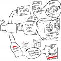
shittiestmap3shittyharder.png

And then JESS WANTED some PRIME TIME MAP ACTION of her VERY OWN so here's some HOT DARK DESCENT MAP for your EYES

Nyarlathmon asked that I cross out some spoilers

This is totally canon what everyone on the mission has kthx, oh except yours don't mark Mr. Friendly Digimon in the Sanctum
KaosWolf @ Tuesday, March 10th 2015, 9:51 AM
avatar
I like the Chamber of ****** best :) Vile has made it something very not good and hopefully not the right one otherwise people are gonna be uh well it's got a thing called Seal of Destruction I mean what could POSSIBLY go wrong right?
YoshinoSuki @ Tuesday, March 10th 2015, 10:12 PM
avatar
You make the best maps. XD

Shugo: ......Somehow I think the one Nyarlathmon-sama gave us is less... crude.

Anubis: This is more of a napkin doodle. >_>

SHUT UP, YOU TWO. ALSO I LOVE THE SPOILER-FREE NATURE OF THIS PIECE OF ARTWORK. 8D
Crescent @ Tuesday, March 10th 2015, 10:37 PM
avatar
ZOMG SPOILERZ. Or not >_>

We'll never know what was behind Very Bad #1 though ;_;
Sketch Meister @ Wednesday, March 11th 2015, 3:51 AM
avatar
You make da best maps, dawg. DA BEST.

Seriously, we need more. Like one for the Shai-Hulud.


[1594] Artist: Akurei Nagisa | Title: THE DANGERS OF MODIFICATION (MAP) | Time: unknown
Pic #1594

Uploaded
Akurei Nagisa @ Tuesday, March 10th 2015, 8:30 AM
avatar
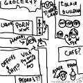
Alternative title: shittiestmap2.png

So Kaos/Vega needed some help with her spatial orientation for "Dangers of Modification", and just like I did for "War of the Lions", my PRIME TIME MAP SKILLZ were READY TO OBLIGE.

I bet everyone wishes I did these for the Alma Arc, huh? >_> WELL TOO BAD, FUCKERS.
YoshinoSuki @ Tuesday, March 10th 2015, 8:39 AM
avatar
NOW GIVE US THE ONE NYARLATHMON HANDED US IN DARK DESCENT. >_> 8D

SRSLY THO. I <3 ur maps. XD
KaosWolf @ Tuesday, March 10th 2015, 8:40 AM
avatar
Yay this makes sense though for some reason I thought things there the...other way. Like.... instead of like || that more like = or something I DUNNO! but yay :) innocent....yes...best describer for vile :)
Akurei Nagisa @ Tuesday, March 10th 2015, 8:40 AM
avatar
GUESS WHAT MY NEXT PICTURE IS >____>

Also you are totally welcome o 3o And yes >_> Vile so innocent. Much sweet little puppy. Such kindness. Wow.

(Edited on March 10, 2015, 8:47 am)
Crescent @ Tuesday, March 10th 2015, 10:37 PM
avatar
Your maps are the best 8D
Sketch Meister @ Wednesday, March 11th 2015, 3:54 AM
avatar
... I want this to be like how all maps show up in the Digivices.

Asher: T___T NO.

What? This is so legit!


[1593] Artist: Sketch Meister | Title: Zetamon Sketch | Time: unknown
Pic #1593

Uploaded
Sketch Meister @ Saturday, February 28th 2015, 7:27 PM
avatar
>_>;;; You know, reading the very first description for Zetamon and her first pic...and now... FUCK she's nothing like she was. >_>;; I mean... WOW, her SKIN COLOR has changed. The only thing that stayed was her hair color!

In this case, continuing using Mass Effect for help in design, this one used the Protheans, while I took some ticks from Samus Aran. What I wanted to convey here was a biotechnological effect compared to the Crown's Stellarmon who is space energy and the Freelancer's Cosmomon who is high, more or less wireless technology.
Benjamin @ Saturday, February 28th 2015, 11:09 PM
avatar
I definitely see the Samus references, though I do not believe heels are Samus' style. :P
Crescent @ Sunday, March 1st 2015, 12:25 AM
avatar
XD

Legs are definitely more Gundam in general, I'd say >_>

I do see the bits of Prothean, though.Design of her gun's really cool.
Sketch Meister @ Sunday, March 1st 2015, 12:31 AM
avatar
You got me there. I was looking at the Gadessa line for armor ideas.
Akurei Nagisa @ Sunday, March 1st 2015, 1:14 AM
avatar
Yeah, her concept kind of got...entirely revamped. *>_>*;;; Her original art wasn't bad! (he says to the artist, whom he is sure would disagree) But my concept was not strong at the time.

This was also when I thought Daedalus would be arc villains, hahahahahaha. >_____>;;;;

But this. This is fantastic. *_* The whole design just fucking flows, here, and it's definitely got a different feel from "living galaxy lady" or "SPACE ON YOUR HAND". ^ 3^

Also dat Numenara. I want one.

Kira: *hugs her gun arm* T 3T Too bad, get your own.

(@Ben: >______>;;;; Actually, thanks to Other M and SSB4...uh...would you believe these heels are functional in comparison to Samus' current gear? Thanks, Sakamoto. 9____9;;;;;)
YoshinoSuki @ Tuesday, March 10th 2015, 8:43 AM
avatar
I rather like the design. ^^ (I don't have much else to say that's useful. *^^* )


[1592] Artist: Sketch Meister | Title: CrossChimaimon Sketch | Time: unknown
Pic #1592

Uploaded
Sketch Meister @ Saturday, February 28th 2015, 5:12 AM
avatar
And the proper adult form for Chimaimon, this of course being "Scar" still. A new gimmick is the ability to swap out parts from different DDNA strains. Apparently the fight with Camille really was inspiring to Kurokawa, since CrossChimaimon adds even more Zhyrmon DDNA...
Akurei Nagisa @ Saturday, February 28th 2015, 5:29 AM
avatar
That right arm in particular evokes nothing but terrible fantastic things in the making. The best things. ; 3;

Scar: *eats a Patamon like it was a hot dog*

Such a friendly Digimon. ; 3;
Crescent @ Sunday, March 1st 2015, 12:39 AM
avatar
And for reference again >_> http://www.dnatamer.net/oekaki/pictures/OP_147.png

He seems a bit more business and not just beast with the new design.

And I dunno what you're talking about, Graham >_> A Ringmon-family arm grafted on seems totes like a kind honor.

I had absolutely no intention of pushing him toward a sort of rival for Junko/Camille, but on top of Camille's recent inspiration, we can't also forget the source of Scar's name >_> Kurokawa himself definitely represents "BAD DAEDALUS" to Junko, and the next time Camille hears him cackling crazily, I'm sure she'll want to kill him again <_<


[1591] Artist: Sketch Meister | Title: Chimaimon Sketch | Time: unknown
Pic #1591

Uploaded
Sketch Meister @ Saturday, February 28th 2015, 3:09 AM
avatar
In my continuing scanning and coloring stuff I draw while at work, I was trying to rework the design of Kurokawa's partner Chimaimon as the original was... well a hot mess. I wanted to give the idea that Chimaimon isn't just some Frankenstein of Digimon parts, but to his Tamer he is a work of art himself, like an abstract piece of sculpture.

Chimaimon "Scar" has been upgraded since his first appearance, his armor reinforced and his DDNA samples changed up a bit. His right arm is a sample of Angemon and Langhuamon DDNA, his right leg is from the Pantheramon strain, his opposing arm is all Devimon, and his leg and his curved horn are from Zhyrmon, the last Digimon to defeat him. He has... a few other surprises.
Akurei Nagisa @ Saturday, February 28th 2015, 3:26 AM
avatar
Ooooohhh. o 3o I liked the original basic design, despite its mishmash nature, but this one's really cool, too, and carries through the Frankensteinian aesthetic without being as cluttered.

Plus he's got these neat dark parallels to a Genomon in all the wrong ways. 8D I love his scarred eye, too.
Crescent @ Sunday, March 1st 2015, 12:30 AM
avatar
For reference >_> http://www.dnatamer.net/oekaki/pictures/OP_146.png

New design is more menacing. I do like that his whatjamacallit pods have some cylinders in addition now too.


[1590] Artist: GoldClaw | Title: Ugly concept | Time: unknown
Pic #1590

Uploaded
GoldClaw @ Tuesday, February 24th 2015, 5:22 PM
avatar
<A> So... tried to see if I can do an ugly roughsketch of Reimu's digimon partner in her adult form....

Kinda did, but not really. Very, very not really. Got the shapes down, along with the tail and two halos... So yeah. MORE TABLET PRACTICE!! *WAVES ARMS*

If someone wants to take a crack at this, you're more than welcome to do so.
Sketch Meister @ Tuesday, February 24th 2015, 5:29 PM
avatar
Not a bad start, and different enough from your original concept.
GoldClaw @ Tuesday, February 24th 2015, 5:52 PM
avatar
Before I forget. The tail is a ghost cat tail of sort. <A> But yeah. Enjoy ugly sketch.
Akurei Nagisa @ Tuesday, February 24th 2015, 6:03 PM
avatar
Halo wings~ o 3o

Pretty cool starting shape, yeah.
Crescent @ Tuesday, February 24th 2015, 9:10 PM
avatar
Hm, yeah, the halo wings are cool o 3o;


[1589] Artist: Sketch Meister | Title: Sketches While Waiting: Genomon SEARCH | Time: unknown
Pic #1589

Uploaded
Sketch Meister @ Tuesday, February 24th 2015, 5:16 PM
avatar
This one is me still messing around with modifications in SAI. Copying is so different from Photoshop. X_X;;

Anyway!

Originally known as the PROWL Model, the SEARCH come from LEO Division VC Katharine Nepeta babying the rather young team Blues assigns her during a mission to better handle her DE. Through kindness and discipline nowhere on the regimen, her "Cat Tail Team" prove to be highly effective spies and scouts despite their small size and childish personalities. After the Tower of Genome is created, Blues discovers that the "house cat" phenotype they represent has split from the "hunter" phenotype he originally created. They are re-classed as Child levels to the Adult level Genomon PROWL models and are rechristened the SEARCH model. Working in publishing media, Blues redesigned their helmets and armor to be cuter so as to be better accepted... and to hide their intent more effectively.

Pictured here are the standard version and Katharine's version. Her five Genomon team are all distinguished by their bandana color and each have a gender.
YoshinoSuki @ Tuesday, February 24th 2015, 5:19 PM
avatar
omg adorbs. <3 Nyaa~!
Akurei Nagisa @ Tuesday, February 24th 2015, 5:25 PM
avatar
Aaaaaaaaaaaaa so cute *______* They're like Cat-Rush in all the best ways
Crescent @ Tuesday, February 24th 2015, 9:11 PM
avatar
They are indeed totes adorbs o 3o


[1588] Artist: Akurei Nagisa | Title: The Sanguine Duchess (Morino Alma, Season 4!) | Time: unknown
Pic #1588

Uploaded
Akurei Nagisa @ Tuesday, February 24th 2015, 4:49 PM
avatar
Alma is one of my favorite characters to play, and my favorite to draw....up until I remember she's got hair THREE FUCKING FEET LONG!!! ; A; Why did I design a character with hair nearly as tall as she is? Why must I live like a fool?

Regardless, though, I know I've said it before, but I love how far she's come. From MacGuffin NPC to fledgling Stability member to a Duchess of the Order, motivated by genius, ambition, and a desire for personal freedom to secure things like vast wealth (Iron Fortress) and really bad news artifacts (Dark Descent).

I wanted her S4 design to sort of reflect her new ambition and priorities, hence the fancier coat and confident look. Also, hey, it's Shoggomon, actually showing up! 8D
Sketch Meister @ Tuesday, February 24th 2015, 4:54 PM
avatar
Dude I am digging the SHIT out of this picture. I mean..DAMN.

Perspective is damn fine, body type actually looks like a child, that fucking confidence without being cocksure, the lines for the face that make her LOOK like a small girl.

THAT. FUCKING. HAIR. I can feel the motion.

You have some a long way, Mr. Swanson. NOW you can be my rival. >.>

Kasumi: *huggles the little girl* Oh my god I want more of you.
YoshinoSuki @ Tuesday, February 24th 2015, 5:04 PM
avatar
I watched you draw this and even from back here, and not able to see the details til now, it looked really nice. I rather like how it came out in the end. ^.^

Also, the argument over stockings will never be forgotten. >_>
Crescent @ Tuesday, February 24th 2015, 9:12 PM
avatar
Alma be pimpin' > 3>

This came out completely rad o 3o Alma and Shoggomon both
Mooncrafter @ Tuesday, February 24th 2015, 11:49 PM
avatar
Because Graham.

Long hair is beautiful.

And you know, insanely fun to draw once you start getting a hang of the textures, which you obviously have with the motion and shading in this. You've got two different tints, which shows an attention to detail with coloring; awesome work. The jacket is shaded in a way that you can actually get the feel of the fabric from it. You'll want to watch your cast shadows though on her shirt and skirt under the jacket. There should be more shadows from the jacket obscuring light over the fabric. Would have liked to have seen more of the same value you gave the rest of her as far as shading goes with her skin, it's looking a little flat.

I'm very impressed with how much you've improved over these past few years. Never stop learning, and I'm proud to include you in my circle of rivals as well.


[1587] Artist: Sketch Meister | Title: Sketches While Waiting: GenoAshmon (COLOR) | Time: unknown
Pic #1587

Uploaded
Sketch Meister @ Tuesday, February 24th 2015, 3:04 PM
avatar
Took the time to color GenoAshmon because why not?
Akurei Nagisa @ Tuesday, February 24th 2015, 3:15 PM
avatar
Aw hell yes. o 3o! The color actually makes it a lot stronger, and helps indicate what's armor and what's organic component!
YoshinoSuki @ Tuesday, February 24th 2015, 5:02 PM
avatar
Ooooo, I like the colored version a little better myself, yes. 83
Crescent @ Tuesday, February 24th 2015, 9:13 PM
avatar
The tree-like elements work really well with the concept, which, itself is a ncie change of pace for an evolution.


[1586] Artist: Sketch Meister | Title: Sketches While Waiting: Project OMPHALOS | Time: unknown
Pic #1586

Uploaded
Sketch Meister @ Monday, February 23rd 2015, 3:52 PM
avatar
And a more feminine one meant to use both X-Genomon and just as big as Project KALLISTI. I'll let Graham discuss it... if he so chooses. >.>
Akurei Nagisa @ Monday, February 23rd 2015, 3:58 PM
avatar
OMPHALOS? >_> Oh, it's nothing special.

Nothing special at all.

No connection to a certain Digimon that a certain PISCES Vice-Captain killed in front of, say, Jace, or anything. And then the Digitama got snapped up by someone. >________> Nope.

The design is hellllllla rad. 8D I liiiiiiiike these.
Crescent @ Tuesday, February 24th 2015, 9:14 PM
avatar
I do really like the design. Reminds me of a thing or two that I can't quite put my finger on.


[1585] Artist: Sketch Meister | Title: Sketches While Waiting: Project KALLISTI | Time: unknown
Pic #1585

Uploaded
Sketch Meister @ Monday, February 23rd 2015, 3:36 PM
avatar
This one be a big'n. Easily trumping almost every other Genomon type in size, Project KALLISTI is a special project within the Shai-Hulud with little actual clearance. Not even the top officers in TAURUS Division are aware of it...

If you're wondering about the colors and names, yes, this is meant to use all seven Sin Digimentals at once, harnessing the power of the Seven Great Demon Lords. Because of this it lacks a proper Fusion Drive. Rather, it must be operated by Genomon "Vaati" and X-Genomon "Lilith", who are attuned to at least two of the sins each. The armor produces a body once the Fusion Drives are installed.

PROCEED WITH CAUTION.
Akurei Nagisa @ Monday, February 23rd 2015, 3:39 PM
avatar
Ahahahahahaha.

AHAHAHAHAHAHAHA. 8D

A++, excellent. The only suggestion I might make is more horns. 8D But still. Yessssssss.
Crescent @ Tuesday, February 24th 2015, 9:15 PM
avatar
Genomon Mecha >_>

ALL SINS COMBINE <_<

The design itself's pretty badass though


[1584] Artist: Sketch Meister | Title: Sketches While Waiting: GenoAshmon | Time: unknown
Pic #1584

Uploaded
Sketch Meister @ Monday, February 23rd 2015, 1:49 PM
avatar
And Vaati's B-Line Adult, the hulking tree-type GenoAshmon. Capable of being a full on fortress that can bombard opponents or create soldiers known as G-Stalkers, GenoAshmon isn't meant to move about. He's meant to ground in and wear down the targets.
Akurei Nagisa @ Monday, February 23rd 2015, 1:53 PM
avatar
DAT TREE

I like the vine aspect of his gauntlet-hands and the roots he's got. o 3o Makes his arboreal nature quite clear.


[1583] Artist: Sketch Meister | Title: Sketches While Waiting: Genex-Genotechmon | Time: unknown
Pic #1583

Uploaded
Sketch Meister @ Monday, February 23rd 2015, 1:29 PM
avatar
The next few uploads I do are sketches I do while at work. Some will get colored, some won't.

For your viewing pleasure is Vaati's Perfect Form, Genex-Genotechmon.
YoshinoSuki @ Monday, February 23rd 2015, 1:31 PM
avatar
Ooo. o 3o Nice!
Akurei Nagisa @ Monday, February 23rd 2015, 1:34 PM
avatar
Ha HA! Oh, I like this one. ^^ Very, very nice Perfect there, Vaati. Got this perfect blend of the "traditional" Genotechmon look with...reminds me of EVA-01, of course, but there's some Gundam in there too.

Anyway. Kickass.
Sketch Meister @ Tuesday, February 24th 2015, 11:17 AM
avatar
Might see if I can get a size reference chart made using these little sketches.
Crescent @ Tuesday, February 24th 2015, 10:19 PM
avatar
Oooh o 3o I really like the proportions. And design. And colors.
Mooncrafter @ Tuesday, February 24th 2015, 11:56 PM
avatar
I like how his face reminds me of Beelzemon <3 Not sure what it is, but glad to see his Impmon code is still showing through here.


<<PREV · [1][37] [38] [39] [40] [41] [42] [43] [44] [45] [46] [47][102] · NEXT>>