View
Search

Name Password


<<PREV · [1][40] [41] [42] [43] [44] [45] [46] [47] [48] [49] [50][102] · NEXT>>


[1532] Artist: JDeschain19 | Title: Charmageddon Celia~ | Time: unknown
Pic #1532

Uploaded
JDeschain19 @ Sunday, May 25th 2014, 3:22 AM
avatar
Garden!Celia still has to work to buy food and such, though she managed to get an apartment on her parents dime. Despite her youth, she snagged a job at the local maid cafe. Seems she brings in a 'special type' of customer.

Tsundere lolis will do that. Her foul mood even gets her bigger tips sometimes. >_>

Still, gotta be hard to take the dangerous predator of magical girls seriously when she's dressed like that, eh? :D

Practice in Manga Studio.
Crescent @ Sunday, May 25th 2014, 3:30 AM
avatar
Oh man the sparkles XD

Looks great. Stylistically, as well o 3o
YoshinoSuki @ Sunday, May 25th 2014, 3:43 AM
avatar
I'm with Justin. XD Oh man, the sparkles.

Nice work in Manga Studio though. o 3o I like it!
Akurei Nagisa @ Monday, May 26th 2014, 3:34 AM
avatar
Definitely a neat twist on the usual style. o 3o

I like how she's forced to be poofy. XD She's got poofy everywhere, and you can tell she's just sort of...resigned to it. XDD


[1531] Artist: YoshinoSuki | Title: [OOC] HylianMouse | Time: 2h 3m
Pic #1531

ShiPainter
(Public)
YoshinoSuki @ Thursday, May 22nd 2014, 10:36 AM
avatar
I just wanted an Avatar for my username; which I wasn't sure if I wanted to toss on DU for funsies, so I made it the proper av size just in case...

Somehow Robyn got turned into a mouse when I started coloring. I can't say I hate the result, so I also posted it here.

I also really like the new way of doing eyes I got from a tutorial. I like 'em a lot more now; even small like this.
Akurei Nagisa @ Thursday, May 22nd 2014, 10:47 AM
avatar
XDD D'AWWWW. This is cute. Goofy as hell, but cute.

Those eyes though! o 3o! Those are really gooooodddd.
Crescent @ Friday, May 23rd 2014, 2:31 AM
avatar
I will not ask how Robyn got somehow turned into a mouse XD Other than as a result of the username in question >_>

Cute 'lil pic though o 3o;


[1530] Artist: Crescent | Title: Neon Night | Time: unknown
Pic #1530

ShiPainter
Crescent @ Wednesday, May 14th 2014, 11:03 PM
avatar
So I came across a very leggy pic that inspired me. And I wanted to doodle something similar - and throw on some stockings. Which equates generally to Nana or Cadence. Though I have a feeling that Graham or Cam is gonna yell about another choice or two that should have been obvious <_<

Aaanyway, I did that Cadence+Camille cheesecake pic sorta recently. And then I also did that Nana Divine Crown Lion helmet cheesecake. But hey, that was Divine Crown Lion, not Nana, so decision made >_>

So here's Nana with her hair... kinda done somewhat manageably <_< Even though it's sorta short, her hair is simply wild (though I notice that, especially with how it's cut off, it came out looking maybe a bit too poofy here). Nethertheless, done up a little bit with a dash of makeup added. She probably could get it a little neater, but that rapidly becomes a matter of diminishing returns since I assume that her hair would soon to be messed up a whole lot in a situation like this >_>;

Veered away from anything Crown-branded in favor of pink stockings and bright blue lingerie. But now I'm kinda tempted with a part two pic that makes up for the lack of Crown-branded items here <__<;
YoshinoSuki @ Thursday, May 15th 2014, 3:37 AM
avatar
Mmmmm. Neon. o 3o~


[1529] Artist: Crescent | Title: Prismatic Change! DenebLiomon! | Time: unknown
Pic #1529

ShiPainter
Crescent @ Wednesday, May 14th 2014, 5:04 PM
avatar
Man I suck at Digimon ;_;

Here's a rough trial at one of the Adult-level evolutions of Nana's partner, GroLiomon. His C-Line (I'll have to try his A and B-Lines again someday >_> ), DenebLiomon.

DenebLiomon, thus far, like AltairLiomon, has only been used by Divine Crown Lion. Drawing from a nighttime cityscape, he has a largely neon colorscheme, emphasizing speed, bestial finesse, and a flashy attack set. He's also the basis of Divine Crown Lion's "Stardust Tonight" Persona Code.

Came out a bit too humanoid. Should've gone with a bit more of a hunched posture. And added a tail.
YoshinoSuki @ Wednesday, May 14th 2014, 5:06 PM
avatar
Yes, but does he make sure Nana eats her Shiitake Mushrooms? >_> <_<

I like the design though. I have a soft spot for neon-y appearances. *^^*
Crescent @ Thursday, May 15th 2014, 2:05 AM
avatar
XD When I decided on the naming scheme for Nana's evolutions, the thought did cross my head how Den-O used the summer triangle stars with Zeronus/Deneb, but screw the rules because it's a cool related three-name pattern <_< Plus, some of the evolutions actually have some kinda star/space-y themes!
Akurei Nagisa @ Thursday, May 15th 2014, 8:32 PM
avatar
He looks pretty capable of making sure Nana eats the shiitake o 3o Even if that's Suzu's job >_>

Seriously though, I like the concept. Neon is rad.


[1528] Artist: YoshinoSuki | Title: [Garden] Yumeno Shugotenshi | Time: unknown
Pic #1528

ShiPainter
(Public)
YoshinoSuki @ Tuesday, May 13th 2014, 2:04 AM
avatar
Color Design Specs.

Details on his left arm scars as well as shape and placement of his Soul Seed. Also his mask's design... and how he looks with his glasses. >_> (Also why he wears his hair the way he does. >_>)

I lost track of how long it took me to do all this cause I got stuck a few times, so... I don't have my Time Invested. ; 3; Anyway, enjoy his Paladin Design. >_>
Akurei Nagisa @ Tuesday, May 13th 2014, 2:30 AM
avatar
Awww hell yes. ^ o^ I like, I like. The cloak and the uniform beneath actually combine really well, and it's a nice use of Shugo's..."traditional" colors, I think. ^^

The mask also carries this menacing Hei feel really well. :O
Crescent @ Tuesday, May 13th 2014, 8:32 PM
avatar
NOW I'VE LOST IT.

I mean >_>

The final design here came out really nice o 3o The little details and design touches with the different parts of his uniform compliment everything well.
JDeschain19 @ Thursday, May 15th 2014, 12:29 AM
avatar
I KNOW I CAN KILL.

Man, does anyone else hear that? Weird.

Cool though. o 3o Looks like he's been through some shit, done some stuff.
Crescent @ Thursday, May 15th 2014, 2:06 AM
avatar
THE TRUTH EXISTS BEYOND THE GATE.

Sorry, old habits from /a/ threads >_>

Now I have to go listen to Howling <_<
YoshinoSuki @ Thursday, May 15th 2014, 2:11 AM
avatar
I heard something, man, but it just sounded like some HOWLING IN THE SHADOWS. *cough* Damn, that throat tickle was rough.

@Jason - >_> He has; all I'mma say. <_<


[1527] Artist: YoshinoSuki | Title: Mr. and Ms. Hyde | Time: 12h 4m
Pic #1527

ShiPainter
(Public)
YoshinoSuki @ Monday, May 12th 2014, 1:08 AM
avatar
Both of them have a lot in common... don't you think~?

A pose I found while meandering through Danbooru struck me as Anubis and Camille. This was the result. Also~, the lighting was just supposed to help me with shading... and then I ended up liking how it looked and so did others I showed it to. So~ I'm leaving it. o 3o;
Crescent @ Monday, May 12th 2014, 1:32 AM
avatar
Yeah, I think the lighting is a nice touch o 3o

Came out really awesome in general 8D Expressions are great. And you nailed Camille's appearance pretty damn well~

(Edit: Also worth specifically praising Camille's hand, because those things are so hard to draw and it came out really expressive ; 3; )
JDeschain19 @ Monday, May 12th 2014, 5:34 PM
avatar
This is really nice, Jess :D
Akurei Nagisa @ Tuesday, May 13th 2014, 2:11 AM
avatar
The glowy parts of this add a...hungry element to this, I think, after looking at it more, rather than sinister. Their expressions really complement each other, though! o 3o Good work!


[1526] Artist: YoshinoSuki | Title: [Concept] Mendicamon (Mittens B-Line) | Time: 10m
Pic #1526

ShiPainter
(Public)
YoshinoSuki @ Sunday, May 4th 2014, 5:42 AM
avatar
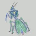
While trying to find a previous image that had inspired the idea for Mittens' B-Line Adult, (based on this species, actually,) I saw a pic of a mantis on Google Images that looked kinda Digimon-y.

I played the "Try to draw something not human and make it more Digimon-like" game.

Man, I suck at this game.
Crescent @ Tuesday, May 6th 2014, 12:07 AM
avatar
Mittensmantis o 3o
Akurei Nagisa @ Tuesday, May 13th 2014, 2:28 AM
avatar
Iunno, I think you took it in a neat direction. o 3o Also the colors are good. It's a lot more bestial than Tenoderamon, but it's not all...hideously dumb like Snimon. 's a good balance.


[1525] Artist: JDeschain19 | Title: Your Last Mistake... | Time: unknown
Pic #1525

Uploaded
JDeschain19 @ Saturday, May 3rd 2014, 4:13 AM
avatar
I been wanting to doodle in the Araki style for ages now, and finally a sudden influx of Jolyne pics convinced me to try it with Celia...And Rose/Esimon.

Then it got all manga page'd.
Crescent @ Saturday, May 3rd 2014, 4:14 AM
avatar
Oh man XDDD The style came out awesome o 3o Great work.
YoshinoSuki @ Saturday, May 3rd 2014, 4:16 AM
avatar
You broke the Garden Run. lol

That aside, damn. o 3o I love the whole thing. Really does look like you ripped out a manga page. XD
Sketch Meister @ Saturday, May 3rd 2014, 8:01 AM
avatar
...O_O

Oh...oh MY


[1524] Artist: Crescent | Title: Chloe Pt2 | Time: unknown
Pic #1524

ShiPainter
Crescent @ Friday, May 2nd 2014, 2:47 AM
avatar
Various rough doodles to further give an idea of Chloe's design o 3o;

Big one is something more representative of her in battle. She is not your smiles and sunshine sort of mahou shoujo >_> She is an arms-crossed, you're in trouble if she doesn't have a reason to take that huge ass rocket axe off her back sort of mahou shoujo.

Speaking of that huge ass thing on her back >_> It is, as you can see in the lower left corner, her Pleaides Arms. The rocket boosters (one on both sides of each blade, and one on the bottom of each blade) not only increase the speed/power of her swings, but are also able of carrying her through the air along with the axe itself.

Above that is just what her hair looks like from behind. And then above that, in the top left corner is her chest armor. In black and white to show the design better and then colored with the gold highlights I'm thinking about adding.
YoshinoSuki @ Friday, May 2nd 2014, 2:49 AM
avatar
I like it. o 3o


[1523] Artist: Crescent | Title: [Garden] Ibarahime Chloe | Time: unknown
Pic #1523

ShiPainter
Crescent @ Thursday, May 1st 2014, 2:51 AM
avatar
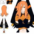
General design trial for Chloe's Raiment. Ran out of paper real estate so no glove and boot design here > 3>

Keyword being general for a few reasons. Her expression is neutral-ish - and really more suited for her everyday self than anything. In battle is probably when Chloe resembles Helena the most <_<

I had a rough companion doodle that I scrapped but will prolly redo that would be more indicative of her actual demeanor in combat.

*Some colors may change a bit; Chloe has the same color hair as Helena and I didn't run this pic by Graham. Not sure if it's a bit too light. Also the chest armor is supposed to have a wing-like design that got kinda lost with the color scheme I've settled on for the moment. So I may change that around a bit - atm leaning towards adding highlights.
YoshinoSuki @ Thursday, May 1st 2014, 3:00 AM
avatar
Dem thighs. o 3o

I like the design~! It makes me think of a tiger, actually. >_>;
JDeschain19 @ Thursday, May 1st 2014, 4:49 PM
avatar
Ya, it is kinda tigerish xD Nice, tho :3
Akurei Nagisa @ Tuesday, May 13th 2014, 2:35 AM
avatar
Hair color is totally canon. Also, I dig that Raiment. o 3o Much style.


[1522] Artist: YoshinoSuki | Title: [Garden] Anubis | Time: 6h 6m
Pic #1522

ShiPainter
YoshinoSuki @ Wednesday, April 30th 2014, 12:17 AM
avatar
"A mysterious little Archon who tends to keep to himself. Sometimes appears rather lazy. Oddly, he appears more fascinated by the Paladins than the Magical Girls..."

I had sketched Anubis rather quickly on a piece of paper. The scanner's been acting tsundere, so I had to work with a photo of the pic to line and color it. >_>

The Rune Font I got from the Puella Magi Wiki, so I could just type it in PS. I wanted to post the little Archon to 1.) Be part of the run! And~ 2.) break the trend since Anubis is black, not innocently white. XD;

Rune Fonts: http://wiki.puella-magi.net/Deciphering_the_runes#Fonts
Online Rune Generator: http://p.mcfog.com/madoka-runes

The second one will spit out the runes as you type and you can screencap for the word/sentence you want. >> But having the fonts make it easier to mess with colors. ^^;
Akurei Nagisa @ Wednesday, April 30th 2014, 12:37 AM
avatar
This fluffy motherfucker. X3 I love him. The color schema works awesomely, too.

Like you noted, he almost favors a pine marten...

I need to redraw Ein.
JDeschain19 @ Wednesday, April 30th 2014, 4:26 PM
avatar
What a cool little dude O: I like it~
Crescent @ Thursday, May 1st 2014, 2:41 AM
avatar
Flufffffyyyy o 3o


[1521] Artist: JDeschain19 | Title: The Blood-Red Rose | Time: unknown
Pic #1521

Uploaded
JDeschain19 @ Thursday, April 24th 2014, 11:42 PM
avatar
Celia for Garden of the Maidens in her Raiment, and with her Archon Akasha. I also intend to use this for her entrance so...Ya. > 3>

God I am TERRIBLE with backgrounds.
YoshinoSuki @ Thursday, April 24th 2014, 11:45 PM
avatar
I like that background though. Also offsets Akasha's eyes rather creepily. >____>

Hella intimidating. ^^
Akurei Nagisa @ Thursday, April 24th 2014, 11:48 PM
avatar
Akasha: o 3o Creepily? I don't see it...Ein Soph, do you see it?

Ein Soph: Hmm...> 3>;

I love how the holy-ish elements (the feathers/white cape) contrast with the menacing aspect she puts off. And the glow in her Soul Seed. Hell, her whole color schema is fantastic. 8D

Akasha is excellent, too. X3 I like that the two Archons we've shown thus far have this white/cream coloration. >_> Very innocent. Just like they are. <_<
Crescent @ Thursday, May 1st 2014, 2:41 AM
avatar
I think the background came out good and adds well to the lighting >.>

As Graham had said, I like the contrasts in Celia's design. And great job with Akasha. Whom I'm sure is all super innocent and stuff <_<


[1520] Artist: Akurei Nagisa | Title: (Garden of the Maidens) Nagisa Mayoke | Time: 8h 20m
Pic #1520

Uploaded
Akurei Nagisa @ Wednesday, April 23rd 2014, 12:44 AM
avatar
So yes. This is going to be my primary heroine for Garden of the Maidens. >_> Unlike Soul Reflection, where the Akurei there skewed a little too much towards a certain Kurosaki, and unlike Age of Steel, where Taran was just sort of DU Akurei in alchemist's clothing at times, I wanted to do something quite different with Garden's heroine, especially given the Madoka influences that are rampant in the RP.

Soooo meet Nagisa Mayoke. Her home life is the nicest of any Nagisa yet, and her nature is kindly and sweet and gentle. >_> This is Akurei's dimensional counterpart. No, he can't believe it either.

(Edited on April 25, 2014, 2:56 pm)
YoshinoSuki @ Wednesday, April 23rd 2014, 4:52 AM
avatar
It really is hard to think of her as an Akurei counterpart. She's smiling far too happily.
JDeschain19 @ Wednesday, April 23rd 2014, 11:17 PM
avatar
Still a nice design. Celia is still not a pervert.
Crescent @ Thursday, May 1st 2014, 2:39 AM
avatar
Late sketcher comment is late. but nice work on the outfit design and soul seed o 3o


[1519] Artist: YoshinoSuki | Title: Silver Digimentals | Time: 2h 10m
Pic #1519

ShiPainter
(Public)
YoshinoSuki @ Wednesday, April 16th 2014, 1:43 AM
avatar
I decided to draw the missing Digimental Symbols for the wiki's Digimentals Entry. (Meaning the other two Golden Digimentals since I already did the 'canonical' Digimentals for that page. >_>)

But recent talks of Silver Digimentals had me doodling. Just thoughts for Symbols.

Also the only thing I could come up with for Mischief since Loyalty is a stylized dog head and I couldn't make a cat paw look less generic. >_>;
Crescent @ Wednesday, April 16th 2014, 1:58 AM
avatar
Hmm o 3o

I think I like the second Unity one a bit better.

And the second Life is more... design-y? >_>

Good work btw~
Akurei Nagisa @ Wednesday, April 16th 2014, 2:04 AM
avatar
I also like the second Unity and Life ones better. o 3o;

Also the cat head works for Mischief, I think, even though I stupidly advised paw.

KACHIDOK--er, Triumph is pretty cool.
Sketch Meister @ Wednesday, April 16th 2014, 7:09 AM
avatar
I dig the hell out of Life and Triumph. ^^ Also, yeah, I am in agreement about the second Unity one.
YoshinoSuki @ Wednesday, April 16th 2014, 7:52 AM
avatar
I think I left the first Unity in there cause it felt more organic, but the second one I fidgeted with to be more unified. I was just afraid it seemed too "clean". *> 3>*

Also, that second Life was my attempt at making it more stylized/symbol-ish, but the first one was the general idea I was trying to convey. XD (And kind what I keep seeing that makes me think of "Life". o 3o; )

....I really did go hunting for some other thought for Triumph, but really, the "I BEAT THIS MOUNTAIN!" pose was all over Google for "Triumph". xD I just had to figure out how to make that a symbol rather than an intricately detailed drawing. >_>;


[1518] Artist: Akurei Nagisa | Title: (Garden of the Maidens) Ein Soph, Archon of Fate | Time: 2h 4m
Pic #1518

Uploaded
Akurei Nagisa @ Tuesday, April 15th 2014, 11:37 PM
avatar
"You see, I want you to agree to a contract with me, and become a magical girl!" /人◕ ‿‿ ◕人\

This is the concept for an adorable little magical girl mascot for an AU that sort of has sprouted out of my head fully formed. Blame Jason. And Justin. And Gen Urobuchi. And also Jess.

Anyhow, he's much more honest than some mascots. Much more. >___>
YoshinoSuki @ Wednesday, April 16th 2014, 1:34 AM
avatar
The only suggestion I'd actually make would be to have a less defined line for his belly color. I had to look twice cause I thought he was holding an egg or... something else.

ANYWHO.

I like how his wing-things look so hand-like. >_________>
Crescent @ Wednesday, April 16th 2014, 2:03 AM
avatar
A bit of what Jess said about the 'holding an egg' thing. We're playing Mahou Shoujo Madoka, not Mahou Shoujo Elena >_>

He does look kinda Kyubey is, but I guess that's essentially what we're going for here XD
Akurei Nagisa @ Wednesday, April 16th 2014, 2:08 AM
avatar
Yeah, I wanted to take Kyubey's "cute" and "angelic" design cues and run elsewhere with them; adding more of a seraphic influence, both with the "wings" and his more serpentine body. <_< Also the aleph markings.

The line is a problem, yeah. Should've been more careful about that definition. X_X
Sketch Meister @ Wednesday, April 16th 2014, 7:08 AM
avatar
...*RUNS AWAY SCREAMING*

I don't care if you took away the creepy dot eyes, NO. Just..just NO. HELL NO. ;_;


[1516] Artist: JDeschain19 | Title: Cheese Hair | Time: unknown
Pic #1516

Uploaded
JDeschain19 @ Thursday, April 3rd 2014, 7:22 PM
avatar
Erica: Hehehe! Yukito, she's so cute! She thinks my hair is cheese! Can we keep her?

Look. Bebe is awesome. Erica is dorbs. Wanted to draw both. Dunno if it'll go past sketch form. I'm tired.
Crescent @ Thursday, April 3rd 2014, 7:25 PM
avatar
D'aaawwwwwwwwwwwwww o 3o Super cute.

*Insert "Cam should watch Rebellion 8D" comment here* >_>
YoshinoSuki @ Thursday, April 3rd 2014, 10:04 PM
avatar
OMG Cuuuuuuute. 8D

Also *insert thumbs up of Justin's Cam comment here*
Akurei Nagisa @ Friday, April 4th 2014, 11:12 AM
avatar
Oh my fuckin' God so cute. 8D I just...that's adorbs.

Also, thirding the "Cam should watch Rebellion Story" drive. o 3o
Sketch Meister @ Monday, April 7th 2014, 7:43 PM
avatar
This is both adorable and makes me nervous. >_> I do not trust this thing.

Yukito: *is IMMENSELY creeped out by this Bebe* O_o;; How..... how about no?

(Edited on April 7, 2014, 7:43 pm)


[1515] Artist: YoshinoSuki | Title: [04/01] Happy Birthday, Cypher~! | Time: 1h 6m
Pic #1515

ShiPainter
(Public)
YoshinoSuki @ Wednesday, April 2nd 2014, 2:01 AM
avatar
Just a quickie...ish. I couldn't make it look how I wanted, so I played with it.

Anyway, Miss Cypher has April Fool's as her birthday and I wanted to draw rainbows.

Rawr. That strawberry is probably candy. I also realize the time on this sketcher is like 2 hours ahead of me. Damnation. ANYWAY.
Crescent @ Wednesday, April 2nd 2014, 2:12 AM
avatar
Taste the rainbow o 3o

All the colors in her hair never gets old XD
Akurei Nagisa @ Wednesday, April 2nd 2014, 3:16 AM
avatar
8D!! Aaaaaaaa this is a a really adorable Cypher. I really like the close-up, especially, and the blonde eyelashes.

Yairu/Akurei: *may have bought her a jellybean birthday cake..as in, it's made out of jellybeans*
JDeschain19 @ Wednesday, April 2nd 2014, 4:20 PM
avatar
Molly: Happy birthday Cypher! ::Wearing a bikini made entirely of skittles::

Such lovely colors x3 Cypher rules.


[1513] Artist: Sketch Meister | Title: Mittens X Cookie Dough | Time: 1h 24m
Pic #1513

PaintBBS
[View Animation]
Sketch Meister @ Sunday, March 30th 2014, 2:50 PM
avatar
Wormmon (Shugotenshi Custom) is the weirdest little fucker I've yet witnessed in this game. A Wormmon that obsesses over cookie dough and pudding.... how is he a warrior again? X___X

This is something of a cheer up pic for Jess, who just lost someone important recently. Hope this puts a smile on your face.
YoshinoSuki @ Sunday, March 30th 2014, 2:51 PM
avatar
<3
Akurei Nagisa @ Sunday, March 30th 2014, 2:52 PM
avatar
D'awwwwwww. XDD This is fucking adorable. Especially with the cookie dough splatter.

Mittens: *___* Chocolate chip is my favorite~
Crescent @ Sunday, March 30th 2014, 5:53 PM
avatar
GIGA PUDDING D8<

super cute though XD
JDeschain19 @ Sunday, March 30th 2014, 11:29 PM
avatar
Awwwww...! Super adorbs.

I'm sorry Jess, though I don't know the story ;_;


[1512] Artist: Akurei Nagisa | Title: You're Forgetting What You Really Are | Time: 8h 20m
Pic #1512

Uploaded
Akurei Nagisa @ Tuesday, March 25th 2014, 10:52 AM
avatar
...There's a reason I have the things on Alma's Grimoire as "Limiter Release". Full Unchained, which this probably depicts the beginnings of, is, appropriately enough, "Last One". Normally, Kasumi has to give you a Monster Code for Full Unchained state, but...Alma sort of...doesn't need that.

This isn't Shinri (though it's exercising a lot of the capabilities said dark personality discovered). This is just what happens when you back the girl herself into the proverbial corner.

The fire and the giant telekinetically-levitated rocks are a terrible excuse for a background, but whatever. Also the blood isn't my favorite. Oh well. Shoggomon Weapon Mode came out okay though.

....I probably owe everyone a cute after that. x_x;

SOUNDTRACK: This, appropriately enough. Which also got me to watch Kill la Kill. Thank/blame Jason.
Crescent @ Tuesday, March 25th 2014, 8:09 PM
avatar
How could it have been Nui's theme that sold you when Satsuki and Ragyo both have even better themes? :(

Anyway, sure is death loli abomination in here >_>

Overall, think it's a cool visual.
YoshinoSuki @ Tuesday, March 25th 2014, 8:11 PM
avatar
I'mma go with Justin's comment about Death-Loli-Abomination. >_>;;

Aiko: I think you owe more than cute, Swanson. T 3T

Oh look an arrow on fire. How's that feel in your head, there, Graham? >_>;;;;
Akurei Nagisa @ Sunday, March 30th 2014, 2:09 AM
avatar
After considering, and also after a healthy dose of inspiration from Kill la Kill's final episode (DAT SHINRA KOKETSU), I may switch this to being regular old Unchained. It feels too incomplete, in my opinion, to be Full Unchained, and there's so much cool stuff one can do with the while...symbiosis thing, visually.


[1511] Artist: JDeschain19 | Title: Sleepy | Time: unknown
Pic #1511

Uploaded
JDeschain19 @ Monday, March 24th 2014, 8:54 PM
avatar
I tried doing a cute and trying to make it pastel-y while play with colored lineart.

Don't think I pulled it off too well, but hey. I did a cute, so whatever.
Sketch Meister @ Monday, March 24th 2014, 9:01 PM
avatar
Oh god that is adorable. *_*

Battymon: >_> Why a large bat?

Also, I rather like this coloring style.

Mooncrafter @ Monday, March 24th 2014, 9:12 PM
avatar
I really like the colored linework Jason! and this is absolutely adorbs. Like, whoa.
Crescent @ Tuesday, March 25th 2014, 12:02 AM
avatar
This did come out really cute o 3o Maybe it didn't come out particularly pastel-y, though I still think the colored lineart and coloring in general are great.
YoshinoSuki @ Tuesday, March 25th 2014, 3:36 PM
avatar
omg this came out super adorbs! <3 I especially like the colored lineart, actually. I think it really adds to the whole adorbs-ness. o 3o
Akurei Nagisa @ Wednesday, March 26th 2014, 4:56 AM
avatar
Awww, sleepy Aine is cute. ^ 3^ Cute is achieved.

As for the lineart style...I think it works but I can see where your frustrations could come from. o 3o; If that makes sense. Her bed came out nicely.


[1510] Artist: JDeschain19 | Title: Bathing Shenanigans! | Time: unknown
Pic #1510

Uploaded
JDeschain19 @ Sunday, March 23rd 2014, 2:57 AM
avatar
Something I did real quick as a dumb silly thing that was asked to post. :P

Silly Aine. Just admit your love of those wicked, evil titties.
Sketch Meister @ Sunday, March 23rd 2014, 3:51 AM
avatar
She never will. DU has only the strongest tsunderes!
Mooncrafter @ Sunday, March 23rd 2014, 3:56 AM
avatar
aw man this looks fun and cute Jason, would love to see more stuff like this from you in the future
Akurei Nagisa @ Sunday, March 23rd 2014, 1:47 PM
avatar
Poor, poor Aine. XD Sooooooo flustered.
YoshinoSuki @ Sunday, March 23rd 2014, 4:47 PM
avatar
Oh man. XD Like I said on AIM, I love it. <3
Crescent @ Monday, March 24th 2014, 1:18 AM
avatar
As also said on AIM, dem Vampimon tits > 3>
YoshinoSuki @ Monday, March 24th 2014, 4:35 AM
avatar
Auren is a lucky dragon... >_>

....Wait, does Aine have a wingboner? ...omg.


[1509] Artist: YoshinoSuki | Title: Onsen Tigress | Time: 8h 59m
Pic #1509

ShiPainter Pro
(Public)
YoshinoSuki @ Wednesday, March 19th 2014, 12:44 PM
avatar
I realized that Daedalus seems to be holding the market on Catgirls...

...also the hilarious visual of a (flying) squirrel floating casually past a catgirl wouldn't leave me alone.

((...I had issues with my attention span last night... the timer's definitely not quite accurate.))
Akurei Nagisa @ Wednesday, March 19th 2014, 12:48 PM
avatar
CATGIRL SUPREMACY 8D

also I love the floating squirrel. XD And Izumi's hair. o 3o
Crescent @ Wednesday, March 19th 2014, 1:12 PM
avatar
Izumi sees you ಠ_ಠ

Cute pic. The steam/lighting on the water came out nice.
Sketch Meister @ Wednesday, March 19th 2014, 5:47 PM
avatar
I am digging the predatory nature on this, especially given that I had my class go over that word today.


[1508] Artist: Crescent | Title: Naked Blades | Time: unknown
Pic #1508

ShiPainter
Crescent @ Saturday, March 15th 2014, 6:07 PM
avatar
Been wanting to give Millia another go after not doing such a great job with her awhile ago. Came across a couple pics in veins similar to this that inspired me; I originally paused and thought if there was a more established couple that would fit the idea, but decided Kai and Millia were appropriate.

Also because symbolism and junk >_> Kai's whole deal of trying to strip away Millia's pride from consuming her - something that he's put his body on the line for. He's also begun to more or less discard his own layers in order to establish himself as trustworthy without many questions.

Could have come out a bit better. Not too happy with Millia's right shoulder/arm. Maybe I should have also tried going through with my original idea of her hand on Kai's wrist/arm.

Do think I did a much better job with Millia's face this time. Also, Kai's still yet to be drawn with a shirt on >_>
YoshinoSuki @ Saturday, March 15th 2014, 6:11 PM
avatar
Aph: You should always discard more layers... of clothing. 8D

*gets the Karmic Payback for that* DAMNIT, APH. That said, while my spleen returns... I rather like it.
Sketch Meister @ Saturday, March 15th 2014, 10:01 PM
avatar
Millia: WHAT IS THIS MOCKERY?!?!

She says while being beet red.

*STABBED*

.. I deserved that... *falls*

Albert: .... *puts Kai on his list*

That said, watch your waists there because given where her hips are she should be towering over Kai, and both their bodies are too short. Nice premise, though.
Crescent @ Saturday, March 15th 2014, 10:25 PM
avatar
Hm, alright. I kinda felt like their heads wound up borderline a bit large or something... and I guess that's the something ^^;
Akurei Nagisa @ Sunday, March 16th 2014, 12:00 AM
avatar
Muuuuch better on Millia's face this time, and the shading is very good here. o 3o


[1507] Artist: Sketch Meister | Title: Avian Template 001: Genobirmon | Time: 1h 55m
Pic #1507

PaintBBS
[View Animation]
Sketch Meister @ Thursday, March 13th 2014, 3:01 AM
avatar
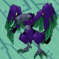
So since this was a constant question as to what they look like, the Genobirmon now have official art.

The first and most used of the avian templates, the Genobirmon are capable of both rapid attack, rescue, and recon. The Genobirmon assigned to the entity known as "Team Vaati" has gold claws to denote it's leadership status.
YoshinoSuki @ Thursday, March 13th 2014, 3:02 AM
avatar
o 3o I like the design. ^_^
R0nnel @ Thursday, March 13th 2014, 3:07 AM
avatar
Ichigo: Where... where are we supposed to sit while RIDING THEM?????

Marlon: They probably are more prone while flying.

These guys look way cool.
Akurei Nagisa @ Thursday, March 13th 2014, 3:43 AM
avatar
o 3o These guys are cool-looking. The wings work differently and better than I expected.
JDeschain19 @ Thursday, March 13th 2014, 8:19 AM
avatar
When you hit them, do they yell anti-Semitic remarks?

https://m.youtube.com/watch?v=7l2FxFGGkUw

"JEW!"

Also cool design, obvi.
Crescent @ Thursday, March 13th 2014, 12:38 PM
avatar
Dammit Jason, now I wanna go play Mega Man X ;_;

Cool design. Mixes an organic Birdramon-y look with Genomon-style armor/tech really well.


[1505] Artist: YoshinoSuki | Title: Hashiridokoro Nasuka | Time: 2h 46m
Pic #1505

ShiPainter
(Public)
YoshinoSuki @ Thursday, March 13th 2014, 2:31 AM
avatar
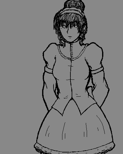
EDIT: I fixed the skirt a little. I redid the face a bit with Cam and Jason's advice. I think I managed to make it look better/older without changing her appearance too terribly much beyond age... (If it won't show the update, refresh the image. x: )

Anyway~, this is Cadence's Maid, Nasuka. Before anyone asks, she's 32. She was also one of the last staff hired by Cadence's mother.
Akurei Nagisa @ Wednesday, March 12th 2014, 5:48 AM
avatar
Oh my God, the lines are really clean and she looks awesome! I love her hair! ^ 3^ Plus it's good to have a visual. o 3o
Sketch Meister @ Wednesday, March 12th 2014, 11:34 AM
avatar
Nice outfit. I like that the various maids in this game all have different styles. This one definitely looks less fetish-y like Celia's maid team or Kasumi's maid team.

That said, watch the skirt, it's looking like it naturally slants.

Wait... she's 32? What sort of facial cream does she use, the fountain of youth? O_o;; I get it, Japanese chicks age like fine wine but she looks 18.

(Edited on March 12, 2014, 11:35 am)
YoshinoSuki @ Wednesday, March 12th 2014, 1:35 PM
avatar
I had drawn her standing less rigid, but when I got to the skirt, my attempt at puffing failed, I think because of the position I'd drawn her standing in. :< It's the same reason her hands went behind her. *X_X*

How would you age her up a little bit, then? She was hired by Miko straight out of High School, and while she was one of tje two primarily responsible for Cadence while growing up, she also looked after the garden Miko planted... lol ^^;;
JDeschain19 @ Wednesday, March 12th 2014, 4:58 PM
avatar
Never hurts to have more maids.
Sketch Meister @ Wednesday, March 12th 2014, 5:21 PM
avatar
The rule of age in art is the more lines the older. If you Certain things like slight lines under the eyes, a longer face, or sharpening the lines of the eyes help to establish that a person is older.

Take Fleur for example or Morana for example. Jason doesn't use a bunch of lines to denote their ages. Their eye shape and face length and structure dictate their ages.

The way Nasuka is drawn at the moment, with her more curvy and slightly wide face, makes her look to be in the same age range as the teenage characters.
JDeschain19 @ Wednesday, March 12th 2014, 5:47 PM
avatar
Give Morana a couple more years tho, and she'll have little lines under her eyes.

...I often plan how to draw characters at varying ages >_>

But ya, Cam's right. I recommend a longer, more mature face or just a single line under an eye can work. Doesn't have to be long, can be really subtle.
Crescent @ Wednesday, March 12th 2014, 5:54 PM
avatar
Iunno, some Japanese women can look like they're 18 until they're 40 >_> That said, yeah, what Cam and Jason said. Something like a slightly longer face would probably work o 3o

But Cyan certainly does like its maids <_<
JDeschain19 @ Wednesday, March 12th 2014, 6:08 PM
avatar
EVERYONE.

LOVES.

MAIDS.
JDeschain19 @ Thursday, March 13th 2014, 8:15 AM
avatar
Post Edit:
That looks way better! Cheers for Jess x3


<<PREV · [1][40] [41] [42] [43] [44] [45] [46] [47] [48] [49] [50][102] · NEXT>>