WOO YEAH.
I've been thinking about doing a little reorganizing things again; like moving the crap from Tranquil Zone up to be all part of the System Core. It's all related to the board without being RP Forums.
But I'd like ideas and input from everyone so I can work on solidifying ideas.
This also plays into my messing around with coding for phpbb 3.1; Which is out and stable, but will change quite a bit and needs a few recodes because MODs are out, Extensions are in, and not much of the crap we use now has been ported over to Extensions that aren't still a little buggy. >_>
I'd like to reorganize, rename, reword, and re...roll.... ah hell.
I'd like to get stuff situated how we like so I can use that to work on the v3.1 Design Board. (Read: A Local copy of phpbb I can mess with and not panic about. > 3>; )
The permissions for this forum should be the same as GD, so anyone should be able to post here. I locked the Archives because Read-Only is Read-Only. >>;
Feel free to post here, or; if it should come up as not letting you post here (which is shouldn't) go ahead and post ideas in the main General Discussion forum with ideas.
Disclaimer: Just because you suggest it doesn't mean it will automatically be put into effect. >_>; I want everyone's input, everyone's thoughts for the board itself... but not everything will work nor will it make sense in practice.
Also, this is not a request for Plot and Game stuff, this is actually designing the board. "The chat might be better only on its own page rather than visible on the front page" is a valid input for this thread. "I want more threads like ______" is not. >_>;; *^^*
BRING IT ON.
Reorganization Station (HALP MUH! TELL ME THINGS!)
4 posts
• Page 1 of 1
-

Yoshino Shurensuki - Autistic Librarian

- Posts: 8241
- Joined: Tue Jun 17, 2008 1:40 am
- Location: The Library of Hingashi
Re: Reorganization Station (HALP MUH! TELL ME THINGS!)
Tranquil zone is pretty great where it is currently, but the alternate RPs could use either moving to a separate website or a more condensed folder system where it's not eating up the front page in length. Especially the alternate RPs that haven't been posted to in over a year. Maybe make an archive system in case we want to revamp and revive said RPs, but otherwise keep them from clogging up the front page.
Not sure if you know how to make the option available, but multiple themes for the board would be nice if you could figure out the coding. Like, we can pick what them we want from the control panel for how the site looks. Could easily make themes based on the different factions over time, but I'm sure the coding would be the hardest part.
Not sure if you know how to make the option available, but multiple themes for the board would be nice if you could figure out the coding. Like, we can pick what them we want from the control panel for how the site looks. Could easily make themes based on the different factions over time, but I'm sure the coding would be the hardest part.
-

Mooncrafter - Sheriff Corgi of the Doggo Tax
- Posts: 8835
- Joined: Sun Jul 06, 2008 4:50 pm
- Location: Best motherfucking place on the Earth. TEXAS
Re: Reorganization Station (HALP MUH! TELL ME THINGS!)
Since I've sort of been sitting in the side seat watching Jess attack the code structures with BEAR HANDS, I can address at least one point on Multiple Themes: the issue with that would be design, not coding. If it's just colors, Jess can flip-flop it around erryday, but the thing is we'd need design resources, unless people want to go through the available themes for PHPBB, pick ones they like, and make sure that all their preferred extensions (mChat, the various utilities that make our life easier) work on that theme. If we were going to build a theme, we'd need:
To create custom graphic icons to replace all of the icons in that devkit. Except maybe the smilies, and even then.
Create a background image/pattern setup that we can stand to look at every day.
And THEN make banners that fit each one.
Soooo that's the deal with that. On the plus side, though, we can probably create a subsection/revamp the AURP subsection so it's autoclosed.
As for my input...well, I've seen the secrets of 3.1, and a lot of my desires were answered there (dropdown menus, muh automerge, greater efficiency all round). I don't like RECENT POSTS as a big window at the top, I'd vote for getting rid of that. Um...Maybe we could replace it with some sort of announcement sticky? That could free up the chatbox (though it would need not to be used for threads as often as chatbox is, and would need to strictly be admin access? With maybe an established etiquette: "we don't use the admin announcement function to call for posts in one specific thread" "we don't use the admin announcement function for personal feelings" "we don't use the admin announcement function to rock out on the guitar")
-

Akurei Nagisa - Resident Lore Slut

- Posts: 14032
- Joined: Tue Jun 17, 2008 2:24 am
- Location: The Great Potato Fields
Re: Reorganization Station (HALP MUH! TELL ME THINGS!)
"The Secrets of 3.1" makes it sound way shinier than it is. >_>; But... yeah, I'm still working on a base theme. It's taking a while. I'm working on the icons and stuff. It took me all day yesterday to figure out most of what colors what in the css file. ;_;
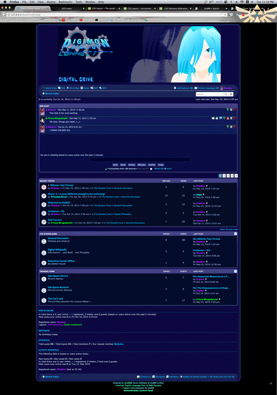
So this is where I was in designing as of yesterday. (July 14th) [Click to see big/full-sized files.]
On the Front Page, you can see what Graham means by the 'Recent Topics'. I'm not a big fan either, and having seen it for a while, I feel like I should just remove the Extension, it's kind of annoying to me. ; 3; You can also see the little [-] on the right side of the Forum Listing: that's a 'Collapse' button, so it'd be in 3.1. (I believe I can set forums to be auto-collapsed on load, I'd have to look at the settings.)
Also, I would totally make the banner bigger, but I had to fake-center the stupid thing via css since I can't figure out how to make it work without falling back on the old stand-by that's kinda outdated anyway. ; 3; (Tables in tables in tables, BRAH. <-- Early 2000's Coding/Design. Everything is CSS and all Mobile-Responsive now, I have a hard time not breaking things. ; A; )
Front Page
The longest topic I have is commentary about 3.1 when I was first setting up accounts and such for testing. But it lets you see the flow of the Topic with like 13 posts. Quick Reply is a separate entity, apparently, so styling/coloring the topic stuff left it out in the cold. 9 39;
I also can't figure out how to reverse the Post Body and the Profile Section. Literally hard-coding wasn't even working. X_X;
Anyhow, by the time I took these caps last night my shoulder was killing me and I was super-tired. >_>;
Viewtopic/Thread Layout

So this is where I was in designing as of yesterday. (July 14th) [Click to see big/full-sized files.]
On the Front Page, you can see what Graham means by the 'Recent Topics'. I'm not a big fan either, and having seen it for a while, I feel like I should just remove the Extension, it's kind of annoying to me. ; 3; You can also see the little [-] on the right side of the Forum Listing: that's a 'Collapse' button, so it'd be in 3.1. (I believe I can set forums to be auto-collapsed on load, I'd have to look at the settings.)
Also, I would totally make the banner bigger, but I had to fake-center the stupid thing via css since I can't figure out how to make it work without falling back on the old stand-by that's kinda outdated anyway. ; 3; (Tables in tables in tables, BRAH. <-- Early 2000's Coding/Design. Everything is CSS and all Mobile-Responsive now, I have a hard time not breaking things. ; A; )
Front Page

The longest topic I have is commentary about 3.1 when I was first setting up accounts and such for testing. But it lets you see the flow of the Topic with like 13 posts. Quick Reply is a separate entity, apparently, so styling/coloring the topic stuff left it out in the cold. 9 39;
I also can't figure out how to reverse the Post Body and the Profile Section. Literally hard-coding wasn't even working. X_X;
Anyhow, by the time I took these caps last night my shoulder was killing me and I was super-tired. >_>;
Viewtopic/Thread Layout

-

Yoshino Shurensuki - Autistic Librarian

- Posts: 8241
- Joined: Tue Jun 17, 2008 1:40 am
- Location: The Library of Hingashi
4 posts
• Page 1 of 1
Who is online
Users browsing this forum: No registered users and 2 guests
