View
Search

Name Password


<<PREV · [1][4] [5] [6] [7] [8] [9] [10] [11] [12] [13] [14][102] · NEXT>>


[2466] Artist: JDeschain19 | Title: Late Night Cali & Bri | Time: unknown
Pic #2466

Uploaded
JDeschain19 @ Wednesday, August 26th 2020, 8:27 PM
avatar
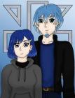
I had some time after I finished my work today to do a quick pic like this. I've had this pose in mind for a long while now, but couldn't decide who to use for it between Celia and Riiko or Cali and Bri. Cam made the final decision.

I'm glad, getting to draw them with this hint of intimacy was really nice. The hand holding was a last minute addition.

I'm still trying new things with trying to make a proper demonic cock for Vitalimon >_> This kind of design has been fun for me, hence trying to do it more.

In my head I was also like "Well that's one way to tell your girlfriend you want attention now that she's done with her work"
Crescent @ Wednesday, August 26th 2020, 8:46 PM
avatar
Interesting to see the new take on the design given your recent comments to be about going in on them more XD

It is a nice pose too, yeah o 3o
Sketch Meister @ Wednesday, August 26th 2020, 9:54 PM
avatar
Why is it I saw the light and sparkles behind her and immediately thought this was gonna get nonsexy very fast due to Calidora's reaction to light?

Definitely an interesting take. I like it, just I'm not used to Plutonemon ever looking or acting intimate...then again the first person to ever want to get involved with her scared me away from her being intimate and I shouldn't have to explain why.

The lipstick marks really make this for me.


[2465] Artist: Crescent | Title: Jade - Season 5 | Time: unknown
Pic #2465

ShiPainter
Crescent @ Friday, August 21st 2020, 7:01 PM
avatar
Similar to Iris, quick sketch of a thought for Jade's new outfit o 3o;

I have no clue what I'm doing with blacks, I should have gone either more or less all-in on the dark blacks on the pants XD
JDeschain19 @ Friday, August 21st 2020, 7:04 PM
avatar
It's a good look o 3o/ I like it
Sketch Meister @ Friday, August 21st 2020, 7:05 PM
avatar
Oh hey, this is neat. Definitely gives the impression of leather so good on your lighting there.
Akurei Nagisa @ Monday, September 14th 2020, 4:00 AM
avatar
You're really on fire with these Jade designs, dude, they have a lot of personality! >_> I mean, probably the fact that Jade and black leather work well helps, but STILL. XD


[2463] Artist: Crescent | Title: Iris - Revised S5 | Time: unknown
Pic #2463

ShiPainter
Crescent @ Monday, August 17th 2020, 7:27 PM
avatar
Alright, super quick edit based on some feedback from Cam, probably looking at something more like this for Iris now.
Sketch Meister @ Tuesday, August 18th 2020, 12:02 PM
avatar
Already an improvement. I'd cuff the shorts but I got a solid idea of what to do. Iris gonna be cute.

Dagrus: ..O_o; I don't think she wants "cute".

Ezio: ....I mean I'd *like* cute.

Astromon: The Boar could learn to be a touch more lady like.

Dag/Ezio: DX STAR-1!!!
Akurei Nagisa @ Monday, September 14th 2020, 4:03 AM
avatar
Torn jorts, especially with leggings, wouldn't work for everyone, but Iris pulls it off.


[2462] Artist: Crescent | Title: Iris - Season 5 | Time: unknown
Pic #2462

ShiPainter
Crescent @ Sunday, August 16th 2020, 2:07 PM
avatar
Here's a rough concept of Iris's new hairstyle and outfit. Been messing around, both in my head and sketching for awhile now to arrive somewhere that worked. Managed to get this together well enough, despite experiencing an even larger inability to draw lines than usual >_>

Her Yugioh hair, as he termed it, is largely Cam's idea after I decided that Iris has been letting it grow out a bit more and going toward something in the vein of G Gundam's Allenby. I think it's in part because I feel like her face came out a bit more adult-y proportioned here, but Cam did a doodle to establish the hairstyle that captured the sort of anime poofiness a bit better.

Her outfit... I'm surprised I kinda got it to come together in the end XD Still undecided if it's a bit much or not. Hilariously, despite everything else having a sporty feel, it's the punky-prep corset-vest that was the final addition that brings everything together >_> That's along with a zip-up top and Goodbye Bunny-branded leggings. I was originally trying to work some blue somewhere into one of her tops to blend with her Dinoforce jacket, but I think that would have been a bit too much and wound up only putting some blue into her sneakers.
Sketch Meister @ Sunday, August 16th 2020, 3:25 PM
avatar
I can see where some of your favorite design aspects came together here. The YuGiOh! hair, Fumina's top from Build Fighters Try, they actually come together pretty nicely up top...though I think the pants are several degrees too loud. I think for this outfit jean shorts to bring up more blue would work out better and changing up the pants as they are now into tight, under-armor-ish leggings. Possibly invert the colors.
Crescent @ Sunday, August 16th 2020, 5:16 PM
avatar
Yeah XD The concept for the outfit actually started with the pink pants, as you may or may not recall, but in practice they are maybe a bit loud for an "everyday" look. Shorts + leggings would probably work instead
Akurei Nagisa @ Monday, September 14th 2020, 4:02 AM
avatar
Oh not bad, even without the shorts. o 3o THE RETURN OF PINK TO IRIS' DESIGN!

Those are honestly very cute leggings. >_> I bet Haruka has a pair, though I'm not sure GBB is her mascot.

Hermes: >_> Probably No! No! Dolphin is.


[2461] Artist: Sketch Meister | Title: Doctor, Doctor | Time: unknown
Pic #2461

ShiPainter
Sketch Meister @ Wednesday, August 12th 2020, 11:03 PM
avatar
Decided to try and get something out and Cassandra won out after pouring over the legion of reference pics I have on my phone. I wanted to show that she was a little older, self worn, but starting to recover from dealing with her worst enemy. Ya know. Herself.

That and hey, sexiness. >3>
Crescent @ Wednesday, August 12th 2020, 11:13 PM
avatar
u 3u~ Very nice bust (get it? 8D)
Mooncrafter @ Wednesday, August 12th 2020, 11:17 PM
avatar
Hair is a little lacking in volume than what I normally draw, but I loved that I was able to tell who you were drawing just from the messiness of it all.

Cass: *Stabbing Justin from behind* Quite. Though it’s a little outside of my preferred style, lacking the fishnets and all, still a stunning look with a low cut dress. I approve of the design.
JDeschain19 @ Thursday, August 13th 2020, 2:22 AM
avatar
Looks good o 3o/ Good to get something out every once in a while
Akurei Nagisa @ Monday, September 14th 2020, 6:25 AM
avatar
GIMME THE NEWS, I GOT A BAD CASE OF--

Akurei: DO NOT BRING THE GRATEFUL DEAD INTO THIS!!! D8<

A sardonic-but-cute Cass! Who is also showing off the fine chest. u vu Very nice.


[2460] Artist: YoshinoSuki | Title: [FFXIV] Librarian Chibi-Angel | Time: unknown
Pic #2460

ShiPainter
YoshinoSuki @ Tuesday, August 11th 2020, 12:23 AM
avatar
No Glasses Version is [ here ]. ^.^

I was so happy I found the Eorzean Font (bonus, it also had Hingan Font!) so~ I made good use of it... AND managed to make a nice Chapter image for my Tumblr. So there's that. xD

I'd doodled this outfit before, and I liked it, so I did it again. The purple is supposed to be a Spell Speed/Quicktongue Materia, btw. Because... well the Piety (yellow) didn't look good and I got frustrated trying to make the gem look opalescent. D:

ALSO. I did it. I finished it before Patch 5.3 dropped so I can focus on MSQ. lol
Sketch Meister @ Wednesday, August 12th 2020, 1:29 PM
avatar
Neeeeeeeeerd.

He looks adorbs, tho.
Crescent @ Wednesday, August 12th 2020, 11:12 PM
avatar
Very cute (nyaa) u 3u
Akurei Nagisa @ Monday, September 14th 2020, 3:53 AM
avatar
Lookit this cute little dork. XD

You got his cloak and pants so well. 8D Also much props on figuring out all those Eorzean fonts.


[2459] Artist: Crescent | Title: The Sanctity of Tea Time | Time: unknown
Pic #2459

Uploaded
Crescent @ Monday, August 3rd 2020, 4:34 PM
avatar
Decided to try a quick thing XD

Schwarz Vi Obscura doesn't like missing tea time, even if otherwise distracted u_u So here's him enjoying his afternoon cup while Glory, previously indisposed, is given a few moments to rest.

I was originally gonna do Schwarz's ambiguous shadow still like so in the foreground, but off to the side before realizing that it would make for some fun convenient censoring >_> I didn't really go in too hard on the details but think the fluids are at least a bit of an improvement over the Maid Camille pic.
Sketch Meister @ Monday, August 3rd 2020, 5:21 PM
avatar
I hate that you have this pic that strikes all the boxes with me BUT THAT MOTHER FUCKING TEA takes up (almost) all my attention. There should not be so much personality in two silhouetted hands, a cup, and a saucer....AND YET.

Fangiremon: Look. Tea time is important.


[2458] Artist: JDeschain19 | Title: Multitasking feat. Celia and CutieKnightmon Squad | Time: unknown
Pic #2458

Uploaded
JDeschain19 @ Friday, July 31st 2020, 10:00 PM
avatar
So it's obvious by now I really like CeliaxCutieKnightmon. I think this might've actually been the FIRST lewd sketch of them together.
Crescent @ Friday, July 31st 2020, 10:02 PM
avatar
And so it began >_>

Nice size diff between Celia and the one riding her tho o 3o
Sketch Meister @ Friday, July 31st 2020, 10:05 PM
avatar
The CutieKnightmon are the greatest form of backfiring I have ever encountered. An at one point idol-y unit introduced to improve moral for the Royal Knight troops that was then weaponized to try and throw Celia off (as she is literally the only Tamer they have a positive set of data on) and oh my lord in-game and out-of-game I had no idea they would be this popular. XD

Miniselle: ::is actively trying to delete the form from her core::
Akurei Nagisa @ Monday, September 14th 2020, 3:49 AM
avatar
They're raising SOMEONE'S morale! 8D HEYYYYOOOO

You draw them really cute in the midst of lewdity. XD


[2457] Artist: JDeschain19 | Title: Celia Flanked | Time: unknown
Pic #2457

Uploaded
JDeschain19 @ Friday, July 31st 2020, 9:58 PM
avatar
Another Another o 3o

I like lewd support Riiko > 3> Builds up lewd karma by teasing and pleasuring Celia in other ways, only to have it turned back on her manyfold when it's her turn. * v*
Crescent @ Friday, July 31st 2020, 10:04 PM
avatar
Support Riiko u 3u~
Sketch Meister @ Friday, July 31st 2020, 10:06 PM
avatar
o3o Save some milk for Riiko.

Though yeah, I do like the support role here, especially in conjunction with the other pics that went up.


[2456] Artist: JDeschain19 | Title: Celia and Riiko vs. the CutieKnightmon Squad | Time: unknown
Pic #2456

Uploaded
JDeschain19 @ Friday, July 31st 2020, 9:55 PM
avatar
Ok so there were a few CutieKnightmon pics too that I hadn't posted because of fear of backlash, that fear that comes with literally all loli work I do, but Cam is insisting I post it also. o 3o; Blame him.

This was an attempt as using simpler shading to see if I could get a decent effect. I couldn't.
Crescent @ Friday, July 31st 2020, 10:05 PM
avatar
I like how Celia's just going through the gauntlet of them and Riiko's only getting her going more waiting for her turn > 3>
Sketch Meister @ Friday, July 31st 2020, 10:08 PM
avatar
Look. Look. She can pump them for intel when it's all over.

After Celia pumps them. And then her. And then another round because Riiko has never been satisfied with a one and done.
Akurei Nagisa @ Monday, September 14th 2020, 3:44 AM
avatar
Something something filling station something. XD

That look on the CutieKnightmon Red and Green models, and Green's distended belly, nnf. > u>


[2455] Artist: Crescent | Title: Soullock/Ferocity!Jade | Time: unknown
Pic #2455

ShiPainter
Crescent @ Friday, July 31st 2020, 9:54 PM
avatar
Another rough pic, was trying to has out a design for how Jade would have spent most of her time in Soullock - part tattered clothing, part slavegirl disguise, part salvaged gear, part Digimental supplement. I was originally gonna do something else with her hair, but I took a look at the new Crest of Ferocity design and just kinda tried it in her hair like that XD

With her D-Phone dead, locking away both her Enhancement and Digimon Partner, Jade wound up using a Digimental of Ferocity acquired within Soullock that has a flame/heat bend to it. The claw weapon on her right arm is augmented by the Digimental, allowing her to heat it up as well as launch the claw tips.

I feel like the rust and darker red colors are Soullock appropriate, not sure about the rest.And maybe should have added a few more pieces of kitbashed armor, maybe on her hip(s) and/or left shoulder or something.
JDeschain19 @ Friday, July 31st 2020, 10:02 PM
avatar
Damn, Ferocity!Jade looks sick o 3o/

I love the design a lot.
Sketch Meister @ Friday, July 31st 2020, 10:09 PM
avatar
I love the Digimental tats and the crest in her hair. I never really considered how someone with ink might change with Digimental usage. o3o
Akurei Nagisa @ Monday, September 14th 2020, 3:42 AM
avatar
Oooohh, fuck yeah. o uo This is really cool, and incorporates Jade's personal aesthetic with Soullock kit really well!


[2454] Artist: JDeschain19 | Title: Crown Saver and the Blazecleaver Beast | Time: unknown
Pic #2454

Uploaded
JDeschain19 @ Friday, July 31st 2020, 9:28 PM
avatar
Another like the one before where I was playing with Riiko in her Crown Uniform with Celia looking a bit more monstrous using the Blazecleaver.
Sketch Meister @ Friday, July 31st 2020, 9:30 PM
avatar
>.> Oddly enough this may have happened after the lights went out in their last h-thread.
Crescent @ Friday, July 31st 2020, 9:38 PM
avatar
The most incomplete looking but I really did the action > 3>


[2453] Artist: JDeschain19 | Title: Sneaking Away into the School | Time: unknown
Pic #2453

Uploaded
JDeschain19 @ Friday, July 31st 2020, 9:26 PM
avatar
So this was an idea around the time of the Gym Shorts thread, where after a win Riiko wisked Celia away into the currently empty school to give her a proper cheerleader's congratulations...

...The Haruka goes looking for them and happens to stumble across them. Oops!
Sketch Meister @ Friday, July 31st 2020, 9:28 PM
avatar
I really should draw Riiko in a cheerleader outfit sometime. She can still fit into her St. Eld's one, ya know.

Granted it's tight in the chest area but oh no >3>

This and the previous one are definitely fighting over the top spot for me.
Crescent @ Friday, July 31st 2020, 9:37 PM
avatar
Yeah, I like the outfit barely fitting Riiko >_>

Also Haruka's face XD
Akurei Nagisa @ Monday, September 14th 2020, 3:41 AM
avatar
Poor Haruka. XD You guys, at least lock the door.


[2452] Artist: JDeschain19 | Title: Riiko is 'Helping' | Time: unknown
Pic #2452

Uploaded
JDeschain19 @ Friday, July 31st 2020, 9:24 PM
avatar
I've wanted to do a lewd with Celia and Riiko in a gym setting for ages, always with Riiko taking advantage of the fact Celia is kind of trapped when she's lifting weights. This devilish side of Riiko is very very good.
Sketch Meister @ Friday, July 31st 2020, 9:29 PM
avatar
I really dig the overhead angle on this one. 8D If there was one I would definitely want to see completed it would be this one.
Crescent @ Friday, July 31st 2020, 9:35 PM
avatar
Ditto on the overhead view, yeah o 3o Nice shot of Riiko's booty, at that > 3> And Celia's struggle face is real XD


[2451] Artist: JDeschain19 | Title: Unfinished Frey and Alice Desk Times | Time: unknown
Pic #2451

Uploaded
JDeschain19 @ Friday, July 31st 2020, 9:21 PM
avatar
I found 4 more super old, super rough basically outlines for h pic ideas I had, and Cam is demanding I post them D8

So uh...Here. This was just something with Alice getting fucked over a desk. I actually remember this one pretty well cause I tried like 16 different angles and somehow settled on the most boring one.
Sketch Meister @ Friday, July 31st 2020, 9:27 PM
avatar
I dunno, I think this has the opportunity for some good background design. >3>
Crescent @ Friday, July 31st 2020, 9:33 PM
avatar
I feel like Medusamon's tail makes a pose like this interesting XD


[2450] Artist: Sketch Meister | Title: Keep Smiling~! The Lovely Heartmon | Time: unknown
Pic #2450

ShiPainter
Sketch Meister @ Friday, July 31st 2020, 5:04 PM
avatar
Heartmon is a design that Justin and I have been trying to hammer down for...fuck how long now? I tend to try and draw when a design is fully put down so I get as close to the aesthetics of the player, so yeah, I was grateful for the reference.

I boosted some of the anatomical stretching, mainly more pushing of the hourglass shape of Heartmon and between the ref sheet that got put up days ago and the original head shot I went for a cartoonish depiction of curvy attractiveness ala Jessica Rabbit and Betty Boop with really helped put it all together.

NGL I really dig the girl now. Sorry, Lulu.
Crescent @ Friday, July 31st 2020, 5:18 PM
avatar
Visually, Heartmon goes back to a design for her face (also the first time I drew Lulu's) in spring 2013. And that general DNA carried over to the full concept I did at the start of the week. But, yeah, to be entirely truthful, Heartmon was kinda one-note back way back when Graham wanted me to play Angelo's daughter - I had the vague idea to go in on the heart-shaped head and the half-and-half aesthetic, but didn't really bother with exactly how to visualize it XD Then, as Lucrezia started to take a more prominent role, I started to flesh her out more; and now with Lulu really active as the new Crown Berserker, it was time for a proper design.

That said, I think you absolutely nailed her design o 3o The proportions are perfect; she was always meant to have an exaggerated hourglass shape, and the way you went with it both captures her personality and works great for a Child stage. I love some of the extra details to further the half-and-half that draw some more from her evo concepts/Candelira, and some of the added details like the smiley face buckler and how you used the armor plate to divide the bottom of her dress.
JDeschain19 @ Friday, July 31st 2020, 9:30 PM
avatar
Ok I wasn't able to comment before because I was streaming Instagrats BUT I will say this design fucking nails it. I always found Heartmon very...uncanny? She looked very strange to me, even tho I grasped the idea. Taking the cartoony Betty Boop angle feels like the final piece of the puzzle cause damn this rules now.
Sketch Meister @ Friday, July 31st 2020, 9:33 PM
avatar
Thanks, man. I only wish I figured out that piece way earlier. In hindsight it feels like it was staring me in the face the whole time.
Crescent @ Friday, July 31st 2020, 9:56 PM
avatar
To be fair, I wasn't providing terribly much to work with until just very recently XD And I think basically all of my Child-level Digimon designs that you've drawn are ones that you had some sort of art from me to base them on.
Akurei Nagisa @ Monday, September 14th 2020, 3:39 AM
avatar
I have to agree with Jason. This skin tone and the much more cartoony, Betty Boop aspect adds a "-mon" aspect that Heartmon sorely needed. Trying to blend human flesh with a kaijin-derived design just did not work for me, as cute as Viv is, and this really fixes that.

I like the duality in this, between armored and not.


[2449] Artist: xehnis | Title: DU Shoto and Takashi | Time: unknown
Pic #2449

Uploaded
xehnis @ Monday, July 27th 2020, 9:30 PM
avatar
I finally sketched out DU version of Shoto and Takashi (Gomamon's human guise).
Sketch Meister @ Tuesday, July 28th 2020, 3:36 PM
avatar
Get that Gomamon a rock band. >.>

Definitely cute pic here. I like how even in Live Disguise there are some visual cues to Gomamon. I also like the Shoto's hairstyle, but then again I'm a sucker for asymmetry.
Crescent @ Tuesday, July 28th 2020, 4:42 PM
avatar
Oh huh yeah, that's a pretty nice take on a human'd Gomamon o 3o I also like Shoto's hair a lot, yeah
Akurei Nagisa @ Monday, September 14th 2020, 3:36 AM
avatar
Aw, Shoto's hair is super cute! ^ o^ I like her look!


[2448] Artist: Crescent | Title: Something Goes Doki Doki | Time: unknown
Pic #2448

ShiPainter
Crescent @ Monday, July 27th 2020, 11:37 AM
avatar
Just a quick sketch. I wanted to work out Vivienne's colors a bit better, obviously >_> Think I do have something closer to her proper skin tone here, though still seeming pretty human; harder to differentiate since DokiDokiHeartmon has her most human-like face. Going with the yellow sclera helps a bit there.
Sketch Meister @ Monday, July 27th 2020, 11:42 AM
avatar
I'M SURE SHE HAS A BIG HEART UNDER ALL THAT TIDDY.

BIG HEART. BIGGEST. HUGE.

Ichimu: O_O; Do we ask the file size of those things?

Dagrus: O_O; Maybe they're rendered on the cloud...
Benjamin @ Monday, July 27th 2020, 1:55 PM
avatar
I'm sure she has to have a big heart to carry those breasts around. o_o;
Akurei Nagisa @ Monday, September 14th 2020, 3:35 AM
avatar
OH JESUS IT'S A SCARIER PASSIONLIP. O__O I'M A BREAST MAN, BUT NO THANKS.


[2447] Artist: Crescent | Title: Heartmon Lineup | Time: unknown
Pic #2447

ShiPainter
Crescent @ Sunday, July 26th 2020, 7:29 PM
avatar
Alright, some more designs I've been wanting to do. From left to right are the Child through Perfect stages of Lucrezia's partner, Vivienne. Heartmon, DokiHeartmon, and DokiDokiHeartmon. Sizing is vaguely to scale (heights are 5'6", 6'6", and 7'4").

Super rough designs here lacking finer detail (and maybe a few more armor parts), done more for establishing the general look than trying too much to Digimon-y up the proportions (I definitely don't think I exaggerated her hourglass shape enough, though I did mess around a bit with a larger forearm design on Heartmon). Doki is probably a bit... small, since she's supposed to be DD, and then DokiDoki, um, Further Beyond XD But yeah.

Colors are super basic and in practice would be some more variety on the pinks (particularly Heartmon's own armor), plus DokiDoki's is supposed to have some purple designs going. Other big note is that her skin's supposed to be kinda chalky-white, I probably should have used a colored background to mess around with that better so it came out a bit less human-y. In general, happy enough with how everything's vaguely looking... though I feel like potentially Doki's helmet should have more of a knight thing going and more of the golden vine design as opposed to the kinda sci fi kitsch I wound up with.
Sketch Meister @ Sunday, July 26th 2020, 11:11 PM
avatar
Oh that's how the Heart Containers work. Yeah I was seeing those in my head all wrong I see. o3o

It's enough to go off of, at least. Glad you got these out.
Crescent @ Monday, July 27th 2020, 10:27 AM
avatar
Yeah XD I mean, I didn't even line those up properly on the ring, but gives enough of an idea.

But yeah - even with how touch and go some elements here are, glad I got rough templates for the designs out. Heartmon was actually in the minority, as the Child levels for the vast majority of my active core cast have gotten some sort of art. But I have quite a few without anything for core evolutions (obviously not even starting on Armor evos; not counting the Valor Digimimental banner, I think Lagomon is my only Digimon with art of any of those lol >_>), so I'd like to try to keep something like this up to provide at least vague visual references for more of my Digimon.
Akurei Nagisa @ Monday, September 14th 2020, 3:34 AM
avatar
Huh. o_O I didn't realize DokiDoki was...that humanoid. The Heart Containers are pretty neat, but...IDK. I think my favorite is DokiHeartmon.

I think part of it is these concept sketches with her looking this human-y bother me.


[2446] Artist: Crescent | Title: Meilongmon | Time: unknown
Pic #2446

ShiPainter
Crescent @ Thursday, July 23rd 2020, 5:04 PM
avatar
I have some fun Digimon in mind for Hong Kong and London, may wind up trying to get designs for a few of them down >_>

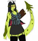
Here is a super rough doodle of Meilongmon,appearing in Golden Fist Cinemaland. She's Filmlongmon's preferred Casting Director and Costume Designer.
Sketch Meister @ Thursday, July 23rd 2020, 5:22 PM
avatar
Oooook. See I read her description wrong. I thought she was like smol but busty, not more regularly proportioned.

Longer arm is a start but don't be afraid to really stretch how the anatomy works for a Digimon or monster girl design. Particularly in the glasses and skirt don't think of how things might work with something human. Those logistics are for the cosplayers.
Crescent @ Thursday, July 23rd 2020, 5:27 PM
avatar
Well, actually, she probably should look a bit shorter/smoller, yeah >_> I was originally gonna just do a bust, then decided to try more and didn't keep her height in mind so much. Maybe I should have messed with those proportions a bit more too. But yeah, wanting to kinda expand on better depecting Digimon-yness are reasons why I kept this super rough and will prolly try and force myself to draw some more World Tour enemies. Part of the reason why the finer elements of Bellfloramon are still stuck in design hell etc.
Sketch Meister @ Thursday, July 23rd 2020, 5:28 PM
avatar
Keep it up, practice makes perfect and all.

I really dig the design on the top, I would stretch that to the skirt.
JDeschain19 @ Saturday, July 25th 2020, 4:12 PM
avatar
Don't be afraid to ask for help either, dude o 3o/

I think you got a good base here (admittedly I wanna try and take my own crack at it) but ya, keeping in mind proportions and stuff and trying to do more Digimon-y things...not always easy
Akurei Nagisa @ Sunday, September 13th 2020, 1:44 PM
avatar
Yeah, I definitely was imagining someone...different, possibly less humanoid or more...small, dragon/fairy-like. XD;

Also, she's still super evil and we're gonna delete her. u 3u No matter how curvy.


[2445] Artist: xehnis | Title: Miqo'te (FF14) | Time: unknown
Pic #2445

Uploaded
xehnis @ Wednesday, July 22nd 2020, 3:01 PM
avatar
Okay so I was going to draw DU Shoto but then I remembered it was my room mates birthday so I did this first. :3
Crescent @ Thursday, July 23rd 2020, 4:57 PM
avatar
Cute kitty u 3u~
Sketch Meister @ Thursday, July 23rd 2020, 5:19 PM
avatar
Dig the details on the clothing. o3o And that background.
YoshinoSuki @ Monday, July 27th 2020, 1:44 AM
avatar
Wow, the detail on the sign must've taken you ages to do. :o I thought the moogle head was part of her yukata at first, then realized it was a handbag. XD <3
Akurei Nagisa @ Sunday, September 13th 2020, 1:41 PM
avatar
THIS IS SUCH A CUTE YUKATA DESIGN. Especially that stylized moogle pattern! 8D


[2444] Artist: xehnis | Title: Moonfire Faire Shoto (FF14) | Time: unknown
Pic #2444

Uploaded
xehnis @ Thursday, July 16th 2020, 11:31 PM
avatar
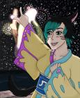
Artwork I was working on lately. My FF14 character Shoto for the Moonfire Faire. I thought it would be fun to design a yukata based on her class ingame. She is a scholar (healer) that heals with fairies Selene and Eos. So it has half as Selene and other half as Eos. :D

(Edited on July 16, 2020, 11:31 pm)
JDeschain19 @ Thursday, July 16th 2020, 11:34 PM
avatar
Oh neat! ' v' Fancy fireworks
xehnis @ Thursday, July 16th 2020, 11:38 PM
avatar
Thanks! I really need to work on drawing DU Shoto next. lol
Sketch Meister @ Thursday, July 16th 2020, 11:44 PM
avatar
Oh my lord she looks so happy. 8D It's very adorable.
YoshinoSuki @ Monday, July 27th 2020, 1:42 AM
avatar
Those fireworks came out awesome! :D I really dig the yukata design too. ^ o^/
Akurei Nagisa @ Sunday, September 13th 2020, 1:35 PM
avatar
Aaaah cute! Sorry it took so long to comment! ; 3;


[2443] Artist: Haru | Title: Refine? No Revise! (Dead Number) | Time: unknown
Pic #2443

ShiPainter
Haru @ Thursday, July 16th 2020, 10:33 PM
avatar
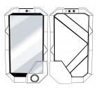
And the last of them! The Dead Number hasn't been drawn in...*a bit*, and the last time I drew it was years ago and thus clunky. It's design in the front is supposed to be frightfully simple, something easily manufactured to look like everything else as that is the way of order. The back...yeah I wanted to make it terrifying. Design base was the Darkness Loader and the newer Digivices/Phones from Last Evolution Kizuna. The number of "eyes" that appear in the "Consume Mode" denotes the rank/importance of the wielder, with Albert for example having five while a newbie or a Rectifier would have one.
JDeschain19 @ Thursday, July 16th 2020, 10:49 PM
avatar
The Dead Number phones feel the most like a tokusatsu designed-to-be-a-toy look by far, but that's not a bad thing. Ya'll have awakened me to Kamen Rider so now I think this shit is cool as fuck lmao I love it, def one of my fave designs
Crescent @ Thursday, July 16th 2020, 10:55 PM
avatar
I do really like how you expanded on the Dead Number design a bunch, both with doubling down on the maw and the eye, yeah XD

Now we gotta rank Sentinel members, though u_u
Akurei Nagisa @ Sunday, September 13th 2020, 1:10 PM
avatar
It's such a nice normal smartphone!

UNTIL IT ISN'T


[2442] Artist: Haru | Title: Refine? No Revise! (Grimoire Phone Covenant) | Time: unknown
Pic #2442

ShiPainter
Haru @ Thursday, July 16th 2020, 10:29 PM
avatar
Not too much to change here, I actually got inspiration from the VERY first PET design used in BN1 and 2 and never used in the anime only the manga. Keeping with the book style I adjusted the design to allow for the ability to put it in a "Tablet Mode". The (English) Digital Script engraved on every one says "WE BRING STABILITY". The key shape really isn't apparent with I suppose a loose chevron going on.
JDeschain19 @ Thursday, July 16th 2020, 10:48 PM
avatar
I always liked the 'book' idea for Stability, and even the little inscription really drives their vibe home. Admittedly I find the Almost-W shape in the middle weirdly distracting, but everything else is sleek.
Crescent @ Thursday, July 16th 2020, 10:53 PM
avatar
Yeah, keeping the book design and single unfolded screen helps make this distinct. I like how the tab is positioned so one half of it becomes asymmetrical when unfolded.
Akurei Nagisa @ Sunday, September 13th 2020, 1:05 PM
avatar
The Grimoires, of all the phones, should be foldable and the whole phone-table hybridness really works because they're supposed to be book-like, and it adds a bit of sleek mysticism. Also that inscription is nice. 8D

...I should fiddle with how Alma's arm-Grimoire works, maybe it can extend to full tablet mode too. o 3o;


[2441] Artist: Haru | Title: Refine? No Revise! (Oracle-III) | Time: unknown
Pic #2441

ShiPainter
Haru @ Thursday, July 16th 2020, 10:25 PM
avatar
Where it all started. I liked the heavy industrial look of the original so I continued on that like of those while using the PET Progress as a design basis. The key shapes here are "triangles".
JDeschain19 @ Thursday, July 16th 2020, 10:46 PM
avatar
Simple and industrial. Function over form. Pretty perfect concept.
Crescent @ Thursday, July 16th 2020, 10:52 PM
avatar
The hardened case here is very Daedalus-appropriate, yeah o 3o
Akurei Nagisa @ Sunday, September 13th 2020, 12:59 PM
avatar
This is a perfect refinement of the whole "industrial smartphone" ideal of the Oracle. o uo All hail the refined Oracle-III!


<<PREV · [1][4] [5] [6] [7] [8] [9] [10] [11] [12] [13] [14][102] · NEXT>>